为什么我的位置:绝对div在Edge中的位置不同?
问题描述 投票:8回答:1
我们正试图在图片的角落贴上徽章。为此我们使用父<div>作为包装器和<span>。到目前为止,Chrome,Firefox和IE11的工作正常,但在MS Edge中它没有按预期工作。似乎Edge计算的right:属性与其他属性非常不同。
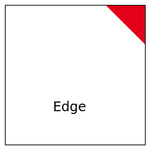
结果如预期:

出乎意料的结果:
这是我的代码:
.parent {
  width: 200px;
  height: 200px;
  border: 1px solid black;
  position: relative;
  overflow: hidden;
}

.child {
  background-color: #e2001a;
  position: absolute;
  right: -65px;
  width: 220px;
  height: 50px;
  -webkit-transform: rotate(45deg);
  transform: rotate(45deg);
  padding-left: 100px;
  display: table;
  z-index: 10;
  color: white;
  text-align: center;
  line-height: 1.2;
}
<div class="parent">
<span class="child">Some cool text</span>
</div>我做错了什么,或者Edge行为与其他浏览器有什么不同?
1个回答
3
投票
投票
你可以像下面这样做,它似乎在Edge *上没问题
.parent {
  width: 200px;
  height: 200px;
  border: 1px solid black;
  position: relative;
  overflow: hidden;
}

.child {
  background-color: #e2001a;
  position: absolute;
  top: 0;
  left: -20px;
  right: -20px;
  height: 50px;
  text-align: center;
  transform: translateX(30%) rotate(45deg) translateY(70%);
  z-index: 10;
  color: white;
  text-align: center;
  line-height: 1.2;
}
<div class="parent">
<span class="child">Some cool text</span>
</div>*我不知道为什么......
更新以使用原始代码段:
transform需要像上面那样改变,translateX()and和translateY()需要一些调整工作。
以下是适用于Chrome,Firefox,Edge和IE11的代码:
.parent {
  width: 200px;
  height: 200px;
  border: 1px solid black;
  position: relative;
  overflow: hidden;
}

.child {
  background-color: #e2001a;
  position: absolute;
  right: -65px;
  width: 220px;
  height: 50px;
  transform: translateX(10%) rotate(45deg) translateY(100%); //wokring with translateX and translateY instead of just rotate
  display: table;
  z-index: 10;
  color: white;
  text-align: center;
  line-height: 1.2;
}
<div class="parent">
<span class="child">Some cool text</span>
</div>最新问题
- 如何将通用列表传递给c#中的方法
- 创建一个小部件以允许用户打开一个对话框以导航到 Excel 文件,然后选择选项卡并传递到数据框
- 如何在Python中通过Google Places API(新)文本搜索(仅ID)调用?
- 无法在Android应用程序中实现片段导航:需要指导
- 以 RTL 格式将文本写入文本文件
- 无法使用具有设置功能的 Pinia 从状态检索数据
- 如何使用pymongo连接mongodb atlas
- 仅根据日期切片器选择显示过去 X 天
- 使用配置文件时出现 Docker 网络问题
- 为什么无法将数据加载到我的集合中? MongoDB
- MapStruct 未生成实现
- Vim badbod 配置适配器
- 我的可见按钮不起作用,我该如何解决它?
- 有没有一种方法可以将多人的日历显示到一个 SharePoint 列表日历中?
- 无法使用 Design Automation for Revit 从可扩展存储读取架构
- 连接到 Azure 时使用 SQLProgrammabilityProvider 时出错?
- prisma 按关系排序只有 _count 属性。无法按关系字段排序
- PhP 表分配
- 如何使用 stlite 挂载本地文件系统
- Azure VM,连接sharepoint来转换数据
© www.soinside.com 2019 - 2024. All rights reserved.