根据情况确定用于不同屏幕尺寸的不同布局
问题描述 投票:0回答:1
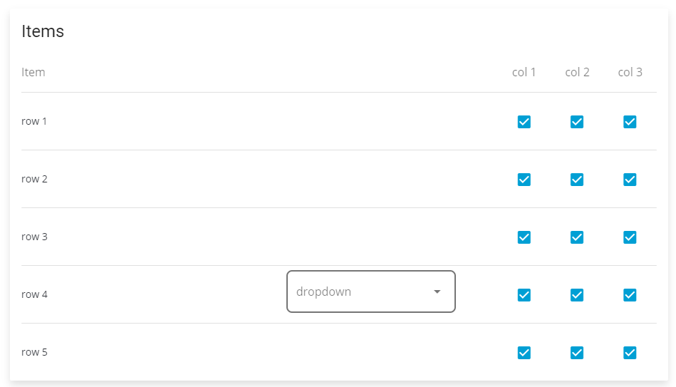
我有一个vue.js应用程序,正在使用vuetify。我有一个看起来像这样的表:
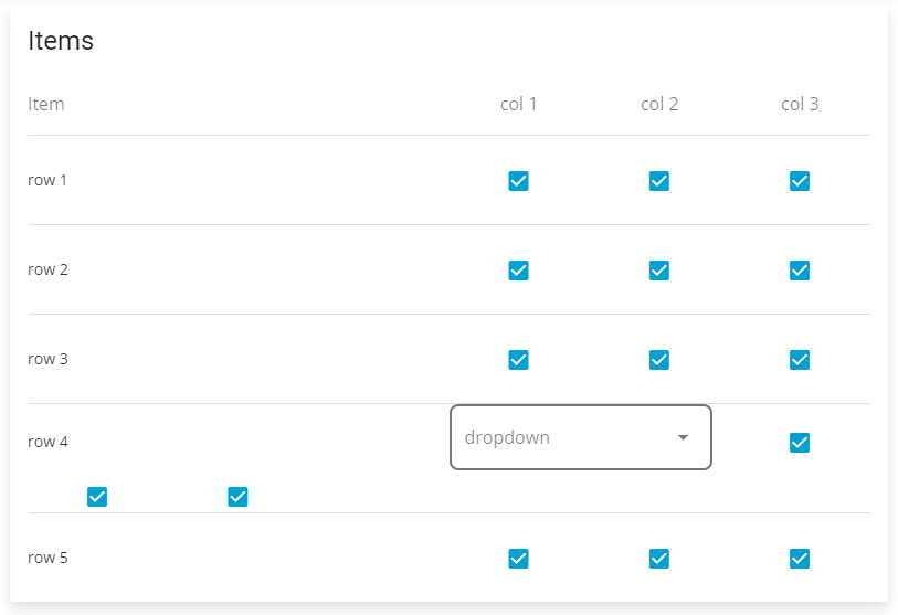
当我缩小视口的宽度时,它最终看起来像这样:
我不喜欢这种观点。我希望将下拉列表推到行描述下,并使复选框与其他行的复选框保持对齐,如下所示:
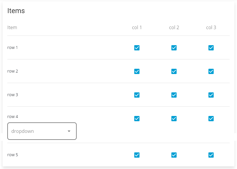
问题是,每行中项目的顺序如下:描述,下拉列表(如果适用于行),复选框1,复选框2,复选框3。它放在行的末尾。但是可以使用低于某些屏幕宽度的CSS来做到这一点吗?
这是我的代码:
<v-card class="mb-3 px-3">
      <v-card-title class="px-0">
          <div class="headline">Items</div>
      </v-card-title>
      <v-container fluid pa-0>
      <v-layout row wrap py-3>
          <v-flex xs9 sm6 md9>
              <v-label>Item</v-label>
          </v-flex>
          <v-flex sm2 md1 class="text-xs-center hidden-xs-only"><v-label>Col 1</v-label></v-flex>
          <v-flex sm2 md1 class="text-xs-center hidden-xs-only"><v-label>Col 2</v-label></v-flex>
          <v-flex sm2 md1 class="text-xs-center hidden-xs-only"><v-label>Col 3</v-label></v-flex>
      </v-layout>
      <v-divider></v-divider>
      </v-container>
      <v-form>
        <v-card v-for="(item, index) in items" :key="index" :id="'index-' + index" flat>
            <v-container fluid pa-0>
                <v-layout row wrap align-center style="min-height: 80px;">
                    <v-flex xs12 sm6 :class="item.hasDropdown ? 'md5' : 'md9'"><p class="pt-3 pb-3 font-weight-medium">{{item.description}}</p></v-flex>
                    <v-flex md4 v-if="item.hasDropdown">
                      <v-select :items="dropdownOptions" v-model="dropdownSelection" outline label="dropdown" class="d-inline-block"></v-select>
                    </v-flex>
                    <v-flex xs4 sm2 md1><label class="hidden-sm-and-up">Col 1:</label><v-checkbox v-model="item.col1" class="checkbox"></v-checkbox></v-flex>
                    <v-flex xs4 sm2 md1><label class="hidden-sm-and-up">Col 2:</label><v-checkbox v-model="item.col2" class="checkbox"></v-checkbox></v-flex>
                    <v-flex xs4 sm2 md1><label class="hidden-sm-and-up">Col 3:</label><v-checkbox v-model="item.col3" class="checkbox"></v-checkbox></v-flex>
                </v-layout>
            </v-container>
            <v-divider v-if="index < items.length - 1"></v-divider>
        </v-card>
      </v-form>
    </v-card>
[您会注意到我正在使用vuetify的flex类,例如sm2,md1,sm2等。这些类非常适合在不同屏幕尺寸上调整列数,但是在vuetify中是否有类似功能可用于确定不同的布局在不同的屏幕尺寸上?
1个回答
0
投票
投票
您可以将order classes用于此目的。只需根据需要添加order-lg / order-md等。在您的示例中,我使用的是order-md。根据您的需求进行定制。这是我的操作方式:
- 而不是
v-flex,您必须使用v-col - 对于网格使用
md=9样式代替md9 - 您的页面必须在根级别具有
v-app,否则它将不起作用。
...................................
<v-card class="mb-3 px-3">
  <v-card-title class="px-0">
      <div class="headline">Items</div>
  </v-card-title>
  <v-container fluid pa-0>
    <v-layout row wrap py-3>
      <v-flex xs9 sm6 md9>
          <v-label>Item</v-label>
      </v-flex>
      <v-flex sm2 md1 class="text-xs-center hidden-xs-only"><v-label>Col 1</v-label></v-flex>
      <v-flex sm2 md1 class="text-xs-center hidden-xs-only"><v-label>Col 2</v-label></v-flex>
      <v-flex sm2 md1 class="text-xs-center hidden-xs-only"><v-label>Col 3</v-label></v-flex>
  </v-layout>
  <v-divider></v-divider>
  </v-container>
  <v-form>
    <v-card v-for="(item, index) in items" :key="index" :id="'index-' + index" flat>
        <v-container fluid pa-0>
            <v-layout row wrap align-center style="min-height: 80px;">
                <v-col xs=12 sm=6 :md="item.hasDropdown ? '5' : '9'"><p class="pt-3 pb-3 font-weight-medium">{{item.description}}</p></v-col>
                <v-col xs=4 sm=2 md=1 order-md="2"><label class="hidden-sm-and-up">Col 1:</label><v-checkbox v-model="item.col1" class="checkbox"></v-checkbox></v-col>
                <v-col xs=4 sm=2 md=1 order-md="2"><label class="hidden-sm-and-up">Col 2:</label><v-checkbox v-model="item.col2" class="checkbox"></v-checkbox></v-col>
                <v-col xs=4 sm=2 md=1 order-md="2"><label class="hidden-sm-and-up">Col 3:</label><v-checkbox v-model="item.col3" class="checkbox"></v-checkbox></v-col>
                <v-col md=4 v-if="item.hasDropdown" order-md="1">
                  <v-select :items="dropdownOptions" v-model="dropdownSelection" outline label="dropdown" class="d-inline-block"></v-select>
                </v-col>
            </v-layout>
        </v-container>
        <v-divider v-if="index < items.length - 1"></v-divider>
    </v-card>
  </v-form>
</v-card>
解决方案2解决方案1更像是通过验证的方式进行订购。对于普通的CSS方式:
<v-card class="mb-3 px-3">
  <v-card-title class="px-0">
      <div class="headline">Items</div>
  </v-card-title>
  <v-container fluid pa-0>
  <v-layout row wrap py-3>
      <v-flex xs9 sm6 md9>
          <v-label>Item</v-label>
      </v-flex>
      <v-flex sm2 md1 class="text-xs-center hidden-xs-only"><v-label>Col 1</v-label></v-flex>
      <v-flex sm2 md1 class="text-xs-center hidden-xs-only"><v-label>Col 2</v-label></v-flex>
      <v-flex sm2 md1 class="text-xs-center hidden-xs-only"><v-label>Col 3</v-label></v-flex>
  </v-layout>
  <v-divider></v-divider>
  </v-container>
  <v-form>
    <v-card v-for="(item, index) in items" :key="index" :id="'index-' + index" flat>
        <v-container fluid pa-0>
            <v-layout row wrap align-center style="min-height: 80px;">
                <v-flex xs12 sm6 :class="item.hasDropdown ? 'md5' : 'md9'"><p class="pt-3 pb-3 font-weight-medium">{{item.description}}</p></v-flex>
                <v-flex md4 v-if="item.hasDropdown" class="v-select">
                  <v-select :items="dropdownOptions" v-model="dropdownSelection" outline label="dropdown" class="d-inline-block"></v-select>
                </v-flex>
                <v-flex xs4 sm2 md1 class="v-chkbox"><label class="hidden-sm-and-up">Col 1:</label><v-checkbox v-model="item.col1" class="checkbox"></v-checkbox></v-flex>
                <v-flex xs4 sm2 md1 class="v-chkbox"><label class="hidden-sm-and-up">Col 2:</label><v-checkbox v-model="item.col2" class="checkbox"></v-checkbox></v-flex>
                <v-flex xs4 sm2 md1 class="v-chkbox"><label class="hidden-sm-and-up">Col 3:</label><v-checkbox v-model="item.col3" class="checkbox"></v-checkbox></v-flex>
            </v-layout>
        </v-container>
        <v-divider v-if="index < items.length - 1"></v-divider>
    </v-card>
  </v-form>
</v-card>
这是CSS:
.v-chkbox {
  order: 1;
}
.v-select {
  order: 2;
}
**不要忘记我没有添加的媒体查询。
**要了解有关CSS排序的更多信息,请检查MDN和CSS Tricks链接。
欢呼:)
最新问题
- Next.js 项目中格式化程序出现 Eslint 错误
- Android Studio 中未使用的 @Composable 函数检查
- Vue3:热避免加载图像时的许多 v-if 条件,基于 10+ 状态
- Nginx 对于没有 '/public/' 前缀的 Laravel Filament 静态文件返回 404
- 如何使用 Jinja 语法在 HTML 中重定向期间传入变量?
- Java 8 JavaFX - 如何设置选项卡标题文本的颜色
- 尽管安装了Opus,但仍不会导入
- 当我在flutter中创建子路由时,为什么会同时创建父页面?
- 后端到前端回调URL的Oauth2方法
- 如何自定义选定的NavigationBarItem?
- ValueError:层“sequential_4”的输入0与该层不兼容:预期形状=(无,100,100,3),发现形状=(无,100,3)
- 在 Visual Studio Code 中同时运行两个项目
- 我在 flutter 中使用滑块尝试保存首选项中的值,但它没有在 ui 中更新
- 将数据写入云存储时,将 GCP Pub Sub 上的文件名前缀设计为 YYYY/MM/DD
- 尝试使用forEach方法跨div传播
- 如何使用 pandas 添加线性相关性
- 分水岭算法
- 如何在不引用SendPort的情况下防止Flutter中跨多个Isolate并发执行代码块?
- 未从 REST api Node js 获得任何响应
- 为什么有些服务器不接受HTTP DELETE中的body参数?
© www.soinside.com 2019 - 2024. All rights reserved.