仅为顶部和底部边缘创建线性渐变边框?
问题描述 投票:3回答:1
使用下面的代码,我只能为元素的底部边缘生成线性渐变border-image。如何修改代码使其也成为顶部代码?
div {
    /* gradient shining border */
    border-style: solid;
    border-width: 3px;
    -webkit-border-image: -webkit-linear-gradient(
        left,
        rgba(0,0,0,1) 1%,
        rgba(0,255,255,1) 50%,
        rgba(0,0,0,1) 100%
    ) 0 0 100% 0/0 0 3px 0 stretch;
    -moz-border-image: -moz-linear-gradient(
        left,
        rgba(0,0,0,1) 1%,
        rgba(0,255,255,1) 50%,
        rgba(0,0,0,1) 100%
    ) 0 0 100% 0/0 0 3px 0 stretch;
    -o-border-image: -o-linear-gradient(
        left,
        rgba(0,0,0,1) 1%,
        rgba(0,255,255,1) 50%,
        rgba(0,0,0,1) 100%
    ) 0 0 100% 0/0 0 3px 0 stretch;
    border-image: linear-gradient(
        to left,
        rgba(0,0,0,1) 1%,
        rgba(0,255,255,1) 50%,
        rgba(0,0,0,1) 100%
    ) 0 0 100% 0/0 0 3px 0 stretch;
}
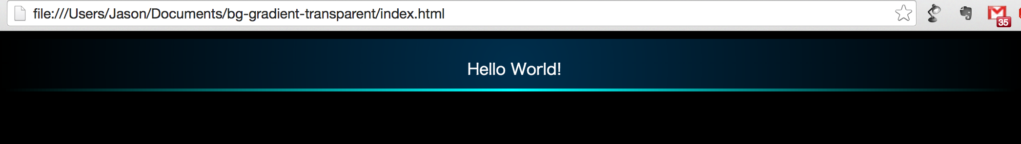
当前输出:
1个回答
10
投票
投票
您正在使用速记border-image属性来设置渐变的大小,并且根据提供的值,顶部,左侧和右侧边框均无效。
将100%设置为顶部边界的宽度,将3px设置为其高度将导致仅在顶部和底部应用渐变。
border-image: linear-gradient(to left, rgba(0, 0, 0, 1) 1%, rgba(0, 255, 255, 1) 50%, rgba(0, 0, 0, 1) 100%)
              100% 0 100% 0/3px 0 3px 0 stretch;
在以上代码行中,100% 0 100% 0/3px 0 3px 0表示每侧渐变边框的大小(读为[top] [right] [bottom] [left])。最初是0 0 100% 0/0 0 3px 0。
div {
  /* gradient shining border */
  border-style: solid;
  border-width: 3px;
  border-image: linear-gradient(to left, rgba(0, 0, 0, 1) 1%, rgba(0, 255, 255, 1) 50%, rgba(0, 0, 0, 1) 100%)
                100% 0 100% 0/3px 0 3px 0 stretch;

  /* other demo stuff */
  height: 50px;
  line-height: 50px;
  background-color: #222;
  color: white;
  text-align: center;
}
<div>Some content</div>请注意,如果需要支持IE10及更低版本,则border-image property still has pretty low browser support和将不起作用。代替它,您可以像下面的代码片段一样使用border-image来产生类似的效果。这也可以在IE10中使用(但仍无法在IE9中使用,因为它们根本不支持渐变)。
background-imagediv {
/* gradient shining border */
background-image: linear-gradient(to left, rgba(0, 0, 0, 1) 1%, rgba(0, 255, 255, 1) 50%, rgba(0, 0, 0, 1) 100%),
linear-gradient(to left, rgba(0, 0, 0, 1) 1%, rgba(0, 255, 255, 1) 50%, rgba(0, 0, 0, 1) 100%);
background-size: 100% 3px;
background-position: 0% 0%, 0% 100%;
background-repeat: no-repeat;
/* other demo stuff */
height: 50px;
line-height: 50px;
background-color: #222;
color: white;
text-align: center;
}最新问题
- Visual Studio Code 离线包安装
- Material UI 自动完成 - 警告:包含“key”道具的道具对象正在传播到 JSX 中
- 引导轮播指示器“文本对齐:中心”不起作用
- 创建新的链接服务返回 SqlFailedToConnect
- 我如何使用 swiftUI 及其材质(.ultraThinMaterial.regular.thickmaterial)等创建相同的模糊视图
- 滑动窗口算法内循环时间复杂度
- 使用 App Intents 启动麦克风“必需条件为 false:IsFormatSampleRateAndChannelCountValid(format)”
- Nunit 测试给出结果 OneTimeSetUp: 找不到合适的构造函数
- 在更新 Git 中的远程子模块上的更改之前,我应该签出到分支吗?
- 如何获取低于指定金额的付款?
- Prisma 与 Google Cloud SQL PostgreSQL - 从 Google Cloud Run 访问时未找到表
- EF Core 在添加时更改实体的 ID。无法跟踪实体,因为具有键值的另一个实例已被跟踪
- EFCore 在添加时更改实体的 ID。无法跟踪实体,因为具有键值的另一个实例已被跟踪
- GitLab 管道上传的正确 TWINE_REPOSITORY_URL 是什么?
- join 期间 ctrl+c 上的 Python 线程行为
- 内循环的时间复杂度
- Chrome 扩展:将自定义事件从内容脚本传递到 React/Next.js 应用程序
- 调整职员用户按钮大小
- 如何强制MacOS PKG要求用户在安装后将安装程序移至垃圾箱?
- 如何在 iOS 和 Web 的 React Native 中实现可调整大小、可移动和可移动的可拖动矩形?
© www.soinside.com 2019 - 2024. All rights reserved.