如何在 HTML/CSS 中正确定位图标和导航栏?
问题描述 投票:0回答:1
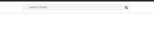
我正在尝试复制 YouTube 教程中的网站设计。这是目标布局:
...这是我的样子:
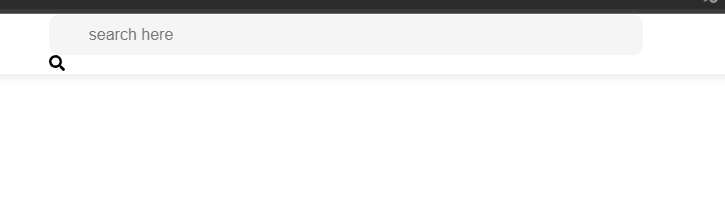
主要问题是图标和导航栏的定位。浏览器栏和我的元素之间似乎缺少空间。谁能帮我实现正确的布局?
* {
  padding: 0;
  margin: 0;
  box-sizing: border-box;
  font-family: 'poppins', sans-serif;
}

.topbar {
  position: fixed;
  background: #fff;
  box-shadow: 0 4px 8px 0 rgba(0, 0, 0, 0.08);
  width: 100%;
  height: 60px;
  padding: 0 20px;
  display: grid;
  grid-template-columns: 2fr 10fr 0.4fr 1fr;
  align-items: center;
  z-index: 1;
}

.logo h2 {
  color: #df7f27;
}

.search {
  position: relative;
  width: 60%;
  justify-self: center;
}

.search input {
  width: 100%;
  height: 40px;
  padding: 0 40px;
  font-size: 16px;
  outline: none;
  border: none;
  border-radius: 10px;
  background: #f5f5f5;
}

.search i {
  position: absolute;
  right: 15px;
  top: 15px;
  cursor: pointer;
}

.user {
  position: relative;
  width: 50px;
  height: 50px;
}

.user img {
  position: absolute;
  top: 0;
  left: 0;
  height: 100%;
  width: 100%;
  object-fit: cover;
}
<head>
<meta charset="UTF-8">
<meta http-equiv="X-UA-Compatible" content="IE=edge">
<meta name="viewport" content="width=device-width, initial-scale=1.0">
<link rel="stylesheet" href="styles.css">
<script defer src="https://use.fontawesome.com/releases/v5.15.4/js/all.js" integrity="sha384-rOA1PnstxnOBLzCLMcre8ybwbTmemjzdNlILg8O7z1lUkLXozs4DHonlDtnE7fpc" crossorigin="anonymous"></script>
<title>pomodone.app</title>
</head>
<body>
<div class="container">
<div class="topbar">
<div class="logo">
<h2>Pomodone</h2>
</div>
<div class="search">
<input type="text" id="search" placeholder="search here">
<label for="search"><i class="fas fa-search"></i></label>
</div>
<i class="fas fa-bell"></i>
<div class="user">
<img src="img/user.jpg" alt="">
</div>
</div>
<div class="sidebar"></div>
<div class="main"></div>
</div>
</body>1个回答
1
投票
投票
@Iomipac,您需要设置标签的位置。 请添加此样式。希望对你有帮助~。
.search >label {
            position: absolute;
            right: 15px;
            top: 50%;
            transform: translateY(-50%);
        }
* {
  padding: 0;
  margin: 0;
  box-sizing: border-box;
  font-family: 'poppins', sans-serif;
}

.topbar {
  position: fixed;
  background: #fff;
  box-shadow: 0 4px 8px 0 rgba(0, 0, 0, 0.08);
  width: 100%;
  height: 60px;
  padding: 0 20px;
  display: grid;
  grid-template-columns: 2fr 10fr 0.4fr 1fr;
  align-items: center;
  z-index: 1;
}

.logo h2 {
  color: #df7f27;
}

.search {
  position: relative;
  width: 60%;
  justify-self: center;
}

.search input {
  width: 100%;
  height: 40px;
  padding: 0 40px;
  font-size: 16px;
  outline: none;
  border: none;
  border-radius: 10px;
  background: #f5f5f5;
}

.search>label {
  position: absolute;
  right: 15px;
  top: 50%;
  transform: translateY(-50%);
}

.search i {
  position: absolute;
  right: 15px;
  top: 15px;
  cursor: pointer;
}

.user {
  position: relative;
  width: 50px;
  height: 50px;
}

.user img {
  position: absolute;
  top: 0;
  left: 0;
  height: 100%;
  width: 100%;
  object-fit: cover;
}
<div class="container">
<div class="topbar">
<div class="logo">
<h2>Pomodone</h2>
</div>
<div class="search">
<input type="text" id="search" placeholder="search here">
<label for="search">icon<i class="fas fa-search"></i></label>
</div>
<i class="fas fa-bell"></i>
<div class="user">
<img src="img/user.jpg" alt="">
</div>
</div>
<div class="sidebar"></div>
<div class="main"></div>
</div>最新问题
- 为人们创建一个 Excel 数据透视表,其中工作日为列,课程为行
- ModuleNotFoundError:没有名为“Crypto”的模块错误
- 使用 UserDeleatedCredential 和 azure-sdk-for-go 的跨租户 Azure Blob Storage SAS 失败,并显示“签名不匹配”
- 如何获取这个变量?
- Weebly 部分间距过大
- Python 中的裸异常的替代方案?
- Service-worker.js 未正确注册
- 如何使用 MS-Graph 和 C# 将电子邮件消息作为 EML 保存到文件夹
- Qt5 连接自定义窗口关闭信号到不同的窗口
- 取消连接是boost::asio
- 是否可以在 React Native 应用程序中使用 Prisma?
- 我在安装 dlib 库时在 python 中遇到错误
- 如何从文件开头复制x个字节并将它们附加到文件末尾以使文件增加x个字节?
- 修改结帐订单项后如何更新订单总额?
- 在 eslint.config.js 上运行 tsc 会引发错误
- 查找并标记重复项
- openbim 组件中的 FPC(OBC)
- Ember.js 辛烷值验收测试
- 尝试在addEventListener中设置表单的文件input.value = null
- 修复错误 [FirebaseError: 由于客户端离线而无法获取文档
© www.soinside.com 2019 - 2024. All rights reserved.