有没有办法为带边框的按钮创建CSS尖角?
问题描述 投票:0回答:3
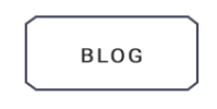
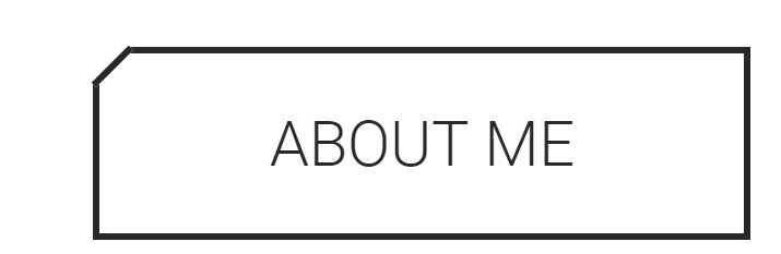
有没有办法在CSS中创建这样的按钮?带有“博客”文字的。我尝试在每个角落添加一个 div,给这些 div 边框并旋转它们,但正如你所看到的(Anout Me btn),这不是最好的解决方案,因为角落不准确。
谢谢您的想法!
3个回答
4
投票
投票
没有 CSS 规则可以做到这一点,但这是可能的。您的按钮需要一个
inline-blockblockabsolute::before::after您可以看看我不久前制作的这些六边形按钮以获得更好的想法:https://codepen.io/chriskirknielsen/pen/MpXKVV
编辑:这是一个代码片段,而不是 Codepen 链接:
*, *::before, *::after {
  padding: 0;
  margin: 0;
  box-sizing: border-box;
  transition: .25s all .02s ease-in-out;
}

body, html {
  text-align: center;
  font-family: sans-serif;
  font-size: 32px;
  background-color: #123143;
  height: 100%;
}

.button--hexagon {
  position: relative;
  margin: 1rem auto;
  text-align: center;
  font-size: .5rem;
  line-height: .5rem;
  vertical-align: middle;
  color: #ffce00;
  display: inline-block;
  border-width: 0;
  border-style: solid;
  border-color: #ffffff;
  padding: .5rem;
  cursor: pointer;
  background: transparent;
  width: calc(100% / 6);
}

.button--hexagon span {
  z-index: 20;
  position: relative;
}

.button--hexagon::before, .button--hexagon::after {
  content: '';
  position: absolute;
  border-color: inherit;
  border-style: inherit;
  height: 50%;
  width: 100%;
  left: 0;
  z-index: 10;
  background-color: rgba(18, 49, 67, 0.75);
}

.button--hexagon::before {
  border-width: 2px 2px 0 2px;
  top: 0;
  transform-origin: center bottom;
  transform: perspective(0.5rem) rotateX(3deg);
}

.button--hexagon::after {
  border-width: 0 2px 2px 2px;
  bottom: 0;
  transform-origin: center top;
  transform: perspective(0.5rem) rotateX(-3deg);
}

.button--hexagon:hover {
  color: #123143;
  border-color: #ffce00;
}

.button--hexagon:hover::before,
.button--hexagon:hover::after {
  background: #ffce00;
}
<button class="button--hexagon"><span>Some text</span></button> 0
投票
投票
CSS 并不容易做到这一点。您可以尝试使用 CSS 形状来获得粗略的相似性 - 但作为形状,您将无法获得准确的结果,并且如果您的意图是这样,您可能无法在其上画出正确的笔画。
#octagon {
    width: 100px;
    height: 100px;
    background: red;
    position: relative;
}

#octagon:before {
    content: "";
    position: absolute;
    top: 0;
    left: 0;
    border-bottom: 29px solid red;
    border-left: 29px solid #eee;
    border-right: 29px solid #eee;
    width: 42px;
    height: 0;
}

#octagon:after {
    content: "";
    position: absolute;
    bottom: 0;
    left: 0;
    border-top: 29px solid red;
    border-left: 29px solid #eee;
    border-right: 29px solid #eee;
    width: 42px;
    height: 0;
}
0
投票
投票
您可以在纯CSS中使用clip-path属性
button {
        width: 200px;
        min-height: 50px;
        clip-path: polygon(6% 0, 93% 0, 100% 22%, 100% 78%, 94% 98%, 7% 98%, 0 79%, 0 21%);
        background: green;
      }
和按钮
<button>Cut corner effect.</button>
最新问题
- Podio .Net CreateItem 参考
- podio .net ID 为 XXXXXXX 的应用程序在 ID 为 XXXXXXX 的个人资料上没有正确的视图
- .NET 的 Podio API - 无法创建项目
- 如何接收非原始对象作为查询参数?
- 通过 .NET API 切换跑道中的隐藏字段
- 是否可以使用 .NET Podio API 以 Globiflow 的方式从 Podio 发送电子邮件?
- 我想在最后一次将长网址转换为短网址...如何做到这一点
- Postgres 在 BIGINT 列上使用索引吗?
- 使用 laravel splade 在刀片文件中显示顶点图时遇到问题
- QGIS - 表达式过滤器不起作用 - 特征数量永远不对
- DateUtil 中的 CompareIgnoreTime()
- 使用 Build Tools 2022 安装 MSTest 需要哪些工作负载?
- 如何在Python中抓取Instagram帐户信息
- Adobe AIR 可以利用的最大内存量是多少?
- Python 到 Redis 集群的连接超时
- Appsheet 使用机器人更新现有行列
- 元素的屏幕坐标,通过 Javascript
- 如何使用NestJS在Bull Board注册多个队列
- 如何防止在行提交时不断重新渲染 MUI `DataGrid`?
- 我无法连接到 Digital Ocean Managed (Postgres) 数据库
© www.soinside.com 2019 - 2024. All rights reserved.