如何显示具体编号CSS网格中的行数?
问题描述 投票:-1回答:3
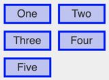
我正在使用CSS网格显示5张卡片。这些卡在台式机中完美对齐成一行。但是,当我切换到移动设备时,它们将按照以下图像显示。
是否可以在CSS网格中指定为仅显示两行。
3个回答
0
投票
投票
您可以使用CSS。您要么创建一个无移动显示类,要么将其内容隐藏在特定的断点处。或者,如果您要从数组中接收此数据,则可以修改数组或在代码中指定索引,以将项目呈现到其中。但是,您也需要为此设置一个断点,因此我只需要直接使用CSS @media屏幕即可。如果您想将第5格作为该行的第三个元素,则可能需要调整网格。
0
投票
投票
您不能只指定2行 但是您可以尝试将最后一行设置为minmax(0,0)以外的overflow:hidden;值...隐藏它们:
section {
  display: grid;
  grid-template-columns: 1fr 1fr;
  grid-gap: 1em;
  overflow: hidden;
  grid-template-rows: minmax(100px, 1fr) minmax(100px, 1fr) minmax(0px, 0); /* third-row won't show, next might , grid-gap will increase height of section if set */
}

section {
  counter-reset: divs;
}

div {
  border: solid;
}

div:before {
  counter-increment: divs;
  content: counter(divs)
}
p:before {
color:red;
  content: counter(divs)
  }
<section>
<div></div>
<div></div>
<div></div>
<div></div>
<div></div>
</section>
<p> boxes are standing here </p>这会隐藏第三行,如果更多,则会显示某些元素,因为grid-gap设置将为每增加一行增加height。
您可以使用margin代替grid-gap,并为每个额外的行添加以隐藏mimax(0,0)的grid-template-rows值。下面的另一个演示
section {counter-reset:divs;}
div {border:solid;margin:0.5em;}
div:before {counter-increment:divs;content:counter(divs)}

section {
  display:grid;
  grid-template-columns:1fr 1fr;
  overflow:hidden;
  grid-template-rows:
    minmax(100px,1fr)
    minmax(100px,1fr)
    minmax(0,0)
    minmax(0,0)
    minmax(0,0)
    minmax(0,0)
    minmax(0,0)  ;/* 7 rows values set , 5 rows can be hidden */
}

p:before {
color:red;
  content: counter(divs)
  }
<section>
<div></div>
<div></div>
<div></div>
<div></div>
<div></div>
<div></div>
<div></div>
<div></div>
<div></div>
<div></div>
<div></div>
<div></div>
<div></div>
<div></div>
</section>
<p> boxes are standing here.</p>0
投票
投票
仅隐藏最后一个元素,以防网格环绕。我做了一个有效的例子。
.wrapper {
  display: grid;
  grid-auto-flow: column;
}

@media only screen and (max-width: 800px) {
  .wrapper {
      grid-auto-flow: row;
      grid-template-columns: repeat(2, minmax(300px, 500px));
  }
  .five {
    display: none;
  }
}
最新问题
- Google 表单到 Pdf 添加图像
- 如何构建 nextjs 应用程序?
- Apache Kafka 与 Redpanda 的性能测试
- Terraform 可以用作 CICD 在 aws 中构建/部署应用程序代码吗?
- Flutter项目真机测试启动报错
- BigQuery - 将十六进制字符串转换为 NUMERIC 或 BIGNUMERIC?
- 具有 Git 操作的 Azure 静态 Web 应用程序 [Git 操作错误]
- 问题无法找到 s3ablock-0001-
- 如何在 React Native 中 Text 组件的 `numberOfLines` 截断后添加内联项
- 访问特殊路径的 OPA 政策是什么?
- 创建自己的 mujoco 环境的最佳方法是什么?
- 异常过滤器 Nestjs 无法在我的 websocket 网关上工作
- 如何在jenkins groovy中使用values属性对数组进行排序
- Linter 说“parse”和“serveHttp”已弃用,我该如何解决这个问题?
- 解密/修改Tomcat Server.xml文件中Realm标签的密码 - LDAP
- odoo 8 从表中获取数据并将其插入到另一个表中
- 使用 Powershell 从 Web 下载文件名中包含日期 Month_Year 的文件
- 新安装的Python3.4(redhat linux 4)环境找不到PIP
- 如何修复控制台警告“资源...已使用链接预加载进行预加载,但在窗口加载事件后几秒钟内未使用”?
- 检测 Flutter 中是否按下按钮或手势检测器
© www.soinside.com 2019 - 2024. All rights reserved.