如何在可折叠内容中格式化无序列表
问题描述 投票:0回答:2
所以,我在可折叠的内容div中存在一个无序列表的问题。当div折叠时,列表没有任何样式显示,但是在div完全折叠后,我的css接管并以样式显示。
我将在此处添加我的整个代码,如果您单击“我的路线”,您将了解我在说什么,这有点难以解释。
谢谢,理查德。
* {
    font-family: 'Roboto', sans-serif;
}

body {

    background-color: #fff;
}

/* Every CSS rule for the Sidebar and it's contents */

.logo {
    width: 180px;
    height: 55px;
    margin: 14px auto;
    background-size: contain;
    background-repeat: no-repeat;
    background-image: url(../images/logo.png);
}

.sidebar {
    height: 100vh;
    background-color: #fff;
}

#map {
    height: 100vh;
}

.collapse {
    font-size: 14px;
}

.collapse ul {
    margin: 0;
    padding: 0;
    list-style-type: none;
}
.collapse ul li {
    padding: 7px;
    border-radius: 4px;
    border-bottom: 1px solid #E2E6EA;
}

.collapse ul li:hover {
    background-color: #e2e6ea;
}

.collapse i {
    cursor: pointer;
    margin-left: 10px;
}

footer {
    bottom: 0;
    width: 100%;
    font-size: 14px;
    text-align: center;
    position: absolute;
    padding-bottom: 30px;
    margin: 40px 0 0 -15px;
}

/*Blurred Content for Modal Window*/
body.modal-open .container-fluid{
    -webkit-filter: blur(4px);
    -moz-filter: blur(4px);
    -o-filter: blur(4px);
    -ms-filter: blur(4px);
    filter: blur(4px);
}

.modal-content {
    margin-top: 60px;
    border-radius: 6px;
    background-color: #fff;
}
<!doctype html>
<html lang="en">
<head>
<!-- Required meta tags -->
<meta charset="utf-8">
<meta name="viewport" content="width=device-width, initial-scale=1, shrink-to-fit=no">
<title>TripQuest</title>
<!-- Bootstrap CSS -->
<link rel="stylesheet" href="https://stackpath.bootstrapcdn.com/bootstrap/4.3.1/css/bootstrap.min.css" integrity="sha384-ggOyR0iXCbMQv3Xipma34MD+dH/1fQ784/j6cY/iJTQUOhcWr7x9JvoRxT2MZw1T" crossorigin="anonymous">
<!--Custom CSS-->
<link rel="stylesheet" type="text/css" href="assets/css/main.css">
<!--Font Awesome-->
<link rel="stylesheet" href="https://use.fontawesome.com/releases/v5.11.2/css/all.css" integrity="sha384-KA6wR/X5RY4zFAHpv/CnoG2UW1uogYfdnP67Uv7eULvTveboZJg0qUpmJZb5VqzN" crossorigin="anonymous">
</head>
<body>
<div class="container-fluid">
<div class="row">
<div class="sidebar col-3">
<div class="logo"></div>
<div class="mt-5"></div>
<div class="form-group">
<input type="text" class="form-control" id="routename" placeholder="Route Name (Max of 28 Characters)" maxlength="28">
</div>
<div class="form-group">
<button type="submit" class="btn btn-info btn-md btn-block">Create Route</button>
</div>
<button type="button" class="btn btn-light btn-md btn-block" data-toggle="collapse" data-target="#myroutes">My Routes</button>
<div id="myroutes" class="collapse">
<div class="mt-4 mb-4">
<ul>
<li>
10/29/19 - Montgomery & Butler County
<i class="far fa-edit"></i>
<i class="far fa-trash-alt"></i>
</li>
<li>
10/12/19 - Clinton & Highland County
<i class="far fa-edit"></i>
<i class="far fa-trash-alt"></i>
</li>
<li>
10/05/19 - Indiana
<i class="far fa-edit"></i>
<i class="far fa-trash-alt"></i>
</li>
</ul>
<div class="mt-4"></div>
<p style="text-align: center;" class="text-warning">You can store up to 10 routes.</p>
</div>
</div>
<div class="mt-2"></div>
<button type="button" class="btn btn-light btn-md btn-block" data-toggle="modal" data-target="#exampleModal">My Account</button>
<footer>
© 2019 TripQuest.org
<div class="mt-4 mt-b-3">
<i class="fab fa-2x fa-facebook-square" style="padding-right: 8px"></i>
<i class="fab fa-2x fa-twitter-square" style="padding-right: 8px"></i>
</div>
</footer>
</div>
<div id="map" class="mapsec col-9" style="background-color: #f5f7f8;">Google Maps</div>
<script>
// Initialize and add the map
function initMap() {
// The location of Uluru
var uluru = {lat: 38.897663, lng: -77.036575};
// The map, centered at Uluru
var map = new google.maps.Map(
document.getElementById('map'), {zoom: 13, center: uluru});
// The marker, positioned at Uluru
var marker = new google.maps.Marker({position: uluru, map: map});
}
</script>
<!--Load the API from the specified URL
* The async attribute allows the browser to render the page while the API loads
* The key parameter will contain your own API key (which is not needed for this tutorial)
* The callback parameter executes the initMap() function
-->
<script async defer
src="https://maps.googleapis.com/maps/api/js?key=AIzaSyACgLN4EW-PpbSRRzZm5iBGeDcgS1OKLHQ&callback=initMap">
</script>
</div>
</div>
<!-- Modal -->
<div class="modal fade" id="exampleModal" tabindex="-1" role="dialog" aria-labelledby="exampleModalLabel" aria-hidden="true">
<div class="modal-dialog" role="document">
<div class="modal-content">
<div class="row">
<div class="col-12">
<div class="mt-5 mb-5">
<p style="text-align: center;">My Account</p>
</div>
</div>
</div>
</div>
</div>
</div>
<!-- Optional JavaScript -->
<!-- jQuery first, then Popper.js, then Bootstrap JS -->
<script src="https://code.jquery.com/jquery-3.3.1.slim.min.js" integrity="sha384-q8i/X+965DzO0rT7abK41JStQIAqVgRVzpbzo5smXKp4YfRvH+8abtTE1Pi6jizo" crossorigin="anonymous"></script>
<script src="https://cdnjs.cloudflare.com/ajax/libs/popper.js/1.14.7/umd/popper.min.js" integrity="sha384-UO2eT0CpHqdSJQ6hJty5KVphtPhzWj9WO1clHTMGa3JDZwrnQq4sF86dIHNDz0W1" crossorigin="anonymous"></script>
<script src="https://stackpath.bootstrapcdn.com/bootstrap/4.3.1/js/bootstrap.min.js" integrity="sha384-JjSmVgyd0p3pXB1rRibZUAYoIIy6OrQ6VrjIEaFf/nJGzIxFDsf4x0xIM+B07jRM" crossorigin="anonymous"></script>
</body>
</html>2个回答
0
投票
投票
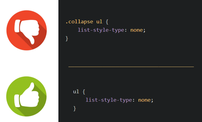
这是因为您要基于父类将样式应用于列表,而父类具有collapse类,该类在折叠事件中不会出现,而仅在完成时才会出现。更好的方法是将一个类添加到列表<ul class="my-styled-list">,然后使用.my-styled-list { ... }
0
投票
投票
尝试此100%,它将起作用..!
ul{
    list-style-type: none;
}
最新问题
- 存储RSA密钥并在.Net core中使用它的最佳方法(寻找跨平台解决方案)
- 在 Automation Studio 4.12 中传输时出现“没有此类文件或目录”错误
- Perl 正则表达式检索第一个数字
- 在函数之间传递列表以一次引发异常而不是一次引发异常是一种不好的做法吗?
- 使用服务器标记在 onblur asp.net 文本框中分配隐藏字段值
- Perl 在脚本内就地编辑(而不是一行)
- RegExp 匹配重复字符
- 如何构建带有命名空间的CMake库?
- 从 URL 获取 HTTP 响应代码的最佳方法是什么?
- Swift - 如何在 UIStackview 上设置点击事件
- GitLab:自动将签名附加到问题评论
- Google OAuth 无法在 Heroku 上运行 - “错误 400:redirect_uri_mismatch
- GCP GKE DNS 网络不稳定
- CUDA 统一内存是否可以解决较新 GPU 上的数据移动问题?
- Pyspark 数据帧错误:列“DateCreated”的类型为带时区的时间戳,但表达式的类型为字符变化
- Django模型因缺少id字段而无法查询?
- 如何在Stripe Checkout中添加总金额中的运费?
- 为什么在分解循环中除以相同的因子?
- std::fstream 性能缓慢
- 了解Android Studio Iguana 2023.2.1中的ViewCompat.setOnApplyWindowInsetsListener
© www.soinside.com 2019 - 2024. All rights reserved.