固定在顶部中心的矩形开始动画到全屏
问题描述 投票:1回答:5
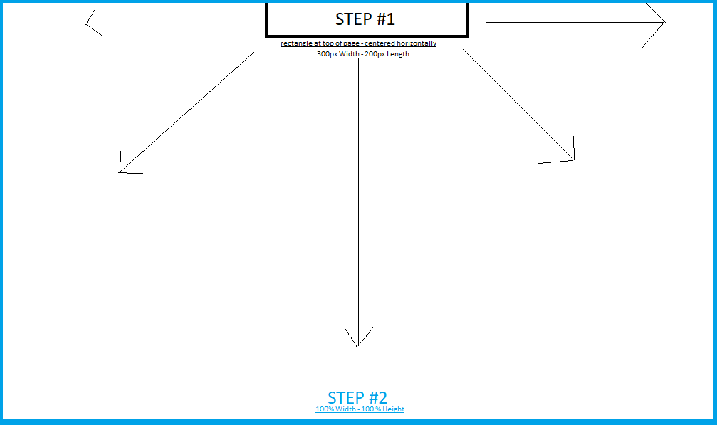
我正在尝试为屏幕顶部居中/固定的小矩形div设置动画,并将从中心缩放为全屏叠加。这是我想要创建的动画的线框。
我现在有一个解决方案,但绝对不是最干净或优雅的:
<div class="step1"></div>.step1 {
border:none;
background:none;
text-align: Center;
font-size: 1.6em;
height: 200px;
width: 300px;
background-color: blue;
position: fixed;
left: 47%;
margin-left: -1.75em;
top: 0;
z-index: 1;
transition: all .2s;
}
.step2 {
height: 100%;
width: 100%;
left: 0%;
top: 0;
margin: 0;
border:none;
background:none;
color: white;
text-align: Center;
background-color: blue;
position: fixed;
z-index: 1;
border-radius: 0;
}
我也得到一个janky动画,我知道必须有一个更好的方法。谁能提供更清洁的解决方案?
5个回答
0
投票
投票
你可以在.toggleClass()上.click():
$('div').click(function() {
  $(this).toggleClass('step');
});
div {
width: 300px;
height: 200px;
position: fixed;
top: 0;
left: 50%;
transform: translateX(-50%); /* makes it horizontally centered */
background: blue;
transition: all .3s linear; /* added linear transition effect, it's "ease" by default */
}
.step {
width: 100vw; /* 100% of the viewport width */
height: 100vh; /* 100% of the viewport height */
}<script src="https://ajax.googleapis.com/ajax/libs/jquery/2.1.1/jquery.min.js"></script>
<div></div>0
投票
投票
我建议使用像这样的css动画
.step1 {
  border:none;
  background:none;
  text-align: Center;
  font-size: 1.6em;
  height: 200px;
  width: 300px;
  background-color: blue;
  position: fixed;
  left: 47%;
  margin-left: -1.75em;
  top: 0;
  z-index: 1;
  transition: all .2s;
  animation-name:demo;
  animation-duration:2s;
  animation-fill-mode:forwards;
}

@keyframes demo{
  0%{height:200px;width:300px;left:47%;margin-left:-1,75em}
  100%{height:100%;width:100%;left:0;margin-left:0}
}
<div class="step1"></div>0
投票
投票
这是我的方法。您可以通过将鼠标悬停在div上来触发动画。我决定使用转换,因为它对于像这样的简单应用程序更实用。
<!DOCTYPE HTML>
<head>
<meta charset="UTF-8">
<style type="text/css">
 div {
background-color: #ff0000;
width: 100px;
height: 100px;
background: red;
position: absolute;
top: 0px;
left: 50%;
transition: width 10s, height 10s,  left 10s;

}
div:hover {
width: 100%;
height: 100%;
left: 0;
}
</style>
</head>
<body>
<div></div>
</body>
</html>
0
投票
投票
检查以下演示:
$(document).ready(() => {
  setTimeout(() => {
    $('#myDiv').toggleClass('step1 step2');
  },1000);
});
#myDiv {
position: fixed;
top: 0;
background-color: blue;
transition: all .2s;
}
.step1 {
left: 35%;
right: 35%;
height: 100px;
}
.step2 {
left: 0;
right: 0;
height: auto;
bottom: 0;
}<script src="https://ajax.googleapis.com/ajax/libs/jquery/2.1.1/jquery.min.js"></script>
<div id="myDiv" class="step1"></div>0
投票
投票
这是一个简单的解决方案:
body {
  margin: 0;
  height: 100vh;
}

div {
  width: 300px;
  margin: auto;
  height: 200px;
  background: blue;
  animation: animate 3s linear 1s forwards;
}

@keyframes animate {
  to {
    width: 100%;
    height: 100%;
  }
}<div></div>最新问题
- 尽管使用了 useMemo 和 useCallback,为什么我的 React 组件还是意外地重新渲染?
- 如果值在范围内,则为条件调度一个函数
- pybind11 -“导入错误:导入示例时 DLL 加载失败”
- Selenium 自定义定位器未返回 WebElement 错误
- 按 A 列求和总数量
- 检查单词是否回文的简单函数
- 无表单数据的大文件上传的 LWP PUT
- 为什么 Flex 容器的子级会重叠
- 为长时间运行的任务创建一个单独的线程
- 拆分字符串并使用结果数组填充到两个单独的列中
- PostgreSQL 中的 COPY 函数
- 访问动态网站并点击箭头展开然后选择元素使用Python加载页面内容
- bash 提示和函数内的回显颜色
- 将最后一个 bash 命令复制到剪贴板
- Azure blob 批量删除命令抛出错误
- 在 HTTP header 中传递用户名/密码作为参数还是 HTTP Body 中哪个更好?
- 完整日历自定义按钮 - 省略号图标
- 无法动态设置输入(月份)值Vue 3 [已关闭]
- 如何在不使用任何字符串方法的情况下获得以下代码中大写的 am pm ?
- 如何在 PL/pgSQL 中返回一组不进行强制转换的复合类型?
© www.soinside.com 2019 - 2024. All rights reserved.