带箭头的纯 CSS 工具提示
问题描述 投票:0回答:3
我有这个:
span {
padding: 10px;
display: inline;
}
[title]:hover::before {
background: #333;
top: 20%;
background: rgba(0,0,0,.8);
border-radius: 5px;
color: #fff;
content: attr(title);
padding: 5px 15px;
position: absolute;
z-index: 98;
width: auto;
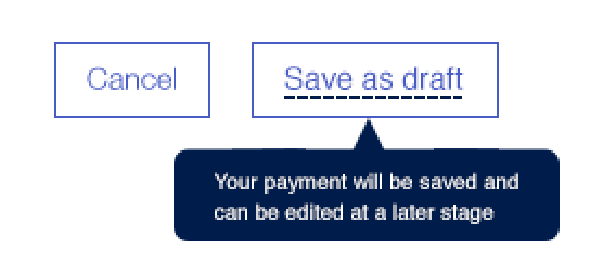
}<span class="dijitButtonContents" id="saveButton" title="Save as draft"><span id="saveButton_label">Save</span></span>我需要像这样添加一个指向箭头:
任何人都可以通过仅使用伪元素来帮助我实现这一点吗?
谢谢。
3个回答
6
投票
投票
像这样?
span {
  padding: 10px;
  display: inline;
}

[title] {
  position: relative;
}

[title]:hover:before {
  background: #333;
  top: 100%;
  background: rgba(0, 0, 0, .8);
  border-radius: 5px;
  color: #fff;
  content: attr(title);
  padding: 5px 15px;
  position: absolute;
  z-index: 98;
  width: auto;
  margin-top: 10px;
}

[title]:hover:after {
  width: 0;
  height: 0;
  border-left: 5px solid transparent;
  border-right: 5px solid transparent;
  border-bottom: 10px solid #333;
  content: ' ';
  position: absolute;
  top: 100%;
  left: 50%;
}
<span class="dijitButtonContents" id="saveButton" title="Save as draft"><span id="saveButton_label">Save</span></span>2
投票
投票
我使用 CSS 三角形生成器来创建箭头。
编辑: 为居中对齐添加了 CSS。还在 CSS 中提供了解释每个值的注释。
添加
:hover.center-align {
text-align: center;
}
[title] {
position: relative;
}
[title]:before,
[title]:after {
z-index: 98;
}
[title]:before {
bottom: -10px;
/* calculate 50% width of the parent element minus width of the current element */
left: calc(50% - 10px);
width: 0;
height: 0;
border-style: solid;
border-width: 0 10px 10px 10px;
border-color: transparent transparent #333 transparent;
content: "";
position: absolute;
display: block;
}
[title]:after {
background: #333;
/* calculate single line height plus height of the arrow element */
top: calc(1em + 10px);
border-radius: 5px;
color: #fff;
content: attr(title);
padding: 5px 10px;
position: absolute;
/* calculate 50% width of the parent minus half of the width of current element minus half of the padding */
left: calc(50% - 45px - 5px);
/* requires fixed width for calculation above */
width: 90px;
text-align: center;
}<span class="dijitButtonContents" id="saveButton" title="Save as draft">
<span id="saveButton_label">Save and write a long description</span>
</span>
<br/><br/><br/><br/>
<span class="dijitButtonContents" id="saveButton" title="Save as draft">
<span id="saveButton_label">Save</span>
</span>
<div class="center-align">
<span class="dijitButtonContents" id="saveButton" title="Save as draft">
<span id="saveButton_label">Save and write a long description</span>
</span>
<br/><br/><br/><br/>
<span class="dijitButtonContents" id="saveButton" title="Save as draft">
<span id="saveButton_label">Save</span>
</span>
</div>0
投票
投票
工具提示在悬停或焦点上使用顺风对等选择器(无 JS)
<script src="https://cdn.tailwindcss.com"></script>

<div class="relative ml-2 mt-1 h-24 w-48">
  <div class="peer h-10 w-10 cursor-pointer rounded-full border bg-gray-600 text-center text-2xl text-white focus:bg-black hover:bg-black" tabindex="0">? </div>
  <div class="invisible absolute left-0 top-12 h-16 w-40 rounded-lg bg-black p-2 text-md text-white shadow-2xl peer-focus:visible peer-hover:visible hover:visible">Hi!, how can i help you?</div>
  <svg viewBox="0 0 100 100" class="stroke-3 invisible absolute left-6 top-8 h-4 w-4 stroke-black peer-focus:visible peer-hover:visible hover:visible">
    <polygon points="50,0 100,100 0,100" />
  </svg>
</div>
最新问题
- 当用户在深色和浅色主题之间切换时如何刷新我的小部件(Jetpack Glance)?
- 合并指标并检索指标值作为属性?
- 将第二个图放置在 ggplot2 中另一个图的 x 轴上
- 2024 年 5 月 10 日的 Teams 后端更改破坏了与 Teams 应用程序/机器人的屏幕截图共享 - URL 格式已更改且无法访问机器人
- Xcode 无法运行 macOS 应用程序:NSPOSIXErrorDomain 153
- 如何在 .net 8 c# 中创建允许可为空的获取属性的通用接口
- 在 Cosmos 数据库上使用 LINQ Skip Take 是否支持服务器端分页?
- jQuery UI 图标系统是否有一个“空”图标 - 一个没有图像的图标?
- 在 Python 3 中查找给定套接字和 inode 的进程 ID
- SQL Server 小于或等于 (<=) date not including last date
- 在下一个js中使用leaflet.js隐藏国家周围地图的其余部分
- python 覆盖上一行
- 如何组合输入和函数?
- 如何使用 Apache Sedona 将 parquet 格式数据框中的纬度和经度列转换为点类型(几何)?
- VueJS3 过滤数组 props
- 使用Linux C select系统调用来监控文件
- R 中的 n 维积分,极限为函数
- 如何从 Salesforce API 检索 ActionCadence 数据
- 如何在页面对象模型(Selenium+python)中抽象Web元素和动作?
- Angular Firebase:登录页面刷新时闪烁(AuthGuard + redirectUnauthorizedTo)
© www.soinside.com 2019 - 2024. All rights reserved.