CSS 模态对话框按钮标签偏离中心
问题描述 投票:0回答:0
我正在制作一个 Apple macOS 主题的 css 库,目前正在使用 css flexbox 开发弹出模式。
按钮应该将其中的文本居中。这是我试过的:
/* Styling for the popover modal */
#popover {
  display: flex;
  flex-direction: column;
  position: absolute;
  top: 50%;
  left: 50%;
  transform: translate(-50%, -50%);
  z-index: 100000000;
  border-radius: 10px;
  opacity: 1;
  padding: 16px;
  width: 260px;
  height: auto;
  align-items: center;
  text-align: center;
  backdrop-filter: blur(30px) saturate(1);
}

#popover img.pop-img {
  width: 64px;
  height: 64px;
  margin-top: 4px;
  margin-bottom: 0;
}

#popover .btn-container {
  display: block;
  margin-top: 16px;
  padding: initial;
}

#popover .btn-container .btn-lg {
  display: inline-flex;
    border-radius: 6px;
    opacity: 1;
    line-height: 16px;
    font-size: 13px;
    font-weight: 500;
    font-style: normal;
    letter-spacing: -0.2px;
    text-align: center;
    padding-block: 5px !important;
    padding-inline: 15px;
    height: 26px !important;
}

#popover.hide {
  display: none;
}

.btn:enabled.btn-primary {
    background: linear-gradient(180deg, rgba(255, 255, 255, 0.18), rgba(255, 255, 255, 0)), rgb(0, 122, 255);
    box-shadow: 0 1px 1px 0 rgba(0, 122, 255, 0.2);
    color: white;
}

.btn:enabled.btn-active {
    box-shadow: 0px 0px 1px rgba(0, 0, 0, 0.3), 0px 1px 2px rgba(0, 0, 0, 0.15);
    opacity: 1;
    background-color: white;
    color: var(--light-text-primary);
}

.btn {
    border-radius: 5px;
    margin: 5px;
    display: inline-flex;
    font-family: var(--dark-font-family);
    transition: 0.3s;
    opacity: 1;
    font-size: 13px;
    font-weight: 400;
    font-style: normal;
    letter-spacing: 0px;
    text-align: center;
    line-height: 16px;
    padding-inline: 15px;
    padding-block: 2px;
    border: none;
    height: 20px;
}

.btn:enabled {
    cursor: pointer;
}
  <div id="popover" class="hide">
    <img src="icon-none.png" alt="No Icon" class="pop-img">
    <h2>Modal Title</h2>
    <p>Modal Content</p>
    <div class="btn-group">
      <button class="btn btn-lg btn-primary">Label</button>
      <button id="close-btn" class="btn btn-lg btn-active">Label</button>
    </div>
  </div>
// Get the button and popover modal elements
const button = document.getElementById('popover-btn');
const popover = document.getElementById('popover');
const closeBtn = document.getElementById('close-btn');

// When the button is clicked, show the popover modal
button.addEventListener('click', () => {
  popover.classList.remove('hide');
});

// When the close button is clicked, hide the popover modal
closeBtn.addEventListener('click', () => {
  popover.classList.add('hide');
});

// When the user clicks outside of the popover modal, hide it
window.addEventListener('click', (event) => {
  if (event.target !== button && event.target !== popover && !popover.contains(event.target)) {
    popover.classList.add('hide');
  }
});
我有
.btn-lg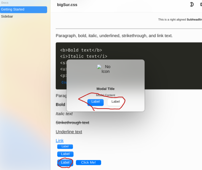
最新问题
- PHP:变量名前面的 & 是什么意思?
- TypeAheadField 下拉项目不会更新
- 从字符串中捕获前 4 个数字的正则表达式
- 计算字符串中每个单词的字母
- Google 是否认可“组织”架构?
- 如何将作业提交到Hadoop中的特定节点?
- 如何创建ical导出链接?
- 使用plotnine和Python构建绘图
- 如何在财富表 React 中选择一个单元格并获取值电子表格
- array_multisort 按辅助数组出现的顺序排序
- 如何从 SPA(单页 Javascript 浏览器应用程序)安全地请求带有刷新令牌的新访问令牌
- ng-content 块和外部表单之间的引用 ngForm
- 由右值引用绑定的自定义类的右值的生命周期
- 如何在基于国家所在大陆的 Pandas DataFrame 上添加列
- MySQLDriverCS 错误:错误的查询。您的 SQL 语法有错误;
- 为什么Redshift中的information_schema.table_privileges不支持truncate类型?
- Excel 宏编译错误 - 参数不可选
- 数据仓库-地理维度
- 如何使用键盘向上移动惰性列内容?撰写
- Javascript Textarea 阻止 KeyDown/KeyUp 事件本身的 Alt gr + 组合键
© www.soinside.com 2019 - 2024. All rights reserved.