CSS背景图片在真正的智能手机上的浏览器中没有响应
问题描述 投票:0回答:3
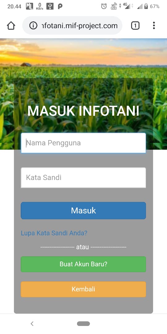
我有如下所示的CSS,在PC浏览器中进行响应时,我已经使用响应式设计模式对其进行了正常测试,但是当我在手机上进行测试时,背景没有响应:
.imgBG {
  background: url(../../../assets/img/bg-img/bg-login-blur.jpg) no-repeat center center fixed;
  font-family: Open Sans;
  padding-top: 40px;
  padding-bottom: 40px;
  position: fixed;
  width:100%;
  height:100%;
  background-size:cover;
  background-position:center;
  background-repeat:no-repeat;
  -webkit-background-size: cover;
  -moz-background-size: cover;
  -o-background-size: cover;
  padding:20px;
 }
我想念的是什么,您能告诉我吗?
3个回答
0
投票
投票
将此行添加到代码中:background-attachment: fixed;
0
投票
投票
使用此代码。
 .imgBG {
    background-image: url(../../../assets/img/bg-img/bg-login-blur.jpg);
    background-repeat: no-repeat;
    background-position: center;
    background-size: cover;
    width: 100%;
    height: 100%;
}
0
投票
投票
将其添加到您的HTML标头中:
<meta name="viewport" content="width=device-width, initial-scale=1.0">
最新问题
- 如何使用 jsdoc 记录一组从另一个函数的返回值解构而来的函数?
- 我正在尝试完成部署糖果机的上传步骤,我得到以下输出
- 如何使用 Next.js 13 Route Handler 将图像上传到 Cloudinary?
- 类型“List<dynamic>”不是类型“List<Widget>”的子类型
- 是否有一种方法可以在线获取提交日志信息而无需克隆整个存储库?
- 我尝试在 Amazon Linux 实例上安装 Jenkins 并收到如下错误
- Flask Web 应用程序 [Azure] 遍历目录非常慢
- 在Python中查询数据
- 浏览器如何使用 CSS 图像?
- Django 静态文件仅在调试器启动时显示(DEBUG=True)
- 无法将我的 CurdRepository 接口导入到我的控制器
- azure 函数应用程序连接到 postgresql
- 如何在react中不使用钩子更新页面滚动上的URL?
- 在不失去焦点的情况下为锚标记添加动画删除线
- 如何更改 blazor 验证器上 int 的默认错误消息
- 示例请求正文中 JsonPatchDocument 的 Swagger 意外 API PATCH 操作文档
- Select2 插件不适用于页面加载后创建的 html
- 我不知道如何查询,我只能找到纸箱10的体积
- 无法在Python 3.8 32位虚拟环境中安装asammdf
- 如何查看Azure上资源使用的可用区?
© www.soinside.com 2019 - 2024. All rights reserved.