将a和标记放在同一行中
问题描述 投票:1回答:5
我正在尝试创建一个<form>作为项目的一部分,该项目具有带有标签的文本输入。我试图把<label>和<input>放在同一条线上,与这个示例项目一样对齐右侧:
这是我试图使用的代码:
.labelrow {
  text-align: right;
  vertical-align: top;
}

.inputrow {
  display: inline-block;
  text-align: left;
  vertical-align: top;
}
<form id="survey-form">
<div class="labelrow">
<label id="name" for="name">* Name:</label></div>
<div class="inputrow">
<input type="text" id="name" class="input-field" required placeholder="Enter your name"></div>
<div class="labelrow">
<label id="email" for="email">* Email:</label>
</div>
<div class="inputrow">
<input type="email" id="name" class="input-field" required placeholder="Enter your email">
</div>
</form>这段代码给出了我的结果:

<label>正确对齐,但<input>在另一条线上。我能解决什么才能让两者在同一条线上并与示例中的右侧对齐?
5个回答
2
投票
投票
解
- 房子既标签又输入单个
div - 将
display: flex添加到父级,这样您就可以在小屏幕上更灵活地设置字段样式。例如,当使用flex-direction: column限制视口空间时,您可以在小屏幕上将输入上方的标签移动 labels通常没有ids。相反,他们指向包含forms的id元素。我在以下代码中修复了你的labels- 重复的
ids也是禁忌(也是固定的)
.row {
  display: flex;
  align-items: center;
  justify-content: flex-end;
}

.input-field {
  margin-left: 1em;
  padding: .5em;
  margin-bottom: .5em;
}
<form id="survey-form">
<div class="row">
<label for="name">* Name:</label>
<input type="text" id="name" class="input-field" required placeholder="Enter your name">
</div>
<div class="row">
<label for="email">* Email:</label>
<input type="email" id="email" class="input-field" required placeholder="Enter your email">
</div>
</form>1
投票
投票
通过将两个元素包含在同一个“div”中,您可以将它们连续排列在一起。
<form id="survey-form">
    <div class="inputrow">
        <label id="name" for="name">* Name:</label>
        <input type="text" id="name" class="input-field" required placeholder="Enter your name">
    </div>
    <div class="inputrow">
        <label id="email" for="email">* Email:</label>
        <input type="email" id="name" class="input-field" required placeholder="Enter your email">
    </div>
</form>
默认情况下,“div”标签在插入之前和之后始终放置换行符。
1
投票
投票
删除<div>s并在每个<br>后添加<input>。将以下内容添加到<label>和<input>:
display: inline-block;
height: 1.2rem;
line-height: 1.2rem;
vertical-align: middle;
height和line-height可以调整,但保持彼此相等。将<form>宽度设置为100vw,当然还有text-align: right上的<label>s。将<label>s和<input>s放入<fieldset>并将以下内容分配给<fieldset>
width: 50vw;
margin-left: 40vw;
border: 0px none transparent
顺便说一句<label>s有一个重复的#id无效,因此删除。
演示
html,
body {
width: 100%;
height: 100%;
font: 400 16px/1.2 Raleway;
background: #FBFBFB;
}
form {
width: 70vw;
}
fieldset {
width: 50vw;
text-align: right;
margin-left: 20vw;
border: 0px none transparent;
background: none;
}
legend {
width: 70vw;
text-align:center;
margin: 0 auto;
}
label,
input,
button {
display: inline-block;
height: 1.2rem;
line-height: 1.2rem;
vertical-align: middle;
padding-left: 5px;
margin-top: 15px;
font: inherit;
}
input {
width: 60%;
max-width: 300px;
border-radius: 4px;
}
label {
width: 30%;
text-align: right;
}
button {
height: 1.5rem;
padding: 0 5px;
margin: 0 0 0 auto;
float: right;
cursor:pointer;
}
sup {
display:inline-block;
width: 25%;
margin-left: 70%;
margin-top: 10px;
text-align: right;
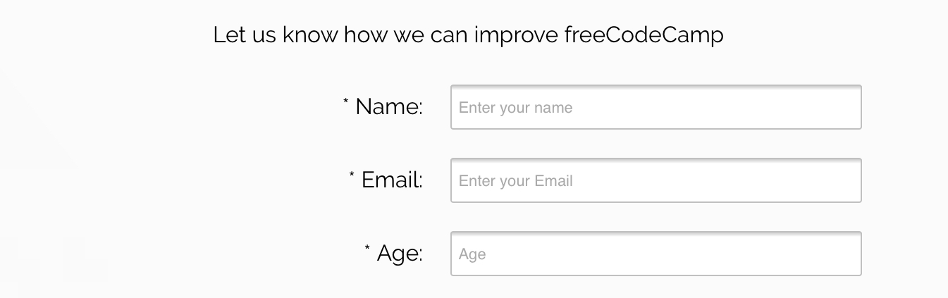
}<link href="https://fonts.googleapis.com/css?family=Raleway" rel="stylesheet">
<form id="survey-form">
<fieldset>
<legend>Let us know how we can improve freeCodeCamp</legend>
<label for="name">* Name:</label>
<input id="name" type="text" placeholder="Enter your name" required><br>
<label for="email">* Email:</label>
<input id="email" type="email" placeholder="Enter your email" required><br>
<label for="age">* Age:</label>
<input id="age" type="number" placeholder="Enter your age" min='18' max='120' required><br>
<sup>* Required</sup>
<button type='submit'>Submit</button>
</fieldset>
</form>0
投票
投票
当你将每个包裹在他们自己的div中时,你会得到你所看到的堆叠。将label和input放入一个div。
0
投票
投票
可能最简单的选择是将input放入label。使label成为文本右对齐的块项目。
label {
  display:block;
  text-align:right;
  margin: 5px;
}
<form id="survey-form">
<label id="name" for="name">* Name: <input type="text" id="name" class="input-field" required placeholder="Enter your name"></label>
<label id="email" for="email">* Email: <input type="email" id="name" class="input-field" required placeholder="Enter your email"></label>
</form>最新问题
- 如何替换 Electron Forge 创建的 Electron.js 包中的默认启动屏幕
- 点击图片打开图片
- 如何使自定义防抖钩子与 useCallback 一起使用?
- useRef 和 useEffect 初始访问以及稍后使用 useRef
- 在用户方便时创建路线
- 使用 zlib uncompress() 时出现未处理的异常
- Java:杀死由 ExecutorService 作为 Runnable 启动的线程
- 如何在 javascript 中从公共方法调用私有方法?
- useCallback 在按钮单击时获取数据
- 将具有特定属性的连续元素分组到对象数组中
- docker 登录“连接被拒绝”,但仅在引擎运行时
- 异步函数作为异步函数的参数
- 如何在 Flutter 中覆盖“showDialog”上的后退按钮?
- C++ 类图 Visual Studio 2022。我无法向映射添加类
- 为什么我们要在 useIsMounted 钩子中使用 Callback 来从钩子返回引用?
- 嵌套 JWT 令牌声明
- React - 如何用 useMemo 替换 useCallback 钩子?
- 为什么类加载时静态块不运行?
- React Native useCallback状态未更新
- React useCallback 与组件内部和外部声明的纯函数之间的区别
© www.soinside.com 2019 - 2024. All rights reserved.