具有透明度的CSS Stepped Progress Bar
问题描述 投票:1回答:1
任何人都可以帮我在仅使用CSS的步进式进度条中围绕圆圈放置透明边框吗?
有很多好的开始,比如这篇文章:Creating CSS3 Circles connected by lines
这个网站:https://www.cssscript.com/animated-step-progress-bar-pure-javascript/
或者这个网站:http://christabor.github.io/css-progress-wizard/
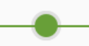
我的问题是我需要一条线穿过圆圈的透明边框。在此示例中,绿线越过圆圈的灰色边框的顶部。
根据上面的一个示例,您可以从这里开始使用笔。 https://codepen.io/anon/pen/oPydjx
body {
  font-family: 'Lato', sans-serif;
  font-size: 20px;
  padding: 20px;
}

@media handheld,
screen and (max-width: 400px) {
  .container {
    margin: 0;
    width: 100%;
  }
  .progress-indicator.stacked {
    display: block;
    width: 100%;
  }
  .progress-indicator.stacked>li {
    height: 80px;
  }
}

.flexer,
.progress-indicator {
  display: -webkit-box;
  display: -moz-box;
  display: -ms-flexbox;
  display: -webkit-flex;
  display: flex
}

.flexer-element,
.progress-indicator>li {
  -ms-flex: 1;
  -webkit-flex: 1;
  -moz-flex: 1;
  flex: 1
}

.progress-indicator>li {
  list-style: none;
  text-align: center;
  width: auto;
  padding: 0;
  margin: 0;
  position: relative;
  text-overflow: ellipsis;
  color: #bbb;
  display: block
}

.progress-indicator>li.completed,
.progress-indicator>li.completed .bubble {
  color: #65d074
}

.progress-indicator>li .bubble {
  border-radius: 1000px;
  width: 20px;
  height: 20px;
  background-color: #bbb;
  display: block;
  margin: 0 auto .5em;
  border-bottom: 1px solid #888
}

.progress-indicator>li .bubble:after,
.progress-indicator>li .bubble:before {
  display: block;
  position: absolute;
  top: 9px;
  width: 100%;
  height: 3px;
  content: '';
  background-color: #bbb
}

.progress-indicator>li.completed .bubble,
.progress-indicator>li.completed .bubble:after,
.progress-indicator>li.completed .bubble:before {
  background-color: #65d074;
  border-color: #247830
}

.progress-indicator>li .bubble:before {
  left: 0
}

.progress-indicator>li .bubble:after {
  right: 0
}

.progress-indicator>li:first-child .bubble:after,
.progress-indicator>li:first-child .bubble:before {
  width: 50%;
  margin-left: 50%
}

.progress-indicator>li:last-child .bubble:after,
.progress-indicator>li:last-child .bubble:before {
  width: 50%;
  margin-right: 50%
}

.progress-indicator>li.active,
.progress-indicator>li.active .bubble {
  color: #337AB7
}

.progress-indicator>li.active .bubble,
.progress-indicator>li.active .bubble:after,
.progress-indicator>li.active .bubble:before {
  background-color: #337AB7;
  border-color: #122a3f
}

@media handheld,
screen and (max-width: 400px) {
  .progress-indicator {
    font-size: 60%
  }
}
<html>
<body>
<ul class="progress-indicator">
<li class="completed">
<span class="bubble"></span> Step 1. <br><small>(complete)</small>
</li>
<li class="completed">
<span class="bubble"></span> Step 2. <br><small>(complete)</small>
</li>
<li class="active">
<span class="bubble"></span> Step 3. <br><small>(active)</small>
</li>
<li>
<span class="bubble"></span> Step 4.
</li>
<li>
<span class="bubble"></span> Step 5.
</li>
</ul>
</body>
</html>1个回答
2
投票
投票
因为线条绝对是位置元素,所以它们出现在气泡上方。您可以在气泡中添加box-shadow以获得效果:
.progress-indicator>li .bubble {
  box-shadow: 0 0 0 3px rgba(0, 0, 0, 0.1);

  border-radius: 50%;
  width: 20px;
  height: 20px;
  background-color: #bbb;
  display: block;
  margin: 0 auto .5em;
  border-bottom: 1px solid #888;
}
例:
body {
  font-family: 'Lato', sans-serif;
  font-size: 20px;
  padding: 20px;
}

@media handheld,
screen and (max-width: 400px) {
  .container {
    margin: 0;
    width: 100%;
  }
  .progress-indicator.stacked {
    display: block;
    width: 100%;
  }
  .progress-indicator.stacked>li {
    height: 80px;
  }
}

.flexer,
.progress-indicator {
  display: flex
}

.flexer-element,
.progress-indicator>li {
  flex: 1
}

.progress-indicator>li {
  list-style: none;
  text-align: center;
  width: auto;
  padding: 0;
  margin: 0;
  position: relative;
  text-overflow: ellipsis;
  color: #bbb;
  display: block
}

.progress-indicator>li.completed,
.progress-indicator>li.completed .bubble {
  color: #65d074
}

.progress-indicator>li .bubble {
  box-shadow: 0 0 0 3px rgba(0, 0, 0, 0.1);

  border-radius: 50%;
  width: 20px;
  height: 20px;
  background-color: #bbb;
  display: block;
  margin: 0 auto .5em;
  border-bottom: 1px solid #888;
}

.progress-indicator>li .bubble:after,
.progress-indicator>li .bubble:before {
  display: block;
  position: absolute;
  top: 9px;
  width: 100%;
  height: 3px;
  content: '';
  background-color: #bbb
}

.progress-indicator>li.completed .bubble,
.progress-indicator>li.completed .bubble:after,
.progress-indicator>li.completed .bubble:before {
  background-color: #65d074;
  border-color: #247830
}

.progress-indicator>li .bubble:before {
  left: 0
}

.progress-indicator>li .bubble:after {
  right: 0
}

.progress-indicator>li:first-child .bubble:after,
.progress-indicator>li:first-child .bubble:before {
  width: 50%;
  margin-left: 50%
}

.progress-indicator>li:last-child .bubble:after,
.progress-indicator>li:last-child .bubble:before {
  width: 50%;
  margin-right: 50%
}

.progress-indicator>li.active,
.progress-indicator>li.active .bubble {
  color: #337AB7
}

.progress-indicator>li.active .bubble,
.progress-indicator>li.active .bubble:after,
.progress-indicator>li.active .bubble:before {
  background-color: #337AB7;
  border-color: #122a3f
}

@media handheld,
screen and (max-width: 400px) {
  .progress-indicator {
    font-size: 60%
  }
}
<ul class="progress-indicator">
<li class="completed">
<span class="bubble"></span> Step 1. <br><small>(complete)</small>
</li>
<li class="completed">
<span class="bubble"></span> Step 2. <br><small>(complete)</small>
</li>
<li class="active">
<span class="bubble"></span> Step 3. <br><small>(active)</small>
</li>
<li>
<span class="bubble"></span> Step 4.
</li>
<li>
<span class="bubble"></span> Step 5.
</li>
</ul>
</body>
</html>最新问题
- Java读取包含int string int int double的.dat文件
- 当您使用 .html() 删除元素时,jQuery 中的事件侦听器是否会自动删除?
- 如何在 CANoe/CAPL 中包含 .h 或 .dll 文件
- C++ 中的模板友元函数
- 如何在 debian 中安装 ansible-core 2.16
- 无法将字符串与 UNIQUEIDENTIFIER 进行比较
- 如何通过显式指定参数类型找到 IEnumerable<T>.ToList() 方法,然后使用自定义参数类型调用它
- 为什么我不先将 Java 小程序转换为 Kotlin 就不能直接在 Android Studio 中运行?
- 如何禁用浏览器中文本区域字段的智能引号?
- 在运行时在 Web API 操作过滤器中获取未知类型
- 我的网站上有一个图像链接,当我将鼠标悬停在其上时,该链接会发生变化,如何将两个图像都转换为链接?
- 如何使用glfw设置glew:GLEW_ERROR_NO_GLX_DISPLAY有问题?
- 我如何引用listview .NET MAUI中的标签
- 在解析函数名称时,如何使 const char 数组函数优先于 const char* 函数?
- 当我在本地主机中打开时,使用 Vite 的 React 应用程序出现空白白屏
- 从所有列检索所有 UNIQUEIDENTIFIER 值的可靠方法
- 960px网格系统仍然是网页设计的标准吗?
- 基于LLM的CLI:GitWise [已关闭]
- 如何在 Docker Hub 中部署镜像服务器
- Varnish:后端返回 503,即使它是健康的
© www.soinside.com 2019 - 2024. All rights reserved.