MudBlazor UI 库颜色
问题描述 投票:0回答:3
我真的很想更改 MudBlazor UI 组件的颜色。但是,我似乎无法覆盖默认样式。有人可以帮我吗?
3个回答
26
投票
投票
在我们详细介绍如何使用 CSS 来设计 MudBlazor 组件的样式之前,让我向您介绍一下 主题文档。
如果主题对您来说还不够,您有多种选择如何使用 CSS 更改 MudBlazor 元素的样式。 请注意,您可能需要应用
!important一种方法是在主 CSS 文件中定义自己的 CSS 类,并将类名传递给组件,如下所示:
<MudButton Class="my-class">Button with custom class</MudButton>
第二种方法是通过
Style<MudButton Variant="Variant.Filled" EndIcon="@Icons.Material.ArrowDownward" Style="background-color: yellowgreen; color: white; width: 200px; height: 60px;">
Download Now
</MudButton>
另一种方法是在剃刀中嵌入
<style><style>
button {
background-color: yellowgreen !important;
color: white !important;
height: @(height)px;
}
</style>
<MudSlider @bind-Value="height" Min="30" Max="300"/>
<MudButton Variant="Variant.Filled">
Use Slider to change my height
</MudButton>
@code {
int height=100;
}
如果您想利用 Blazor 的 CSS 隔离,您必须 确保您的页面/组件顶级元素是 html 元素并且您使用
::deep::deep .mud-button-text { color: red !important; }
最后但并非最不重要的一点是,您可以利用 CSS 变量用自定义值覆盖颜色。以下是如何覆盖复选框颜色的示例(在此处尝试):
<style>
    .mud-checkbox svg path:last-child {
        fill: var(--custom-color) !important;
    }
</style>
<MudCheckBox T="bool" Style="--custom-color: #abcdef" Color="Color.Primary">Series 1</MudCheckBox>
<MudCheckBox T="bool" Style="--custom-color: cornflowerblue" Color="Color.Primary">Series 2</MudCheckBox>
19
投票
投票
如果您想更改默认的
MudblazorPalette更新:新版本的
MudBlazorPaletteLightPaletteDarkPalettePaletteLight具有自定义颜色的主布局:
MainLayout.razor@inherits LayoutComponentBase
<MudThemeProvider Theme="_currentTheme"/>
<MudDialogProvider/>
<MudSnackbarProvider/>
<MudLayout>
<MudAppBar Elevation="0">
<MudIconButton Icon="@Icons.Material.Filled.Menu" Color="Color.Inherit" Edge="Edge.Start" OnClick="@(e => DrawerToggle())"/>
<MudSpacer/>
</MudAppBar>
<MudDrawer @bind-Open="_drawerOpen" Elevation="1">
<MudDrawerHeader>
<MudText Typo="Typo.h6">MyApplication</MudText>
</MudDrawerHeader>
<NavMenu/>
</MudDrawer>
<MudMainContent>
<MudContainer MaxWidth="MaxWidth.ExtraLarge" Class="my-8">
@Body
</MudContainer>
</MudMainContent>
</MudLayout>
@code {
bool _drawerOpen = true;
private readonly MudTheme _currentTheme = new()
{
Palette = new PaletteLight
{
Primary = "#0A7BCF",
Secondary = "#4CAF50",
Info = "#64a7e2",
Success = "#2ECC40",
Warning = "#FFC107",
Error = "#FF0000",
AppbarBackground = "#212121",
TextPrimary = "#0A7BCF",
TextSecondary = "#4CAF50",
// more color properties
}
};
void DrawerToggle() => _drawerOpen = !_drawerOpen;
}
深色主题的主要布局:
MainLayout.razor@inherits LayoutComponentBase
<MudThemeProvider @ref="@_mudThemeProvider" @bind-IsDarkMode="@_isDarkMode" Theme="_currentTheme"/>
<MudDialogProvider/>
<MudSnackbarProvider/>
<MudLayout>
<MudAppBar Elevation="0">
<MudIconButton Icon="@Icons.Material.Filled.Menu" Color="Color.Inherit" Edge="Edge.Start" OnClick="@(e => DrawerToggle())"/>
<MudSpacer/>
<MudIconButton Icon="@Icons.Material.Filled.Brightness4"
Color="Color.Inherit"
Class="nav-button"
OnClick="@ThemeToggle"/>
</MudAppBar>
<MudDrawer @bind-Open="_drawerOpen" Elevation="1">
<MudDrawerHeader>
<MudText Typo="Typo.h6">MyApplication</MudText>
</MudDrawerHeader>
<NavMenu/>
</MudDrawer>
<MudMainContent>
<MudContainer MaxWidth="MaxWidth.ExtraLarge" Class="my-8">
@Body
</MudContainer>
</MudMainContent>
</MudLayout>
@code {
bool _drawerOpen = true;
private bool _isDarkMode;
private MudThemeProvider _mudThemeProvider;
private readonly MudTheme _currentTheme = new()
{
Palette = new PaletteLight
{
Primary = "#0A7BCF",
Secondary = "#4CAF50",
Info = "#64a7e2",
Success = "#2ECC40",
Warning = "#FFC107",
Error = "#FF0000",
AppbarBackground = "#212121",
TextPrimary = "#0A7BCF",
TextSecondary = "#4CAF50",
// more color properties
},
PaletteDark = new PaletteDark
{
Primary = "#6585e0",
Secondary = "#607D8B",
Info = "#a4c2dd",
Success = "#2ECC40",
Warning = "#dc2d7e",
Error = "#de2000",
AppbarBackground = "#121212",
TextPrimary = "#E0E0E0",
TextSecondary = "#BDBDBD",
// more color properties
}
};
protected override async Task OnAfterRenderAsync(bool firstRender)
{
if (firstRender)
{
_isDarkMode = await _mudThemeProvider.GetSystemPreference();
StateHasChanged();
}
}
void DrawerToggle() => _drawerOpen = !_drawerOpen;
void ThemeToggle() => _isDarkMode = !_isDarkMode;
}
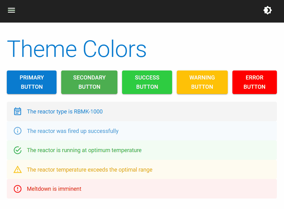
Index.razor@page "/"
<PageTitle>Index</PageTitle>
<MudText Typo="Typo.h2" Class="mb-5">Theme Colors</MudText>
<MudStack Row="true">
<MudButton Color="Color.Primary" Variant="Variant.Filled">Primary Button</MudButton>
<MudButton Color="Color.Secondary" Variant="Variant.Filled">Secondary Button</MudButton>
<MudButton Color="Color.Success" Variant="Variant.Filled">Success Button</MudButton>
<MudButton Color="Color.Warning" Variant="Variant.Filled">Warning Button</MudButton>
<MudButton Color="Color.Error" Variant="Variant.Filled">Error Button</MudButton>
</MudStack>
<br/>
<MudAlert Severity="Severity.Normal">The reactor type is RBMK-1000</MudAlert>
<MudAlert Severity="Severity.Info">The reactor was fired up successfully</MudAlert>
<MudAlert Severity="Severity.Success">The reactor is running at optimum temperature</MudAlert>
<MudAlert Severity="Severity.Warning">The reactor temperature exceeds the optimal range</MudAlert>
<MudAlert Severity="Severity.Error">Meltdown is imminent</MudAlert>
深色模式演示:
5
投票
投票
如果您想更改整个颜色主题,但同时希望保持何时以及如何应用哪些颜色组合的一致性(根据
.mud-* --mud-*)为您提供整个解决方案。
举个例子,当您使用
<MudButton Color="Color.Primary"> </MudButton>.mud-button-text.mud-button-text-primarycolor: var(--mud-palette-primary);--mud-palette-primaryColor.Primary在全局 CSS 文件中,可以按如下方式覆盖 CSS 变量:
:root {
    --mud-palette-primary: violet;
    --mud-palette-primary-text: yellow;
}
也可以使用十六进制值,就像任何其他 CSS 颜色属性值一样。
如果要更改整个调色板,这可能是一项彻底的工作,但不需要自定义类或
!important缺点是,MudBlazor 肯定会在新版本中改变 CSS 变量的使用(可能还有选择);因此,随着时间的推移,这个变量覆盖将需要维护。 (话又说回来,我能想到的任何其他可能的解决方案也是如此。)
快速尝试的示例片段这里。
(注意:在示例代码片段中,除了
VariantColor最新问题
- 如何访问沙盒 iframe 内嵌套 iframe 的 iframe.contentWindow.document?
- WRITE_SETTINGS 权限不明确
- PWA:防止在 PWA 中打开网址
- 为什么 torch.autograd.Function 向后传递 grad_output?
- 更改一个内部列表的元素会更改所有内部列表python [重复]
- 如何使用 WebPack 防止生产中 CSS 缩小?
- Telethon 的“get_input_entity()”是否也会像“get_entity()”一样超出 telegram API 限制(FloodWaitError)?
- 如何在DolphinDB中使用multithreadedTableWriter将数据插入reactiveStateEngine?
- 引用Python列表中的Dict项目? [重复]
- 在Python中的List中添加字典,但是数据重复[重复]
- 如何创建树形图并输入JSON来运行BFS(来自以下json)
- Python如何从嵌套循环返回嵌套字典? [重复]
- Express 应用程序抛出错误,指出“路径不是函数”。这个问题如何解决?
- `MySqlDataReader.GetGuid`返回错误的 UUID
- 字典值在两个不同的键中修改,而不是一个[重复]
- 如何从 Visual Studio 解决方案中删除未使用的库
- 如何访问iframe内嵌套iframe的iframe.contentWindow.document?
- 创建的钱包 v4 地址不匹配:TonConnectUI 与 Tonkeeper
- 如何在kali linux终端中打开kali@kali [已关闭]
- 是否有 API 可以了解自定义受众是否已填充?
© www.soinside.com 2019 - 2024. All rights reserved.