如何使用边框底线移动下划线,使之看起来像使用阴影框下划线的底线?
问题描述 投票:0回答:1
简单问题:
我可以使使用border-bottom的下划线(右侧的线)看起来与使用box-shadow的下划线的右侧(线的左侧)吗?
我只需要CSS。正如您从摘要中看到的那样,它可能跨越多行。
基本上,我需要将边框的底部向上移动一点,不要弄乱其他所有东西。
@import url('https://fonts.googleapis.com/css?family=Proxima+Nova');

div.flex {
  display: flex;
  width: 420px;
  justify-content: space-between;
}

div.flex2 {
  display: flex;
  width: 300px;
  justify-content: space-between;
}

h2 {
  font-family: 'Proxima Nova';
  color: rgb(60,128,124);
  font-size: 21px;
  font-weight: bold;
  margin-top: 20px;
  margin-bottom: 10px;
}

a.boxShadow {
  color: darkGrey;
  text-decoration: none;
  line-height: 26px;

  box-shadow: inset 0 -2px white, inset 0 -4px 0 rgb(60,128,124);
  padding-bottom: 3px;
}

a.borderBottom {
  color: darkGrey;
  text-decoration: none;
  line-height: 26px;

  border-bottom: 2px solid rgb(60,128,124);
}
<div class="flex">
<h2>
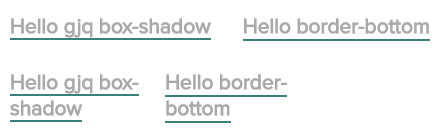
<a class="boxShadow">Hello gjq box-shadow</a>
</h2>
<h2>
<a class="borderBottom">Hello border-bottom</a>
</h2>
</div>
<div class="flex2">
<h2>
<a class="boxShadow">Hello gjq box-shadow</a>
</h2>
<h2>
<a class="borderBottom">Hello border-bottom</a>
</h2>
</div>此问题的原因(浏览器一致性):
box-shadow示例完全符合我的要求,但是在Edge上看起来并不好(而且恐怕其他浏览器也可能无法正确呈现它)。不过,它在Chrome和Firefox上看起来很完美。我尚未测试过的Safari。
另一方面,border-bottom似乎在浏览器中始终呈现。但是我无法在需要的位置显示下划线。
1个回答
1
投票
投票
渐变可以做到这一点
@import url('https://fonts.googleapis.com/css?family=Proxima+Nova');

div.flex {
  display: flex;
  width: 420px;
  justify-content: space-between;
}

div.flex2 {
  display: flex;
  width: 300px;
  justify-content: space-between;
}

h2 {
  font-family: 'Proxima Nova';
  color: rgb(60,128,124);
  font-size: 21px;
  font-weight: bold;
  margin-top: 20px;
  margin-bottom: 10px;
}

a.boxShadow {
  color: darkGrey;
  text-decoration: none;
  line-height: 26px;

  box-shadow: inset 0 -2px white, inset 0 -4px 0 rgb(60,128,124);
  padding-bottom: 3px;
}

a.borderBottom {
  color: darkGrey;
  text-decoration: none;
  line-height: 26px;

  background:
   linear-gradient(rgb(60,128,124),rgb(60,128,124))
    bottom 1px center/ /* Position */
    100% 2px  /*width height*/
   no-repeat;
}
<div class="flex">
<h2>
<a class="boxShadow">Hello gjq box-shadow</a>
</h2>
<h2>
<a class="borderBottom">Hello border-bottom</a>
</h2>
</div>
<div class="flex2">
<h2>
<a class="boxShadow">Hello gjq box-shadow</a>
</h2>
<h2>
<a class="borderBottom">Hello border-bottom</a>
</h2>
</div>最新问题
- 我需要创建一个卡片结构,但我不知道该怎么做
- ng 构建会导致伪选择器发出警告
- 关于在 django 中使用已安装库的补丁文件的建议
- 这个表达式在 C 中的计算结果是真还是假(1 或 0)?
- 如何将 DTO 映射到打字稿中的实体?
- 使用 Java Servlet 从单个参数获取多个部分
- GitLab-KAS 服务由于 GitLab 社区版中的 GitLabCF.Address 无效而失败
- 重新启动应用程序池与站点之间的 IIS 差异
- React Native init 错误找不到模块->node_modules act-native\package.json'
- 在app_initializer内动态加载ngModule forRoot对象
- Express.js 如何在响应中省略虚假字段
- 如何从地图函数获取2个属性
- 如何立即终止我的程序
- AWS 放大了 Angular 17 中的样式错误
- 自托管集成运行时无法使用 Azure.ResourceManager.DataFactory sdk 包找到身份验证密钥
- Git_GitHub 仅分叉存储库的主分支
- VS代码粘贴问题,顺序打乱了
- 强制编译时 constexpr [重复]
- 有没有办法使用 KQL 删除 azure 工作簿中的 null 或空列?
- ggplot - 在 aes 中使用 ifelse 和 geom_line 给出不合逻辑的结果
© www.soinside.com 2019 - 2024. All rights reserved.