使用DIVS +图像定位的响应式布局
问题描述 投票:0回答:1
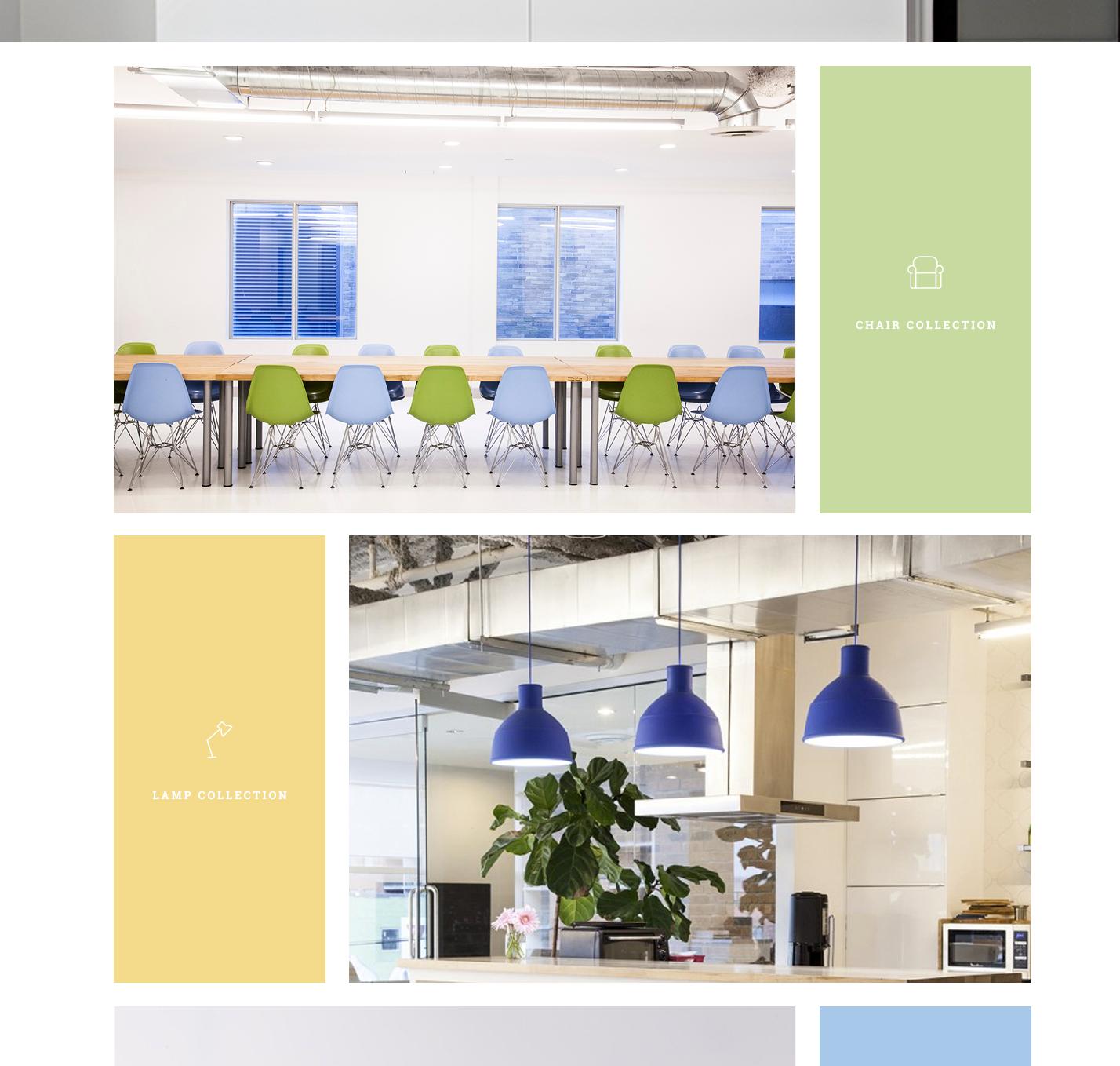
这是我想要实现的布局:
这是我目前的HTML + CSS(我只是在学习,如果它是重复的并且关闭:)
<div class="collection clearfix">
    <div class="image-left1"> </div>
    <div class="icon-left1">
        <img src="images/mainLP-chair-icon.png" alt="Chair Collection">
        <p>Chair Collection</p>
    </div>
</div>

<div class="collection clearfix">
    <div class="icon-right1">
        <img src="images/mainLP-lamp-icon.png" height="48" width="34" alt="Lamp Collection">
        <p>Lamp Collection</p>
    </div>
    <div class="image-right1"> </div>
</div>
...它交替显示总共5个div。
和CSS是:
/* =================== Main Section =================== */

.collection {
    padding-top: 25px;
}

/*=================== CHAIRS ===================*/

.image-left1 {
    background: url(../images/mainLP-chairs.jpg) center;
    height: 570px;
    width: 70%;
    display: inline-block;
}

.icon-left1 {
    float: right;
    width: 30%;
    background-color: #c7db9c;
    padding: 10px;
    border-left: 25px solid white;
    height: 570px;
}


.icon-left1 p {
    text-transform: uppercase;
    font-family: 'Roboto Slab', serif;
    color: #fff;
    font-weight: 400;
    font-size: 14px;
    position: relative;
    top: 220px;
    left: 36px;

}

.icon-left1 img {
    border: 0;
    position: relative;
    top: 222px;
    left: 76px;
}

/*=================== LAMPS ===================*/

.image-right1 {
    background: url(../images/mainLP-lamps.jpg) center;
    height: 570px;
    width: 70%;
    display: inline-block;
}


.icon-right1 {
    float: left;
    width: 30%;
    background-color: #f4dc86;
    padding: 10px;
    border-right: 25px solid white;
    height: 570px;
}


.icon-right1 p {
    text-transform: uppercase;
    font-family: 'Roboto Slab', serif;
    color: #fff;
    font-weight: 400;
    font-size: 14px;
    position: relative;
    top: 220px;
    left: 36px;
}

.icon-right1 img {
    border: 0;
    position: relative;
    top: 222px;
    left: 93px;
}


.wrapper {
    width: 70%;
    margin: 0 auto;
}  (This is around everything)
我不关心响应,但我应该在路上。我看到的一些问题。
每个容器的背景图像都没有正确调整大小 - 它被切断了。我该如何解决这个问题?
必须有一个更好的方法来浮动图像旁边的div中的图标和文本../现在它是不稳定和定位相对的,我认为是不正确的。或者如果它是正确的我认为我编码错了。
1个回答
0
投票
投票
看完之后,解决方案很简单,只需添加:
* {
  box-sizing: border-box;
}
使代码使所有元素包括填充和宽度的边框。
* {
  box-sizing: border-box;
}
    /* =================== Main Section =================== */

    .collection {
        padding-top: 25px;
    }

    /*=================== CHAIRS ===================*/

    .image-left1 {
        background: url(http://hbu.h-cdn.co/assets/15/36/980x654/gallery-1441147503-green-hills-residence-5.jpg) center;
        height: 570px;
        width: 70%;
        display: inline-block;
    }

    .icon-left1 {
        float: right;
        width: 30%;
        background-color: #c7db9c;
        padding: 10px;
        border-left: 25px solid white;
        height: 570px;
    }


    .icon-left1 p {
        text-transform: uppercase;
        font-family: 'Roboto Slab', serif;
        color: #fff;
        font-weight: 400;
        font-size: 14px;
        position: relative;
        top: 220px;
        left: 36px;

    }

    .icon-left1 img {
        border: 0;
        position: relative;
        top: 222px;
        left: 76px;
    }

    /*=================== LAMPS ===================*/

    .image-right1 {
        background: url(http://static.boredpanda.com/blog/wp-content/uploads/2014/07/creative-lamps-chandeliers-16-2.jpg) center;
        height: 570px;
        width: 70%;
        display: inline-block;
    }


    .icon-right1 {
        float: left;
        width: 30%;
        background-color: #f4dc86;
        padding: 10px;
        border-right: 25px solid white;
        height: 570px;
    }


    .icon-right1 p {
        text-transform: uppercase;
        font-family: 'Roboto Slab', serif;
        color: #fff;
        font-weight: 400;
        font-size: 14px;
        position: relative;
        top: 220px;
        left: 36px;

    }

    .icon-right1 img {
        border: 0;
        position: relative;
        top: 222px;
        left: 93px;
    }


    .wrapper {
        width: 70%;
        margin: 0 auto;
    }
<div class="collection clearfix">
<div class="image-left1"> </div>
<div class="icon-left1">
<img src="https://jsfiddle.net/img/logo.png" alt="Chair Collection">
<p>Chair Collection</p>
</div>
</div>
<div class="collection clearfix">
<div class="icon-right1">
<img src="https://jsfiddle.net/img/logo.png" height="48" width="34" alt="Lamp Collection">
<p>Lamp Collection</p>
</div>
<div class="image-right1"> </div>
</div>关于被切断的背景,请尝试使用background-size:contain ...因为background-size: cover不适合你。你通常使用background: ... no-repeat和background-size:contain。
最新问题
- 什么是 modelform_factory 和 modelformset_factory? (姜戈)
- MissingMethodException:未找到方法:升级后“!!0 TorchSharp.ModuleExtensionMethods.to(!!0, Device)”
- 根据 Laravel 9 中带有 @php 命令的标签动态显示内容:本地与 Hostinger 托管问题<h2>
- 如何在 CSS/ HTML5 中剪切图像
- Azure Blob 存储错误:.NET Aspire 中缺少订阅配置
- Windows Power Shell 无法识别任何内容
- VUE 元素缺少结束标记
- 带有不透明度的顺风当前颜色
- 如何以有效的方式检查列表中的字符串是否存在于另一个列表中?
- 合理化自我结束不工作 tailwindcsss
- 选择下拉值后使用 JavaScript 和 PHP 服务器设置文本框值
- 如何修复`指定的类型不符合Cpp17MoveInsertable的要求`?
- makeCluster 在 Windows 上挂起 - 并行包
- 如何使用 Dart 增强枚举来应用状态模式
- 用Python控制循环打包
- VHDL 编码..从整数到位向量的转换
- 如何将 androidx.compose.ui.graphics.Color 转换为 android.graphics.Color (int)
- c# - 如何匹配不在引号内的特定字符
- 如何将 RGB 颜色转换为十六进制颜色 - kotlin
- 如何在 Android 14 的 Google Pixel 上打开蓝牙设置?
© www.soinside.com 2019 - 2024. All rights reserved.