在线性渐变上使用背景位置的百分比值
问题描述 投票:10回答:1
有没有办法让background-position取百分比值?目前我的按钮仅适用于width和background-position的显式值。
body {
  min-height: 100vh;
  display: flex;
  flex-direction: column;
  justify-content: space-around;
  align-items: center;
}

.button {
  display: flex;
  justify-content: center;
  align-items: center;
  text-decoration: none;
  color: white;
  font-weight: bold;
  width: 350px;
  height: 50px;
  border: 1px solid green;
  transition: background 0.5s;
  background-repeat: no-repeat;
  background-image: linear-gradient(to left, #2484c6, #1995c8 51%, #00bbce), linear-gradient(to right, #2484c6 0%, #1995c8 51%, #00bbce 76%);
}
.button-pixel {
  background-position: -350px 0px, 0px 0px;
}
.button-pixel:hover {
  background-position: 0px 0px, 350px 0px;
}
.button-percentage {
  background-position: -100% 0px, 0px 0px;
}
.button-percentage:hover {
  background-position: 0% 0px, 100% 0px;
}
<a href="#" class="button button-pixel">In Pixel</a>
<a href="#" class="button button-percentage">In Percentage</a>1个回答
投票
TL;DR
使用渐变作为背景时,background-position使用的所有百分比值都是等效的,因此您不会看到任何差异。您需要指定与容器大小不同的background-size:
body {
  display: flex;
  flex-direction: column;
  justify-content: space-around;
  align-items: center;
  min-height:90vh;
}

.button {
  text-decoration: none;
  color: white;
  font-weight: bold;
  width: 350px;
  height: 50px;
  text-align:center;
  transition: background 0.5s;
  background-repeat: no-repeat;
  background-image:
    linear-gradient(to left, #2484c6, #1995c8 51%, #00bbce),
    linear-gradient(to right, #2484c6 0%, #1995c8 51%, #00bbce 76%);
  background-size:200% 100%; /*Changed this*/
}
.button-pixel {
  background-position: -350px 0px, 0px 0px;
}
.button-pixel:hover {
  background-position: 0px 0px, 350px 0px;
}
.button-percentage {
  background-position: 100% 0px, 0px 0px;
}
.button-percentage:hover {
  background-position: 0% 0px, 100% 0px;
}
<a href="#" class="button button-pixel">Pixel</a>
<a href="#" class="button button-percentage">Percentage</a>How does background position work?
让我们使用经典图像来解释background-position的工作原理。
使用像素值时,无论大小如何,引用都是图像的上/左角。这就像使用带有定位元素的top / left:
.box {
  width:200px;
  height:200px;
  background-image:url(https://picsum.photos/100/100?image=1069);
  border:1px solid;
  background-position:0 0;
  background-repeat:no-repeat;
  position:relative;
  animation:back 5s infinite linear alternate;
}
.box:before {
  content:"";
  position:absolute;
  top:0;
  left:0;
  width:10px;
  height:10px;
  background:red;
  z-index:1;
  animation:change 5s infinite linear alternate;
}
@keyframes back{
  to{background-position:200px 200px;}
}
@keyframes change{
  to{top:200px; left:200px;}
}
<div class="box">
</div>使用百分比值时,参考值与使用像素值时的参考值不同;它不再是上/左上角:
.box {
  width:200px;
  height:200px;
  background-image:url(https://picsum.photos/100/100?image=1069);
  border:1px solid;
  background-position:0% 0%;
  background-repeat:no-repeat;
  position:relative;
  animation:back 5s infinite linear alternate;
}
.box:before {
  content:"";
  position:absolute;
  top:0;
  left:0;
  width:10px;
  height:10px;
  background:red;
  z-index:1;
  animation:change 5s infinite linear alternate;
}
@keyframes back{
  to{background-position:100% 100%;}
}
@keyframes change{
  to{top:200px; left:200px;}
}
<div class="box">
</div>在这种情况下,我们需要考虑两个参数:容器的大小和图像的大小。这是一个如何工作的例证(我把background-position等于30% 30%):
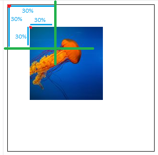
首先,我们考虑图像以找到我们将用于放置图像的参考点。考虑到图像的大小(如绿线所定义),它是从左上角位于30% 30%的图像内部的点。然后,考虑到容器的大小,我们将该点放在30% 30%的容器内,从左上角开始。
从这个逻辑来看,我们可以清楚地识别出一些微不足道的案例
50% 50%(中)100% 100%(右下)100% 0%(右上)
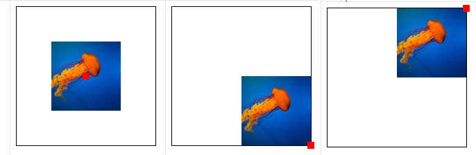
现在很清楚,如果图像的大小等于容器的大小,那么就不会发生任何事情,因为所有的位置都是等价的。图像的顶部/左侧已经位于容器的顶部/左侧(0%0%),中心位于中心(50%50%)等。
.box {
  width:200px;
  height:200px;
  background-image:url(https://picsum.photos/200/200?image=1069);
  border:1px solid;
  background-position:0% 0%;
  background-repeat:no-repeat;
  position:relative;
  animation:back 5s infinite linear alternate;
}
.box:before {
  content:"";
  position:absolute;
  top:0;
  left:0;
  width:10px;
  height:10px;
  background:red;
  z-index:1;
  animation:change 5s infinite linear alternate;
}
@keyframes back{
  to{background-position:100% 100%;}
}
@keyframes change{
  to{top:calc(100% - 5px); left:calc(100% - 5px);}
}
<div class="box">
</div>应用于渐变时,上述逻辑是相同的,因为渐变被视为图像,默认情况下,如果未指定background-size,渐变的大小将是其容器的大小,与使用图像时不同。
如果我们参考specification的background-size,我们可以看到你的问题是如何产生的:
注意:
如果两个值都是自动的,那么应该使用图像的固有宽度和/或高度(如果有的话),缺失的维度(如果有的话)表现为如上所述的自动。如果图像既没有固有宽度也没有固有高度,则其大小确定为包含。
和:
包含
缩放图像,同时保持其固有的纵横比(如果有的话)到最大尺寸,使得其宽度和高度都可以适合背景定位区域。
并且:
位图图像(例如JPG)始终具有固有的尺寸和比例。
CSS
<gradient>s没有内在的维度或内在的比例.ref
图像始终具有内在值,因此在大多数情况下,它与容器的大小不同,因此具有百分比单位的background-position将产生效果。但是渐变没有内在值,因此渐变的尺寸将等于其容器的大小,并且除非我们指定与容器尺寸不同的background-position,否则具有百分比值的background-size将永远不会工作。
More in-depth
我们在上面的例子中看到background-size在使用0%和100%之间的值时如何工作,但是使用负值或大于100%的值呢?逻辑是一样的,但找到参考点会更棘手。
负值(<0%)
我们假设我们想在-50% 0上放置一个背景。在这种情况下,参考点将位于图像之外。这是一个例子:
.box {
  width:200px;
  height:200px;
  border:1px solid;
  background:url(https://picsum.photos/100/100?image=1069) -50% 0/100px 100px no-repeat;
}
<div class="box"></div>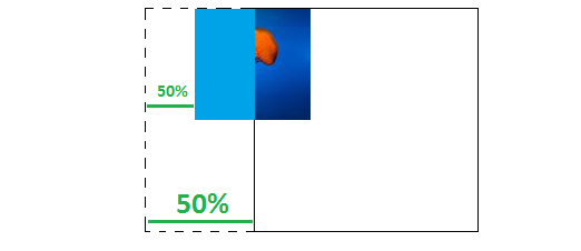
正如我们在图中所看到的,我们首先考虑图像的-50%,即-50px,以便定义我们的参考点(即,从图像的左边缘开始-50px)。然后我们将该点放在-50%处,考虑容器的大小(距离容器左边缘-100px)。然后我们绘制图像,我们得到上面的结果。只有图像的100px可见。
我们还可能注意到,当图像的大小小于容器的大小时,负百分比值将与负固定值相同(两者都将图像向左移动)。在这种情况下,-50% 0与-50px 0相同。
.box {
  width:200px;
  height:200px;
  display:inline-block;
  border:1px solid;
  background:url(https://picsum.photos/100/100?image=1069) -50% 0/100px 100px no-repeat;
}
.alt{
  background:url(https://picsum.photos/100/100?image=1069) -50px 0/100px 100px no-repeat;
}
<div class="box">
</div>
<div class="box alt">
</div>例如,如果我们将图像大小增加到150px 150px,-50% 0将与-25px 0相同。
当我们使尺寸大于容器时,负值将开始向右移动图像(与正像素值一样),这是合乎逻辑的,因为图像的50%将增加,而容器的50%将保持不变。
如果我们考虑前面的插图,就像增加顶部绿线直到它比底部更大。所以标志只是不足以知道背景图像将如何移动;我们还需要考虑尺寸。
.box {
  width:200px;
  height:200px;
  border:1px solid;
  background:url(https://picsum.photos/300/300?image=1069) -50% 0/150px 150px no-repeat;
  animation:change 2s linear infinite alternate;
}
@keyframes change{
  from {background-size:50px 50px}
  to {background-size:300px 300px}
}
<div class="box">
</div>渐变的逻辑上也是如此:
.box {
  width:200px;
  height:200px;
  border:1px solid;
  background:linear-gradient(to right,red,blue) -50% 0/150px 50px no-repeat;
  animation:change 2s linear infinite alternate;
}
@keyframes change{
  from {background-size:50px  50px}
  to   {background-size:300px 50px}
}
<div class="box">
</div>大价值(> 100%)
与之前相同的逻辑:如果我们在150% 0定义背景,那么我们从左边缘(或右边缘的150%)考虑我们的参考点50%,然后我们从容器的左边缘放置它150%。
.box {
  width:200px;
  height:200px;
  border:1px solid;
  background:url(https://picsum.photos/100/100?image=1069) 150% 0/100px 100px no-repeat;
}
<div class="box">
</div>在这种情况下,150% 0相当于150px 0,如果我们开始增加背景大小,我们将具有与之前演示的相同的行为:
.box {
  width:200px;
  height:200px;
  border:1px solid;
  background:url(https://picsum.photos/300/300?image=1069) 150% 0/100px 100px no-repeat;
  animation:change 2s infinite linear alternate;
}
@keyframes change {
  from {background-size:50px 50px}
  to {background-size:300px 300px}
}
<div class="box">
</div>特别案例
使用[0% 100%]范围之外的值允许我们隐藏背景图像,但是我们如何找到确切的值以完全隐藏图像?
让我们考虑下面的例子:
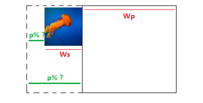
我们的图像宽度为Ws,容器宽度为Wp,我们需要找到p的值。从图中我们可以得到以下公式:
p * Wp = p * Ws + Ws <=> p = Ws/(Wp - Ws) where p in [0,1]
如果容器大小是200px并且图像是100px那么p是1所以100%(我们当然添加负号并且它是-100%)。
如果我们用background-size而不是固定值来考虑百分比值,我们可以使这更通用。假设background-size是S%。然后我们将有Ws = Wp * s (s in [0,1] and S=s*100%),公式将是
p = Ws/(Wp - Ws) <=> p = s / (1 - s)
添加负号将是p = s / (s - 1)。
现在如果我们想隐藏右侧的图像,我们在右边做同样的逻辑(我们考虑前面插图的镜像),但是因为我们总是会考虑左边缘来找到我们需要添加100%的百分比。
新的百分比p'%是100% + p%,公式将是p' = 1 + p --> p' = 1 + s / (1 - s) = 1 / (1 - s)。
这是一个动画来说明上面的计算:
.box {
  width:200px;
  height:50px;
  margin:5px;
  border:1px solid;
  background-image:linear-gradient(to right,red,blue);
  background-position:0 0;
  background-size:calc(var(--s) * 100%) 100%;
  background-repeat:no-repeat;
  animation:change 4s linear infinite alternate;
}
@keyframes  change{
   from { /*Hide on the left*/
     background-position:calc(var(--s)/(var(--s) - 1) * 100%)
   }
   to { /*Hide on the right*/
     background-position:calc(1/(1 - var(--s)) * 100%)
   }
}
<div class="box" style="--s:0.5">
</div>
<div class="box" style="--s:0.8">
</div>
<div class="box" style="--s:2">
</div>让我们计算一些值:
当s=0.5,我们有background-size等于50%,百分比值将从-100%到200%。在这种情况下,我们从负值开始,以正值结束,因为图像的大小小于容器的大小。如果我们考虑最后一个案例(s=2),background-size等于200%,百分比值将从200%到-100%。我们以正值开始并以负值结束,因为图像的大小大于容器的大小。
这证实了我们之前所说的:要将图像向左移动,如果尺寸很小,我们需要负值,但如果尺寸很大,我们需要正值(右边的相同)。
像素和百分比值之间的关系
让我们定义一种基于像素值计算百分比值的方法,反之亦然(即在两者之间进行转换的公式)。要做到这一点,我们只需要考虑参考点。
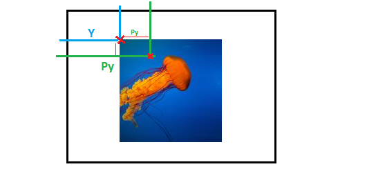
当使用像素值时,我们将考虑蓝线,我们将有background-position:X Y。
当使用百分比值时,我们将考虑绿线,我们将有background-position:Px Py。
公式如下:Y + Py * Ws = Py * Wp其中Ws是图像的宽度,Wp是容器的宽度(考虑到高度的X轴的公式相同)。
我们将有Y = Py * (Wp - Ws)。从这个公式我们可以验证前面解释的两点:
- 当
Wp = Ws,公式不再有效时,它确认当图像的大小与容器相同时,百分比值无效;因此,像素和百分比值之间没有关系。 - 当
Y时Py和Wp > Ws将有相同的标志,并且当Wp < Ws时将有相反的标志。这确认了百分比值根据图像的大小而表现不同。
如果我们考虑background-size的百分比值,我们也可以不同地表达公式。我们将有Y = Py * Wp * (1-s)。
这是一个动画来说明上面的计算:
.box {
  width:200px;
  height:50px;
  margin:5px;
  border:1px solid;
  background-image:linear-gradient(to right,red,blue);
  background-position:0 0;
  background-size:calc(var(--s) * 100%) 100%;
  background-repeat:no-repeat;
  animation:percentage 2s linear infinite alternate;
}
.box.alt {
  animation-name:pixel;
}
@keyframes  percentage{
   from { background-position:-50%;}
   to { background-position:150%;}
}
@keyframes  pixel{
   from { background-position:calc(-0.5 * 200px * (1 - var(--s))) }
   to {  background-position:calc(1.5 * 200px * (1 - var(--s)));}
}
<div class="box" style="--s:0.5">
</div>
<div class="box alt" style="--s:0.5">
</div>
<div class="box" style="--s:2">
</div>
<div class="box alt" style="--s:2">
</div>更改参考
在上面的计算中,我们总是考虑图像的上/左角和容器,以便为像素值或百分比值应用我们的逻辑。可以通过向background-position添加更多值来更改此引用。
默认情况下,background-position: X Y相当于background-position: left X top Y(来自X的left位置和来自Y的top位置)。通过调整top和/或left,我们可以更改参考以及图像的放置方式。这里有些例子:
.box {
  width:150px;
  height:150px;
  display:inline-block;
  background-image:url(https://picsum.photos/70/70?image=1069);
  border:1px solid;
  background-position:0 0;
  background-repeat:no-repeat;
  position:relative;
}

body {
 margin:0;
}
<div class="box"></div>
<div class="box" style="background-position:left 0 bottom 0"></div>
<div class="box" style="background-position:right 0 bottom 0"></div>
<div class="box" style="background-position:right 0 top 0"></div>
<div class="box" style="background-position:right 10% top 30%"></div>
<div class="box" style="background-position:right 10% bottom 30%"></div>
<div class="box" style="background-position:right 10px top 20px"></div>
<div class="box" style="background-position:left 50% bottom 20px"></div>很明显,对于X值,我们只能使用left和right(水平位置)和Y值,我们只能使用bottom和top(垂直位置)。通过所有不同的组合,我们可以逻辑地获得4个不同的角落。
此功能对于优化某些计算也很有用。在特殊情况部分的示例中,我们进行了第一次计算以隐藏左侧的图像,然后另一次计算将其隐藏在右侧。如果我们考虑更改参考,我们只需要进行一次计算。我们采用左侧使用的公式,右侧使用相同的公式。
这是新版本:
.box {
  width:200px;
  height:50px;
  margin:5px;
  border:1px solid;
  background-image:linear-gradient(to right,red,blue);
  background-position:0 0;
  background-size:calc(var(--s) * 100%) 100%;
  background-repeat:no-repeat;
  animation:change 4s linear infinite alternate;
}
@keyframes  change{
   from { /*Hide on the left*/
     background-position:left calc(var(--s)/(var(--s) - 1) * 100%) top 0
   }
   to { /*Hide on the right*/
     background-position:right calc(var(--s)/(var(--s) - 1) * 100%) top 0
   }
}
<div class="box" style="--s:0.5">
</div>
<div class="box" style="--s:0.8">
</div>
<div class="box" style="--s:2">
</div>对于s=0.5,我们将不再从-100%到200%的动画,但它将从left -100%到right -100%。
这是使用像素值的另一个例子,我们可以清楚地看到在更改参考时处理计算是多么容易:
.box {
  width:200px;
  height:200px;
  background-image:url(https://picsum.photos/100/100?image=1069);
  border:1px solid;
  background-position:0 0;
  background-repeat:no-repeat;
  animation:change 2s infinite linear;
}


@keyframes change{
  0%{background-position:left 20px top 20px;}
  25%{background-position:right 20px top 20px;}
  50%{background-position:right 20px bottom 20px;}
  75%{background-position:left 20px bottom 20px;}
  100%{background-position:left 20px top 20px;}
}
<div class="box"></div>通过保持相同的参考来实现相同的动画将是棘手的。因此,如果我们想要进行对称动画,我们在一侧执行逻辑,并通过更改参考在另一侧使用相同的逻辑。
结合像素和百分比值
在CSS3中,我们可以使用calc()来进行涉及不同单元的复杂计算。例如,我们可以编写width:calc(100px + 20% + 12em),浏览器将计算每个单元如何工作的计算值,我们将以像素值结束(对于这种情况)。
怎么样background-position?如果我们写calc(50% + 50px),它会被评估为百分比值还是像素值?将像素值转换为百分比还是相反?
结果不会转换为像素值或百分比值,而是两者将一起使用! background-position在calc()中混合百分比和像素值时有一个特殊的行为,逻辑如下:
- 我们首先使用百分比值通过应用与百分比值相关的所有逻辑来定位图像。
- 我们将(1)的位置视为参考,并且我们使用像素值通过应用与像素值相关的所有逻辑来再次定位图像。
所以calc(50% + 50px)的意思是:将图像居中,然后向左移动50px。
此功能可以简化大量计算。这是一个例子:
.box {
  width:200px;
  height:200px;
  display:inline-block;
  border:1px solid;
  background-image:
    linear-gradient(red,red),
    linear-gradient(red,red),
    linear-gradient(red,red),
    linear-gradient(red,red);
 background-size:20px 20px;
 background-position:
    calc(50% + 20px) 50%,
    calc(50% - 20px) 50%,
    50% calc(50% - 20px),
    50% calc(50% + 20px);
 background-repeat:no-repeat;
 transition:0.5s;
}
.box:hover {
  background-position:50%;
}
<div class="box"></div>
<div class="box" style="width:100px;height:100px;"></div>找到正确的百分比或像素值来放置像上面这样的4个红色方块会很繁琐,但是通过使用calc()混合它们非常容易。
现在,我们假设我们有类似的东西:calc(10% + 20px + 30% + -10px + 10% + 20px)。浏览器将如何处理此问题?
在这种情况下,浏览器将首先评估每个单元以获得简化形式calc(X% + Ypx)然后应用上述逻辑来定位图像。
calc(10% + 20px + 30% + -10px + 10% + 20px)
calc((10% + 30% + 10%) + (20px + -10px +20px))
calc(50% + 30px)
.box {
  display:inline-block;
  width:200px;
  height:200px;
  background-image:url(https://picsum.photos/100/100?image=1069);
  border:1px solid;
  background-position:calc(10% + 20px + 30% + -10px + 10% + 20px) 0;
  background-repeat:no-repeat;
}
.alt {
  background-position:calc(50% + 30px) 0;
}
<div class="box"></div>
<div class="box alt"></div>
无论公式的复杂程度如何,浏览器都将始终分别评估百分比和像素值。
使用更多单位
除了px单位,我们还可以使用背景位置中的所有常见单位,如em,ch,ex,rem,cm等。所有单位行为都与像素值相同。
.box {
  display:inline-block;
  width:200px;
  height:200px;
  font-size:25px;
  background-image:url(https://picsum.photos/100/100?image=1069);
  border:1px solid;
  background-position:50px 0;
  background-repeat:no-repeat;
}
.em {
  background-position:2em 0;
}
.ch {
  background-position:2ch 0;
}
:root { font-size:50px}
.rem {
  background-position:1rem 0;
}
<div class="box"></div>
<div class="box em"></div>
<div class="box ch"></div>
<div class="box rem"></div>所以我们可以使用百分比值或长度值(px,em,ch等)
使用背景源
这是另一个可用于改变背景图像位置的重要属性。此属性依赖于盒子模型,因此我们可以快速提醒它如何工作:
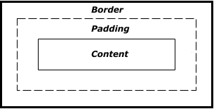
每个元素内部都有3个不同的框:边框,填充框和内容框。 background-origin指定我们需要考虑哪个框来完成我们之前的所有逻辑。
这是一个不言自明的例子:
.box {
  display:inline-block;
  width:200px;
  height:200px;
  font-size:25px;
  background-image:url(https://picsum.photos/100/100?image=1069);
  border:20px solid rgba(0,0,0,0.1);
  padding:20px;
  background-position:0 0;
  background-repeat:no-repeat;
  box-sizing:border-box;
}
.border {
  background-origin:border-box;
}
.padding {
  background-origin:padding-box; /*the default value*/
}
.content {
  background-origin:content-box;
}
<div class="box border"></div>
<div class="box padding"></div>
<div class="box content"></div>现在应该很清楚,当我们没有填充content-box相当于padding-box,而当我们没有边界border-box相当于padding-box。
1:以下是等效值的完整列表:
leftleft center= = =center left0 50%rightright center= = =center right100% 50%toptop center= = =center top50% 0bottombottom center= = =center bottom50% 100%centercenter center= =50% 50%
top leftleft top= =0 0top rightright top= =100% 0bottom leftleft bottom= =0 100%bottom rightright bottom= =100% 100%
top X left Yleft Y top X= =Y Xtop X right Y=right Y top Xbottom X left Y=left Y bottom Xbottom X right Y=right Y bottom X
官方参考:https://www.w3.org/TR/css-backgrounds-3/
在大多数情况下,我只考虑了一个轴进行解释/计算,但是相同的规则适用于两个轴,两者都是独立的。
最新问题
- 如何从 WSL 终端启动 PyCharm?
- 出现此错误后如何在我的 Windows 上安装 vs?
- 将 NTFS 文件属性存储在 Zip 存档中
- 如何在 C# 中使用 ms-graph 从子文件夹而不是父文件夹中删除电子邮件
- 什么原因导致无法显示此 Angular 16 加载微调器?
- 将值添加到 YAML 文件
- 监听Quasar上的输入验证事件
- 用户名 = 电子邮件的正确自动完成应该是什么?
- SSRS - 如何根据列内的 URL 显示外部图像
- 如何嵌套 Jsonnet 对象理解并运行内部循环不同的次数?
- Spring boot 应用程序属性中的不可变列表
- onChange 事件发生时意外调用 setState
- 函数中的中断和继续
- 将 Xamarin.iOS 迁移到 .net 以解决 iOS 问题、想法、问题
- 如何在 plesk Web 主机版本中部署我的 Angular 应用程序?
- 如何将 Django 模型中的信息公开到 forms/views(?)/html(?) 以便能够看到模型内置的所有信息
- Delphi 在运行时更改高 dpi
- 为什么我的 Pickled 类给我 AttributeError: Can't get attribute 'MyClass'?
- 如何修改NestJS的多个出站/外部HTTP请求
- 部署到 Netlify 时,基于 IP 国家/地区代码的 Nuxt 3 中间件重定向不起作用