如何使用CSS垂直居中文本? [重复]
问题描述 投票:2102回答:38
这个问题在这里已有答案:
我有一个包含文本的div元素,我想将此div的内容垂直居中对齐。
这是我的div风格:
#box {
  height: 170px;
  width: 270px;
  background: #000;
  font-size: 48px;
  color: #FFF;
  text-align: center;
}
<div id="box">
Lorem ipsum dolor sit
</div>做这个的最好方式是什么?
38个回答
投票
您可以尝试这种基本方法:
div {
  height: 90px;
  line-height: 90px;
  text-align: center;
  border: 2px dashed #f69c55;
}
<div>
Hello World!
</div>它只适用于单行文本,因为我们将行的高度设置为与包含框元素相同的高度。
一种更通用的方法
这是垂直对齐文本的另一种方法。此解决方案适用于单行和多行文本,但仍需要固定高度的容器:
div {
  height: 200px;
  line-height: 200px;
  text-align: center;
  border: 2px dashed #f69c55;
}
span {
  display: inline-block;
  vertical-align: middle;
  line-height: normal;
}
<div>
<span>Lorem ipsum dolor sit amet, consectetur adipiscing elit. Haec et tu ita posuisti, et verba vestra sunt. Non enim iam stirpis bonum quaeret, sed animalis. </span>
</div>CSS只调整<div>的大小,垂直居中通过设置<span>的行高等于其高度来对齐<div>,并使<span>成为vertical-align: middle的内联块。然后它将<span>的行高设置回正常,因此其内容将在块内自然流动。
模拟表格显示
这是另一个选项,可能不适用于较旧的browsers that don't support display: table and display: table-cell(基本上只是Internet Explorer 7)。使用CSS我们模拟表行为(因为表支持垂直对齐),HTML与第二个示例相同:
div {
  display: table;
  height: 100px;
  width: 100%;
  text-align: center;
  border: 2px dashed #f69c55;
}
span {
  display: table-cell;
  vertical-align: middle;
}
<div>
<span>Lorem ipsum dolor sit amet, consectetur adipiscing elit.</span>
</div>使用绝对定位
该技术使用绝对定位的元素设置顶部,底部,左侧和右侧为0.在Smashing Magazine,Absolute Horizontal And Vertical Centering In CSS的文章中更详细地描述。
投票
您还可以使用以下属性。
display: flex;
align-content: center;
justify-content : center;
投票
其他方式:
不要设置height的div属性,而是使用padding:来实现效果。与行高相似,只有在有一行文本时才有效。虽然这样,如果你有更多的内容,文本仍然会居中,但div本身会略大。
所以不要去:
div {
height: 120px;
line-height: 120px;
}
你可以说:
div {
padding: 60px 0; // Maybe 60 minus font-size divided by two, if you want to be exact
}
这将把padding的顶部和底部div设置为60px,将左侧和右侧padding设置为零,使div 120像素(加上字体的高度)高,并将文本垂直居中放置在div中。
投票
您可以使用以下代码段作为参考。它对我来说就像一个魅力:
<!DOCTYPE html>
<html lang="de">
<head>
<title>Vertically Center Text</title>
<style>
html, body {
height: 100%;
margin: 0;
padding: 0;
width: 100%;
}
body {
display: table;
}
.centered-text {
text-align: center;
display: table-cell;
vertical-align: middle;
}
</style>
</head>
<body style="background:#3cedd5">
<div class="centered-text">
<h1>Yes, it's my landing page</h1>
<h2>Under construction, coming soon!!!</h2>
</div>
</body>
</html>上面代码段的输出如下:
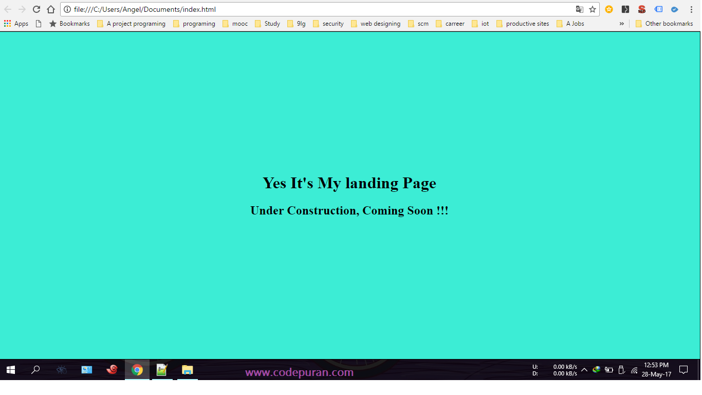
源代码信用:How do I vertically center text with CSS? - Code Puran
投票
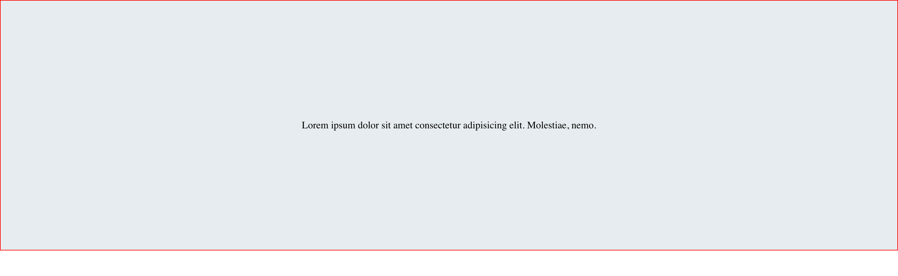
这是使用flexbox的另一个选项。
HTML
<div id="container">
<div class="child">
<span
>Lorem ipsum dolor sit amet consectetur adipisicing elit. Molestiae,
nemo.</span
>
</div>
</div>
CSS
#container {
display: flex;
}
.child {
margin: auto;
}
结果
投票
我不确定是否有人走过writing-mode路线,但我认为它能彻底解决问题,并得到广泛的支持:
.vertical {
//border: 1px solid green;
writing-mode: vertical-lr;
text-align: center;
height: 100%;
width: 100%;
}
.horizontal {
//border: 1px solid blue;
display: inline-block;
writing-mode: horizontal-tb;
width: 100%;
text-align: center;
}
.content {
text-align: left;
display: inline-block;
border: 1px solid #e0e0e0;
padding: .5em 1em;
border-radius: 1em;
}<div class="vertical">
<div class="horizontal">
<div class="content">
I'm centered in the vertical and horizontal thing
</div>
</div>
</div>当然,这将适用于您需要的任何尺寸(除了父母的100%)。如果取消注释边框线,熟悉自己会很有帮助。
JSFiddle demo让你小提琴。
Caniuse support:85.22%+ 6.26%= 91.48%(即使是Internet Explorer!)
投票
满足您所有的垂直校准需求!
声明这个Mixin:
@mixin vertical-align($position: relative) {
position: $position;
top: 50%;
-webkit-transform: translateY(-50%);
-ms-transform: translateY(-50%);
transform: translateY(-50%);
}
然后将其包含在您的元素中:
.element{
@include vertical-align();
}
投票
对此更好的想法。你也可以这样做
body,
html {
height: 100%;
}
.parent {
white-space: nowrap;
height: 100%;
text-align: center;
}
.parent:after {
display: inline-block;
vertical-align: middle;
height: 100%;
content: '';
}
.centered {
display: inline-block;
vertical-align: middle;
white-space: normal;
}<div class="parent">
<div class="centered">
<p>Lorem ipsum dolor sit amet.</p>
</div>
</div>投票
尝试转换属性:
#box {
height: 90px;
width: 270px;
position: absolute;
top: 50%;
left: 50%;
transform: translate(-50%, -50%);
} <div Id="box">
Lorem ipsum dolor sit amet, consectetur adipiscing elit.
</div>投票
对于单行文本(或单个字符),您可以使用此技术:
当#box具有非固定的相对高度(%)时,可以使用它。
<div id="box"></div>
#box::before {
display: block;
content: "";
height: 50%;
}
#box::after {
vertical-align: top;
line-height: 0;
content: "TextContent";
}
查看现场演示at JsBin(更容易编辑CSS)或JsFiddle(更容易更改结果框架的高度)。
如果要将内部文本放在HTML中而不是CSS中,则需要将文本内容包装在附加的内联元素中,然后编辑#box::after以匹配它。 (当然,应该删除content:财产。)
例如,<div id="box"><span>TextContent</span></div>。在这种情况下,#box::after应该用#box span替换。
对于Internet Explorer 8支持,您必须将::替换为:。
投票
简单而通用的方式是(如Michielvoo's table approach):
[ctrv]{
display:table !important;
}
[ctrv] > *{ /* adressing direct discendents */
display: table-cell;
vertical-align: middle;
// text-align: center; /* optional */
}
在父标记上使用此属性(或等效类)甚至可以使许多子对齐:
<parent ctrv> <ch1/> <ch2/> </parent>
投票
另一种方式(这里还没有提到)是Flexbox。
只需将以下代码添加到容器元素:
display: flex;
justify-content: center; /* align horizontal */
align-items: center; /* align vertical */
Flexbox demo 1
.box {
height: 150px;
width: 400px;
background: #000;
font-size: 24px;
font-style: oblique;
color: #FFF;
text-align: center;
padding: 0 20px;
margin: 20px;
display: flex;
justify-content: center;
/* align horizontal */
align-items: center;
/* align vertical */
}<div class="box">
Lorem ipsum dolor sit amet, consectetuer adipiscing elit, sed diam nonummy nibh
</div>或者,不是通过容器对齐内容,当flex容器中只有一个flex项目时,flexbox也可以使用auto margin将flex项目居中(如上面问题中给出的示例)。
因此,要将flex项目水平和垂直居中,只需使用margin:auto进行设置即可
Flexbox Demo 2
.box {
height: 150px;
width: 400px;
background: #000;
font-size: 24px;
font-style: oblique;
color: #FFF;
text-align: center;
padding: 0 20px;
margin: 20px;
display: flex;
}
.box span {
margin: auto;
}<div class="box">
<span>margin:auto on a flex item centers it both horizontally and vertically</span>
</div>注意:以上所有内容适用于将物品放置在水平行中时居中。这也是默认行为,因为默认情况下,flex-direction的值是row。但是,如果flex-items需要在垂直列中布局,那么应该在容器上设置flex-direction: column以将主轴设置为列,另外justify-content和align-items属性现在以justify-content: center垂直居中并且align-items: center相反的方式工作水平居中)
flex-direction: column demo
.box {
height: 150px;
width: 400px;
background: #000;
font-size: 18px;
font-style: oblique;
color: #FFF;
display: flex;
flex-direction: column;
justify-content: center;
/* vertically aligns items */
align-items: center;
/* horizontally aligns items */
}
p {
margin: 5px;
}<div class="box">
<p>
When flex-direction is column...
</p>
<p>
"justify-content: center" - vertically aligns
</p>
<p>
"align-items: center" - horizontally aligns
</p>
</div>一个开始使用Flexbox来查看其一些功能并获得最大浏览器支持语法的好地方是flexyboxes
此外,如今的浏览器支持非常好:caniuse
对于display: flex和align-items的跨浏览器兼容性,您可以使用以下内容:
display: -webkit-box;
display: -webkit-flex;
display: -moz-box;
display: -ms-flexbox;
display: flex;
-webkit-flex-align: center;
-ms-flex-align: center;
-webkit-align-items: center;
align-items: center;
投票
垂直对齐中心的一个非常简单和最强大的解决方案:
.outer-div {
height: 200px;
width: 200px;
text-align: center;
border: 1px solid #000;
}
.inner {
position: relative;
top: 50%;
transform: translateY(-50%);
color: red;
}<div class="outer-div">
<span class="inner">No data available</span>
</div>投票
无论屏幕大小或div大小如下,以下代码都会将div放在屏幕中间:
.center-screen {
display: flex;
flex-direction: column;
justify-content: center;
align-items: center;
text-align: center;
min-height: 100vh;
} <html>
<head>
</head>
<body>
<div class="center-screen">
I'm in the center
</div>
</body>
</html>查看有关flex here的更多详细信息。
投票
我看到了之前的答案,它们只适用于那个宽度的屏幕(没有响应)。对于响应,您必须使用flex。
例:
div{ display:flex; align-item:center;}
投票
请尝试以下代码:
display: table-cell;
vertical-align: middle;
div {
height: 80%;
width: 100%;
text-align: center;
display: table-cell;
vertical-align: middle;
background: #4CAF50;
color: #fff;
font-size: 50px;
font-style: italic;
}<div>
Lorem Ipsum is simply dummy text of the printing and typesetting industry. Lorem Ipsum has been the industry's standard dummy text ever since the 1500s
</div>投票
我想扩展the answer from Michielvoo以释放对行高和呼吸div高度的需求。它基本上只是这样的简化版本:
div {
width: 250px;
/* height: 100px;
line-height: 100px; */
text-align: center;
border: 1px solid #123456;
background-color: #bbbbff;
padding: 10px;
margin: 10px;
}
span {
display: inline-block;
vertical-align: middle;
line-height: normal;
}<div>
<span>All grown-ups were once children... but only few of them remember it</span>
</div>
<div>
<span>And now here is my secret, a very simple secret: It is only with the heart that one can see rightly; what is essential is invisible to the eye.</span>
</div>注意:注释掉css封闭fixed-height所需的部分divis。
投票
我需要一排可点击的大象,垂直居中,但没有使用表来解决一些Internet Explorer 9的怪异问题。
我最终找到了最好的CSS(根据我的需要),它很适合Firefox,Chrome和Internet Explorer 11.可悲的是Internet Explorer 9还在嘲笑我......
div {
border: 1px dotted blue;
display: inline;
line-height: 100px;
height: 100px;
}
span {
border: 1px solid red;
display: inline-block;
line-height: normal;
vertical-align: middle;
}
.out {
border: 3px solid silver;
display: inline-block;
}<div class="out" onclick="alert(1)">
<div> <span><img src="http://www.birdfolk.co.uk/littleredsolo.png"/></span> </div>
<div> <span>A lovely clickable option.</span> </div>
</div>
<div class="out" onclick="alert(2)">
<div> <span><img src="http://www.birdfolk.co.uk/bang2/Ship01.png"/></span> </div>
<div> <span>Something charming to click on.</span> </div>
</div>显然你不需要边框,但它们可以帮助你看看它是如何工作的。
投票
您可以在CSS中使用定位方法:
HTML:
<div class="relativediv">
<p>
Make me vertical align as center
</p>
</div>
CSS:
.relativediv{position:relative;border:1px solid #ddd;height:300px;width:300px}
.relativediv p{position:absolute:top:50%;transfrom:translateY(-50%);}
希望你也使用这种方法。
投票
如果你不关心它的小视觉3D效果,将它设置在button而不是div。
#box
{
height: 120px;
width: 300px;
background: #000;
font-size: 48px;
font-style: oblique;
color: #FFF;
}<button Id="box" disabled>
Lorem ipsum dolor sit amet, consectetur adipiscing elit.
</button>投票
这很容易也很简短:
.block {
display: table-row;
vertical-align: middle;
}
.tile {
display: table-cell;
vertical-align: middle;
text-align: center;
width: 500px;
height: 100px;
}<div class="body">
<span class="tile">
Hello middle world! :)
</span>
</div>投票
绝对定位和拉伸
与上面的方法一样,这个方法首先将父元素和子元素的定位分别设置为relative和absolute。从那里事情不同。
在下面的代码中,我再一次使用这种方法在水平和垂直方向上居中,尽管你只能使用这种方法进行垂直居中。
HTML
<div id="parent">
<div id="child">Content here</div>
</div>
CSS
#parent {position: relative;}
#child {
position: absolute;
top: 0;
bottom: 0;
left: 0;
right: 0;
width: 50%;
height: 30%;
margin: auto;
}
使用此方法的想法是尝试通过将top,bottom,right和left vales设置为0来使子元素伸展到所有四个边缘。因为我们的子元素小于我们的父元素,所以它不能到达所有四个边缘。
将auto设置为四边的边距会导致相反的边距相等,并在父div的中心显示我们的子div。
遗憾的是,上述内容在Internet Explorer 7及更低版本中不起作用,并且与之前的方法一样,子div内的内容可能会变得太大,从而导致其被隐藏。
投票
您可以通过添加以下CSS代码轻松完成此操作:
display: table-cell;
vertical-align: middle;
这意味着你的CSS最终看起来像:
#box {
height: 90px;
width: 270px;
background: #000;
font-size: 48px;
font-style: oblique;
color: #FFF;
text-align: center;
margin-top: 20px;
margin-left: 5px;
display: table-cell;
vertical-align: middle;
}<div id="box">
Some text
</div>投票
.element{position: relative;top: 50%;transform: translateY(-50%);}
在元素的CSS属性中添加这个小代码。太棒了。试试吧!
投票
供参考,并添加一个更简单的答案:
纯CSS:
.vertical-align {
position: relative;
top: 50%;
-webkit-transform: translateY(-50%);
-ms-transform: translateY(-50%);
transform: translateY(-50%);
}
或者作为SASS / SCSS Mixin:
@mixin vertical-align {
position: relative;
top: 50%;
-webkit-transform: translateY(-50%);
-ms-transform: translateY(-50%);
transform: translateY(-50%);
}
使用者:
.class-to-center {
@include vertical-align;
}
作者:SebastianEkström的博客文章Vertical align anything with just 3 lines of CSS:
由于元素被放置在“半像素”上,该方法可能导致元素模糊。对此的解决方案是将其父元素设置为preserve-3d。如下:
.parent-element {
-webkit-transform-style: preserve-3d;
-moz-transform-style: preserve-3d;
transform-style: preserve-3d;
}
我们生活在2015年以上,每个主要的现代浏览器都支持Flex Box。
这将是网站从现在开始制作的方式。
学习它!
投票
所有信用都归于此链接所有者@SebastianEkströmLink;请仔细阅读。在行动codepen看到它。通过阅读上面的文章,我也创建了a demo fiddle。
只需三行CSS(不包括供应商前缀),我们就可以在变换的帮助下完成:即使我们不知道它的高度,translateY也可以垂直居中。
CSS属性变换通常用于旋转和缩放元素,但是使用translateY函数,我们现在可以垂直对齐元素。通常这必须通过绝对定位或设置线高来完成,但这些要求您要么知道元素的高度,要么仅适用于单行文本等。
所以,为此,我们写道:
.element {
position: relative;
top: 50%;
transform: translateY(-50%);
}
这就是你所需要的。它与绝对位置方法类似,但有了好处,我们不必在父元素上设置任何高度或者在父元素上设置position-property。它开箱即用,即使在Internet Explorer 9!
为了使它更简单,我们可以将其作为mixin与其供应商前缀一起编写。
投票
CSS3中引入的Flexbox是解决方案:
/* Important */
section {
display: flex;
display: -webkit-flex;
}
p {
/* Key Part */
margin: auto;
}
/* Unimportant, coloring and UI */
section {
height: 200px;
width: 50%;
margin: auto;
border-radius: 20px;
border: 3px solid orange;
background-color: gold;
}
p {
text-align: center;
font-family: Calibri;
background-color: yellow;
border-radius: 20px;
padding: 15px;
}<section>
<p>
I'm centered!<br/>
Flexboxes are great!
</p>
</section>提示:如果要使文本居中,请用以下其中一行替换上面标有“关键部件”的行:
1)仅垂直:
margin: auto 0;
2)仅横向:
margin: 0 auto;
正如我所注意到的,这个技巧也适用于网格(即display: grid)。
投票
灵活的方法
div {
width: 250px;
min-height: 50px;
line-height: 50px;
text-align: center;
border: 1px solid #123456;
margin-bottom: 5px;
}
span {
display: inline-block;
vertical-align: middle;
line-height: normal;
}<div>
<span>Lorem ipsum dolor sit amet, consectetur adipiscing elit.<br />
Lorem ipsum dolor sit amet, consectetur adipiscing elit.<br />
Lorem ipsum dolor sit amet, consectetur adipiscing elit.</span>
</div>
<div>
  <span>Lorem ipsum dolor sit amet, consectetur adipiscing elit.</span>
</div>
<div>
<span>Lorem ipsum dolor sit amet.</span>
</div>
<div>投票
作为答案接受的解决方案是完美的使用line-height与div的高度相同,但是这个解决方案在文本被包装时不能完美地工作或者是两行。
如果文本被包装或在div内的多行上尝试这个。
#box
{
display: table-cell;
vertical-align: middle;
}
有关更多参考,请参阅:
投票
.EXTENDER {
    position: absolute;
    top: 0px;
    left: 0px;
    bottom: 0px;
    right: 0px;
    width: 100%;
    height: 100%;
    overflow-y: hidden;
    overflow-x: hidden;
}

.PADDER-CENTER {
    width: 100%;
    height: 100%;
    display: -webkit-box;
    display: -moz-box;
    display: -ms-flexbox;
    display: -webkit-flex;
    display: flex;
    -webkit-box-pack: center;
    -moz-box-pack: center;
    -ms-flex-pack: center;
    -webkit-justify-content: center;
    justify-content: center;
    -webkit-box-align: center;
    -moz-box-align: center;
    -ms-flex-align: center;
    -webkit-align-items: center;
    align-items: center;
}
<div class="EXTENDER">
<div class="PADDER-CENTER">
<div contentEditable="true">Edit this text...</div>
</div>
</div>使用CSS+建造。
最新问题
- “CanvasRenderer”类型的对象已被销毁,但您仍在尝试访问它。/Unity.iOS
- 字符串替换:忽略空格
- 如何解决未经审查的代码警告
- AttributeError:模块“utils”没有属性load_dataset
- 点击按钮2-3次后才会发生点击事件
- 为什么 VS Code 缺少 CSS 空白属性的值建议?
- CSS 属性的值未在 VS Code 中的建议值中正确显示
- 如何使图像大小响应于弹性布局Angular
- MongoDB .msi 安装程序无法在 Windows 10 上运行
- 如何使用服务器操作在 nextjs 上设置表单默认值
- GCC 对新目标 ISA 的最低要求
- Argo 工作流程等待 Pod 未在 GKE 上使用命令 docker ps 显示进程
- Argo工作流程:强行停止时执行步骤
- 使用 Argo 命令行解析器:当选项位于现有选项后面时,不会返回未知选项
- 理解 np.apply_along_axis 输出的形状
- Firefox 浏览器阻止执行异步 JavaScript?
- 在不同文档中引用工作表不起作用
- 将 jpg、jpeg、png、heic 格式的图像上传到 Vapor 4。从用 SwiftUI 编写的 iOS 应用程序发送文件
- 为什么我的 HttpOnly Flag Cookie 没有保存?
- 如何在 React 中使用 Token 更改 Ant Design v5 按钮的悬停颜色?