CSS:扩展a from right to left to reveal text
问题描述 投票:3回答:2
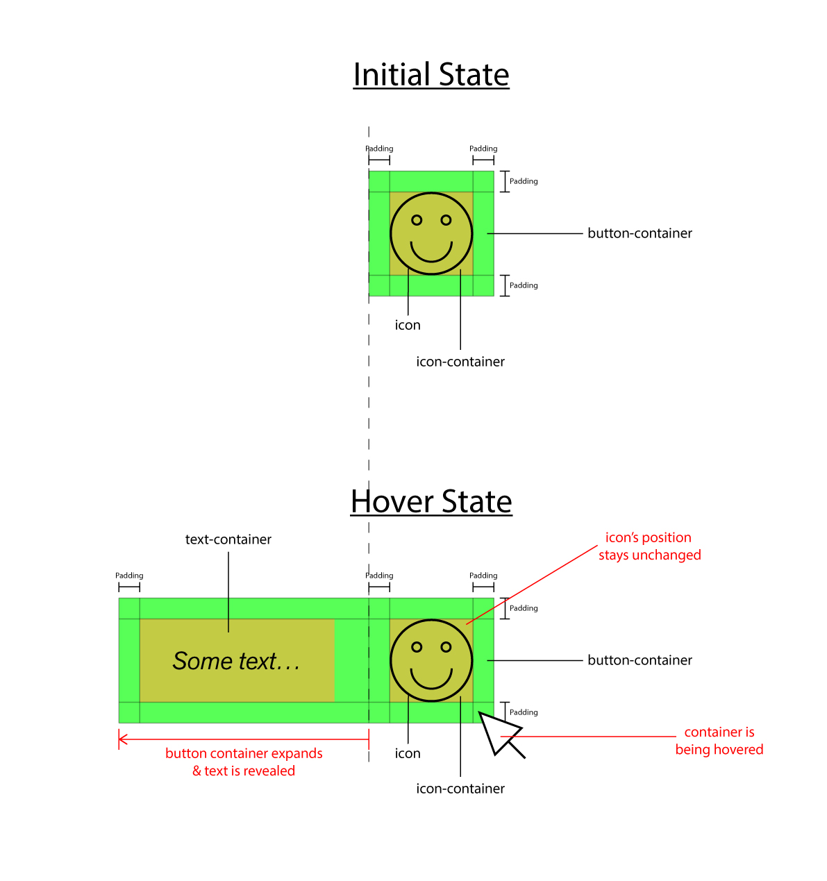
我想设置一个固定的<div>,其中包含一个图标,当它悬停时从右向左扩展(<div>展开,而不是图标),在图标的左侧显示一段文字。图标的位置保持不变。这是一个草图,以帮助说明我想做的事情:
在悬停时更改<div>的大小没有问题,我只需添加一个宽度更大的类(包括转换为扩展设置动画)。但我对元素的定位感到困惑。我将图标和文本(在<span>内)放在单独的<div>中,并尝试使用flex安排所有内容。在扩展/悬停状态下,事情看起来应该是这样,但是一旦<div>再次缩小,包含图标和文本的两个div尝试共享剩下的小空间,因此图标被切断并且文本被压扁。
如果有人能帮助我弄清楚如何按照我希望的方式设置它,我将不胜感激。
这是迄今为止我所得到的一个jsFiddle:Button-GrowOnHover
加上代码本身:
$(document).ready(function() {
  var button = $("#myButton");

  button.mouseenter(function() {
    $(this).addClass("grow");
  });
  button.mouseleave(function() {
    $(this).removeClass("grow");
  });
});
.button-container {
position: fixed;
top: 5%;
right: 5%;
width: 100px;
padding: 5px;
background-color: tomato;
display: flex;
justify-content: space-between;
overflow: hidden;
transition: width 1s;
}
.button-container.grow {
width: 300px
}
.button-text-container {
display: flex;
align-items: center;
justify-content: center;
background-color: lightblue;
}
.button-icon-container {
height: 100%;
display: flex;
align-items: center;
justify-content: center;
}<script src="https://ajax.googleapis.com/ajax/libs/jquery/2.1.1/jquery.min.js"></script>
<div class="button-container" id="myButton">
<div class="button-text-container">
<span>Here comes some text.</span>
</div>
<div class="button-icon-container">
<img src="https://placeholder.pics/svg/100x100/7AFFA6/000000/ICON">
</div>
</div>2个回答
5
投票
投票
如果依赖flexbox order,只能使用CSS执行此操作,并且可以将宽度更改移动到文本而不是父容器:
.button-container {
  position: fixed;
  top: 5%;
  right: 5%;
  padding: 5px;
  background-color: tomato;
  display: flex;
  justify-content: space-between;
  overflow: hidden;
}


.button-text-container {
  order:-1;
  display: flex;
  align-items: center;
  justify-content: center;
  background-color: lightblue;
  white-space:nowrap; /*Keep text always one line*/
  overflow:hidden;
  width:0;
  transition: width 1s;
}

.button-icon-container {
  height: 100%;
  display: flex;
  align-items: center;
  justify-content: center;
}
.button-icon-container:hover + .button-text-container {
  width:200px;
}
<div class="button-container" id="myButton">
<div class="button-icon-container">
<img src="https://placeholder.pics/svg/100x100/7AFFA6/000000/ICON">
</div>
<div class="button-text-container">
<span>Here comes some text.</span>
</div>
</div>1
投票
投票
有更好的css选项,但如果你想用javascript做这个就行了。让需要增长的实际容器改变宽度而不是包装它的那个。
$(document).ready(function() {
  var button = $("#myButton");

  button.mouseenter(function() {
    $('.button-text-container').addClass("grow");
  });
  button.mouseleave(function() {
    $('.button-text-container').removeClass("grow");
  });
});
.button-container {
position: fixed;
top: 5%;
right: 5%;
padding: 5px;
background-color: tomato;
display: flex;
justify-content: space-between;
}
.button-text-container.grow {
width: 300px;
}
.button-text-container {
display: flex;
align-items: center;
justify-content: center;
background-color: lightblue;
overflow: hidden;
width: 0px;
transition: width 1s;
}
.button-icon-container {
height: 100%;
display: flex;
align-items: center;
justify-content: center;
}<script src="https://ajax.googleapis.com/ajax/libs/jquery/2.1.1/jquery.min.js"></script>
<div class="button-container" id="myButton">
<div class="button-text-container">
<span>Here comes some text.</span>
</div>
<div class="button-icon-container">
<img src="https://placeholder.pics/svg/100x100/7AFFA6/000000/ICON">
</div>
</div>最新问题
- 如何在Sparx Enterprise Architect中的自定义文档中的相应属性下添加枚举?
- Yaml-cpp 在析构函数中发出时会发出双引号 yaml 字符串
- 指定Y轴24小时范围
- 扁平化包含列表的Python字典
- 如何在用户模型中以任务为中心来限制仅未完成的任务?
- MUI Datagrid V5 更改页脚高度
- 尝试为 flappybird 类型的游戏统一制作一个 Rigidbody2d 变量
- MongoDB 用一个分片按块进行分区是否合理?在一台服务器上分区
- “Refit 中无法将 JSON 值转换为 Enum
- 如何使用 Servlet Filter 来更改/重写传入 URL?
- 仅允许 Pydantic 模型的某些字段传递到 FastAPI 端点
- 如何构建像 Ahrefs 这样可扩展的网络抓取和数据分析基础设施?
- gfortran:错误:(1)处的“rfunct”接口必须是显式的
- 从特定 NextJS 页面中排除 rel="amphtml" 标签
- Firebase Cloud Functions 正确的返回方式
- CKEditor 5 - 插入文本
- 登录 URL /my_app/ 与 /my_app/users/login 不匹配
- Oracle Spatial Studio,数据库中没有数据源
- VS Code 不排除代码的 node_modules 被监视 - 已达到文件监视限制
- 自动填充和匹配 Angular 选项字段中的文本
© www.soinside.com 2019 - 2024. All rights reserved.