如何在表格行上叠加方块阴影?
问题描述 投票:1回答:1
我有一个表格,我想通过在表格周围应用一个方框阴影来突出显示一些连续的行(TR)。
我的策略是在第一行应用一个名为 "selected-top "的类,中间部分应用 "selected-middle "类,最后一行应用 "selected-bottom "类。
然而,中间几行的阴影却流了出来。我试图通过使用z-index来纠正这个问题(我知道我必须添加一个相对属性,所以我这样做了),但它们似乎没有效果。
下面是代码
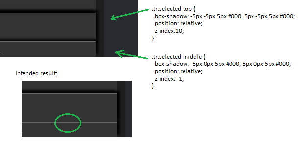
  tr.selected-top {
    box-shadow: -5px -5px 5px #000, 5px -5px 5px #000;
    position: relative;
    z-index:10;
  }
  tr.selected-middle {
    box-shadow: -5px 0px 5px #000, 5px 0px 5px #000;
    position: relative;
    z-index: -1;
  }
这个表只是一个普通的表
<table>
<tr><td>stuff</td></tr>
<tr class="selected-top"><td>highlighting starts</td></tr>
<tr class="selected-middle"><td>highlighting middle</td></tr>
<tr class="selected-bottom"><td>highlighting end</td></tr>
<tr><td>other stuff</td></tr>
</table>
我到底做错了什么?
顺便说一下,我确实尝试过只对中间行的侧面施加阴影,但这样一来阴影就不连续了。
更新了。@Aditya Toke, 像这样: (左边是错误的阴影,右边是正确的阴影)

1个回答
2
投票
投票
你可以通过以下方法来实现 ::before 和 ::after 伪元素用于遮挡 "中间 "行的上下阴影。
伪元素的高度设置正好等于阴影的长度,用于遮挡,并且是绝对位置。
由于影子会遮挡住 selected-bottom 和它的下一个兄弟元素,我们需要将它们添加回来作为。
tr.selected-middle td,
tr.selected-bottom td {
  border-bottom: 1px solid #666;
}
body {
  background-color: #1b1b1b;
  margin: 20px;
}
table {
  font-family: arial, sans-serif;
  border-collapse: collapse;
  width: auto;
  box-sizing: border-box;
  border: none;
  margin: auto;
}

tr { display: block; }
tr, td {
  height: 50px;
  background: #333;
  color: #eee;
}

td {
  padding-left: 16px;
  min-width: 170px;
  width: 100%;
  border-top: 1px solid #666;
}
tr.selected-top {
    position: relative;
    box-shadow: -5px -5px 5px #000, 5px -5px 5px #000;
}
tr.selected-middle {
    position: relative;
    box-shadow: 0px 0px 5px 5px #000;
}
tr.selected-bottom {
    position: relative;
    box-shadow: 5px 5px 5px #000, -5px 5px 5px #000;

}
tr.selected-middle ::before,
tr.selected-middle ::after {
    pointer-events: none;
    position: absolute;
    content:" ";
    background-color: #333;
    left: 0;
    width: 100%;
}
tr.selected-middle ::before {
    height: 10px;
    top: -10px;
}
tr.selected-middle ::after {
    top: calc(100% + 4px);
    height: 5px;
}

tr.selected-middle td,
tr.selected-bottom td {
  border-bottom: 1px solid #666;
}
<table>
<tbody>
<tr>
<td>Some stuffs</td>
</tr>
<tr class="selected-top">
<td>highlighting starts</td>
</tr>
<tr class="selected-middle">
<td>highlighting middle</td>
</tr>
<tr class="selected-bottom">
<td>highlighting ends</td>
</tr>
<tr>
<td>Some stuffs</td>
</tr>
</tbody>
</table>1
投票
投票
table {

  height: 67vh;
    width: 59vw;
    background-color: #333333;
}

td {
/*   background-color: #333333; */
    color: white;
}

div {
  display: flex;
  justify-content: center;
  align-items: center;
}

.div1 {
  box-shadow: -5px -5px 5px #000, 5px -5px 5px #000;
  height: 100%;
  border: 1px solid darkgrey;
  border-left: 0;
  border-right: 0;
}

.div2 {
 box-shadow: -4px 0px 2px 0.5px #000, 2px 0px 0.5px 0.5px #000, 5px 0.5px 3px 0px #000;
  height: 100%;
  border: 1px solid #333333;
}

.div3 {
  box-shadow: -6px 3px 5px #000, 6px 5px 6px 1px #000;
  height: 100%;
  position: relative;
  border: 1px solid darkgrey;
  border-left: 0;
  border-right: 0;
}
<!DOCTYPE html>
<html lang="en">
<body>
<table>
<tr>
<td>stuff</td>
</tr>
<tr class="selected-top">
<td>
<div class="div1">
highlighting starts
</div>
</td>
</tr>
<tr class="selected-middle">
<td>
<div class="div2">
highlighting middle
</div>
</td>
</tr>
<tr class="selected-bottom">
<td>
<div class="div3">
highlighting end
</div>
</td>
</tr>
<tr>
<td>other stuff</td>
</tr>
</table>
</body>
</html>我试着创建类似于你提供的预期输出的东西
最新问题
- 是否可以使用python恢复给定统一差异和原始文本的文本
- 我在 vs 终端中运行 python 代码时遇到问题
- 尝试使用 firebase 身份验证,但不断出现加载资源失败:服务器响应状态为 400 ()
- Cpanel 限制每行字符数
- 将工作表复制到带有模块的新工作簿
- erorr 给我这个错误!代码完整性
- opencv python 稳定的图标识别
- python click 库 - 我如何知道标志是否由用户传递或具有默认值?
- 在组件外部的服务器端 nextjs 上访问 url 参数
- 如何在 bash 中强制执行变量类型?
- MySQL 工作台 AWS EC2
- 从渲染 prop 元素的子元素返回回调
- flutter 国际化未针对其他语言生成
- 宽字符和区域设置
- 想要从 Unity 中导出 SketchUp 支持的 3D 模型
- 输入是否有列表中的内容?
- Mediawiki 可视化编辑器在某些页面上可用,而另一些则不可用
- Commerce JS 将产品变体添加到购物车
- 无限的 Bash 历史记录 [已关闭]
- Blazor 托管 WebAssembly 在 kubernetes 中具有多个副本,导致身份验证问题
© www.soinside.com 2019 - 2024. All rights reserved.