Jetpack Compose:如何将列表项包装在卡片中
问题描述 投票:0回答:3
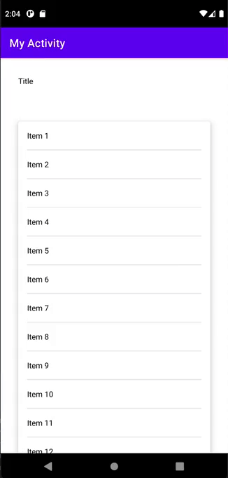
我有一个屏幕,需要在其中显示标题和包含在卡片视图中的项目列表。整个屏幕必须可滚动(如下图所示)。
我知道如何使用可滚动列来做到这一点,但我希望能够使用
LazyColumnitemitems@Composable
fun Screen(
items: List<String>
) {
Column(
Modifier.fillMaxSize()
) {
TopAppBar(title = { Text(text = "My Activity") })
LazyColumn {
// Header
item {
Text("Title", Modifier.padding(32.dp))
}
// I cannot use Box in this way here
Box(Modifier.padding(32.dp)) {
Card {
items(items.size) {
Text("Item $it")
}
}
}
}
}
}
该代码的问题是我无法将列表项包装在卡片视图中,因为
CardLazyListScope3个回答
0
投票
投票
作为解决方法,您可以通过绘制自定义形状来模拟 Card。
它看起来像这样:
sealed class Item
class HeaderItem(...): Item()
class ContentItem(...) : Item()
...
val items: SnapshotStateList<Item> = mutableStateListOf()
...
LazyColumn(
        modifier = Modifier.fillMaxSize(),
    ) {
        itemsIndexed(
            items = state.items,
        ) { index, item ->

            val prevItem = state.items.getOrNull(index - 1)
            val nextItem = state.items.getOrNull(index + 1)

            Column {
                when (item) {
                    is HeaderItem -> Header(item)

                    is ContentItem -> {
                        Box(
                            modifier = Modifier
                                .heightIn(min = 48.dp)
                                .fillMaxWidth()
                                .clip(shape = getShape(prevItem, nextItem, 16.dp))
                                .background(Color.Green.copy(0.3F))
                        ) {
                            Item(item)
                        }
                    }
                }
            }
        }
fun getShape(prevItem: Item?, nextItem: Item?, corner: Dp): Shape {
    return if (prevItem is ContentItem && nextItem is ContentItem) {
        //FLAT
        RectangleShape
    } else if (prevItem !is ContentItem && nextItem !is ContentItem) {
        //ROUNDED_ALL
        RoundedCornerShape(corner)
    } else if (prevItem !is ContentItem) {
        //ROUNDED_TOP
        RoundedCornerShape(topStart = corner, topEnd = corner)
    } else {
        //ROUNDED_BOTTOM
        RoundedCornerShape(bottomStart = corner, bottomEnd = corner)
    }
}
0
投票
投票
我正在寻找相同的内容,但不幸的是找不到解决方案,因此按照 @JanBína 在另一个类似问题下的建议我已经自定义了每个项目卡并获得了所需的输出,代码如下所示
@Composable
fun TransactionItem(
    transaction: Transaction,
    index: Int = 0,
    totalSize: Int = 1,
    onTransactionClicked: (Transaction) -> Unit
) {
    val transactionDateTime = Instant.fromEpochMilliseconds(transaction.date).toLocalDateTime(
        TimeZone.currentSystemDefault()
    )
    val cardMod = Modifier
        .padding(horizontal = 5.dp)
        .padding(bottom = if (index == totalSize - 1) 5.dp else 0.dp)
        .fillMaxWidth()
        .padding(horizontal = 5.dp)

    if (totalSize == 1) {
        cardMod.padding(vertical = 5.dp)
    } else when (index) {
        0 -> cardMod.padding(top = 5.dp)
        totalSize - 1 -> cardMod.padding(bottom = 10.dp)
        else -> cardMod.padding(vertical = 0.dp)
    }

    ElevatedCard(
        onClick = {
            onTransactionClicked(transaction)
        },
        modifier = cardMod,
        shape = when (totalSize) {
            1 -> RoundedCornerShape(15.dp)
            else -> when (index) {
                0 -> RoundedCornerShape(topStart = 15.dp, topEnd = 15.dp)
                totalSize - 1 -> RoundedCornerShape(bottomStart = 15.dp, bottomEnd = 15.dp)
                else -> RoundedCornerShape(0)
            }
        }
    ) {
       ///Item Content goes here
    }
}
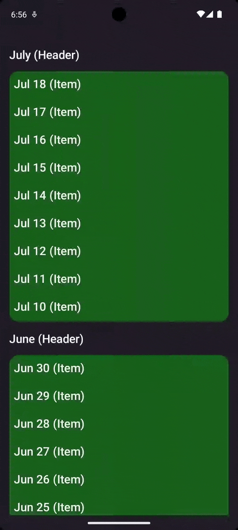
这不是最终的解决方案,我仍在寻找一个可以使用单张卡实现相同效果的解决方案,最终结果如下
-1
投票
投票
你有点混淆了,你应该把
Carditems LazyColumn {
// Header
item {
Text("Title", Modifier.padding(32.dp))
}
items(items.size) {
// You can use Box in this way here
Box(Modifier.padding(32.dp)) {
Card {
Text("Item $it")
}
}
}
}
最新问题
- 使用ag-grid为cellRendererFramework传递多个值?
- PHP exec() 函数和 escapeshellarg 函数仍然允许命令注入
- 如何在SAPUI5中选择合适的快捷键/组合
- 使用 std::vector::insert 将字符串插入 uint8_t 向量中,将随机数据放入其中
- 避免在 React 中状态更改时添加无休止的事件侦听器
- 为什么我的 JavaScript 词法分析器将我的浮点数拆分为标识符和浮点数?
- 在移动设备上上下滚动不起作用我想知道这个代码问题
- Logstash 本地插件安装
- PHP CURL 将 cookie 保存到 cookiejar 中但不使用它
- 删除字符串中的某些字符
- 有没有好的方法在Python中存储非常小的数据?
- Emacs Org-babel 执行 GForth 代码冻结 Emacs
- Upstash 的速率限制器需要 5 秒才能完成 API 调用
- Python Kivy 无法获取窗口提供程序
- 我想知道如何在flutter中缩放子控件
- ERD图中的三元关系
- 出现错误:验证提案时出错:访问被拒绝:通道 [mainchannel] 创建者组织未知,创建者在结构网关 Nodejs 中格式错误
- Composer,捆绑包中哪个版本的 (symfony) 包?
- python pandas groupby 与 min 函数聚合
- Pytube 响应时间太长
© www.soinside.com 2019 - 2024. All rights reserved.