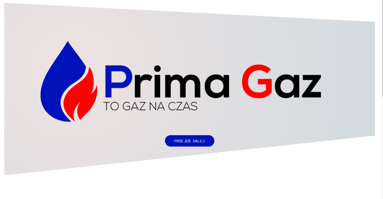
如何使用多边形制作如图所示的背景
问题描述 投票:0回答:1
我想知道如何使用剪辑路径多边形命令制作这样的标题。插入图像会更简单,但我想在 css 中学习和使用动画,我可以做到。
当我尝试不同的方法时,div 相距很远,并且存在各种问题。我会很感激你的建议。
这是我的代码和当前进度
HTML:
<body>
    <header class="header">
      <div class="image"></div>
      <div class="text-box">
        <div class="header-button">
          <a href="#zawartosc" class="btn btn-blue">Przejdź dalej</a>
        </div>
      </div>
    </header>
CSS:
body {
  font-family: "Anonymous Pro", monospace;
  font-weight: 400;
  font-size: 16px;
  line-height: 1, 7;
  color: #777;
  padding: 30px;
}

.header {
  height: 80vh;
  background-image: radial-gradient(
    circle at 18.7% 37.8%,
    rgb(238, 226, 226) 0%,
    rgb(211, 219, 223) 90%
  );

  clip-path: polygon(100% 11%, 100% 77%, 0 100%, 0 0);
  backface-visibility: hidden;
  background-position: top;
  background-size: cover;
  color: black;
  position: relative;
  animation-name: movefromright;
  animation-duration: 1.7s;
  animation-timing-function: ease-out;
}

.image {
  background-image: url(img/logo2.png);
  height: 80vh;
  position: relative;
  background-size: cover;
  background-position: top;
  backface-visibility: hidden;
  animation-name: movefromleft;
  animation-duration: 1.7s;
  animation-timing-function: ease-out;
}
我想要这样的效果
(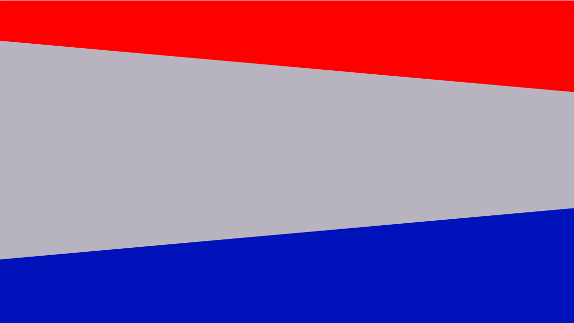
来源:Canva
1个回答
0
投票
投票
因此,我可以采取几种方法来处理这个问题。首先
clip-path第一个片段保持标记不变,并使用
::before::after::before::afterbody {
font-family: "Anonymous Pro", monospace;
font-weight: 400;
font-size: 16px;
line-height: 1, 7;
color: #777;
padding: 30px;
}
.header {
height: 80vh;
position: relative;
}
.header::before {
background-image: linear-gradient(180deg, rgba(255, 0, 0, 1) 0%, rgba(255, 0, 0, 1) 50%, rgba(0, 15, 240, 1) 50%, rgba(0, 15, 240, 1) 100%);
bottom: 0;
color: black;
content: '';
left: 0;
position: absolute;
right: 0;
top: 0;
z-index: -2;
}
.header::after {
animation-name: movefromright;
animation-duration: 1.7s;
animation-timing-function: ease-out;
background-image: radial-gradient( circle at 18.7% 37.8%, rgb(238, 226, 226) 0%, rgb(211, 219, 223) 90%);
backface-visibility: hidden;
bottom: 0;
clip-path: polygon(100% 11%, 100% 77%, 0 100%, 0 0);
content: '';
left: 0;
position: absolute;
right: 0;
top: 0;
z-index: -1;
}
.image {
background-image: url(img/logo2.png);
height: 80vh;
position: relative;
background-size: cover;
background-position: top;
backface-visibility: hidden;
animation-name: movefromleft;
animation-duration: 1.7s;
animation-timing-function: ease-out;
}<header class="header">
<div class="image"></div>
<div class="text-box">
<div class="header-button">
<a href="#zawartosc" class="btn btn-blue">Przejdź dalej</a>
</div>
</div>
</header>第二个片段更改了标记,我推荐这样做。这将允许您将所有内容都放在剪切容器内,并具有蓝色和红色背景。这也让你不必搞乱 z-index 和伪元素。这些都不是坏事,但我认为只包装标题并在那里应用背景会更容易。
被剪裁元素的内容仍然需要适合被剪裁的容器。有几种方法可以解决这个问题。如果将剪切的容器设为同级元素并将其设置为
position: absolute;position: relative;我还注意到,您的
.imagebody {
font-family: "Anonymous Pro", monospace;
font-weight: 400;
font-size: 16px;
line-height: 1, 7;
color: #777;
padding: 30px;
}
header {
background-image: linear-gradient(180deg, rgba(255, 0, 0, 1) 0%, rgba(255, 0, 0, 1) 50%, rgba(0, 15, 240, 1) 50%, rgba(0, 15, 240, 1) 100%);
}
.header-wrapper {
height: 80vh;
background-image: radial-gradient( circle at 18.7% 37.8%, rgb(238, 226, 226) 0%, rgb(211, 219, 223) 90%);
clip-path: polygon(100% 11%, 100% 77%, 0 100%, 0 0);
backface-visibility: hidden;
background-position: top;
color: black;
position: relative;
animation-name: movefromright;
animation-duration: 1.7s;
animation-timing-function: ease-out;
}
.image {
background-image: url(img/logo2.png);
height: 80vh;
position: relative;
background-size: cover;
background-position: top;
backface-visibility: hidden;
animation-name: movefromleft;
animation-duration: 1.7s;
animation-timing-function: ease-out;
}<header>
<div class="header-wrapper">
<div class="image"></div>
<div class="text-box">
<div class="header-button">
<a href="#zawartosc" class="btn btn-blue">Przejdź dalej</a>
</div>
</div>
</div>
</header>在没有看到完整的设计并了解其工作原理的情况下,我不确定能否给您更好的答案,但这应该可以满足您的需求。
最新问题
- 如何在windows下一步创建tar.gz文件?
- 识别 Android 应用程序发布版本中的错误
- 为什么我的BatteryStatusBroadcastReceiver在插拔充电器时频繁显示Toast消息?
- Oracle 中的有效日期检查
- 如何在回车键中获取输入值
- mq_open:参数无效
- SearchReducer,从reduxstore中搜索项目
- Knex 要求安装 sqlite3,但我正在使用 mysql 数据库
- 如何在 Flutter Web 中下载 CSV 并保持跨平台代码?
- Django Scrapy TypeError:RepoSpider.start_requests() 缺少 1 个必需的位置参数:'url'
- 我如何使用 ModelMapper 为相同的源和目标创建两种不同的映射方法
- 如何搜索我在 Laravel Yajra Datatables 中添加的具有关系的列?
- 三角汤中的‘内部最小凹壳’
- 从 ggpattern 创建图例
- 当 minifyEnabled 设置为 true 时,React Native Android 应用程序在发布版本中崩溃
- Bootstrap 折叠使用 css 选择第一个和最后一个子元素
- 看不到drawRect()
- 计算每次获取哈希的字节数
- 将 Java List<POJO> 转换为 Map<String, List<Object>>,其中键是字段名称,值是按字段列出的值列表
- 何时使用 Blazor 自动交互模板?
© www.soinside.com 2019 - 2024. All rights reserved.