Android主题更改复选框项目文本颜色
问题描述 投票:6回答:6
如何在Android Studio styles.xml中更改复选框视图的文本颜色?
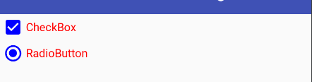
我想创建一个主题,其中所有复选框项都是与默认黑色不同的颜色,如:

除了我希望盒子本身与文本颜色相同。
我应该在我的主题中使用以下内容吗?
<item name="android:checkboxStyle">@style/App_CheckboxStyle</item>
6个回答
投票
我知道很久以前就问过这个问题,但我想补充一下我的解决方案。它适用于所有SDK版本。
你是对的,为了在整个项目中改变CheckBox样式,你必须在你的主题中添加这一行:
<style name="AppTheme" parent="Theme.AppCompat">
    ...
    <item name="android:checkboxStyle">@style/MyCheckBoxStyle</item>
    ...
</style>
还有样式本身,您可以在其中设置自定义文本和复选框颜色:
<style name="MyCheckBoxStyle" parent="Widget.AppCompat.CompoundButton.CheckBox">
    <item name="android:textColor">@android:color/holo_purple</item>
    <item name="buttonTint">@android:color/holo_purple</item>
</style>
注意:android:前缀表示属性链接到SDK属性。如果删除它,该属性将链接到支持库。这就是为什么系统将buttonTint和android:buttonTint视为不同的参数。如果您的最低SDK为21,则无需使用支持库,只需使用android:buttonTint即可。
投票
您可以使用以下命令更改checkbox的颜色:
<item name="colorAccent">@color/green</item>
您可以使用以下命令更改textView中checkbox的颜色:
<item name="android:textColorSecondary">@color/red</item>
例如:
<style name="SampleTheme" parent="Theme.AppCompat">
    <item name="colorAccent">@color/green</item>
    <item name="android:textColorSecondary">@color/red</item>
</style>
否则,如qazxsw poi所述,为自定义颜色创建3个qazxsw poi文件(看看它的第二种方法)。
投票
我的解决方案是使用textColor属性:
xml投票
您可以使用in this answer更改<CheckBox
android:textColor="@color/mycolor"
...
/>
/ android:textColorPrimaryDisableOnly CheckBox和RadioButton以更改drawable
textColorcolorAccent
投票
您可以使用这样的drawable来改变颜色
<style name="AppTheme" parent="Theme.AppCompat.Light.DarkActionBar">
    <item name="colorAccent">#00f</item> <!-- blue -->
    <item name="android:textColorPrimaryDisableOnly">#f00</item> <!-- red -->
</style>
你在布局中只使用按钮属性

投票
在主题级别没有属性对Checkbox文本颜色有影响。
您可以执行的更改文本颜色的方法是定义如下所示的样式,并使用样式属性将其应用于复选框。
<?xml version="1.0" encoding="utf-8"?>
<selector xmlns:android="http://schemas.android.com/apk/res/android">
    <item android:state_checked="true"
        android:drawable="@drawable/cbchk_blue"
        android:state_focused="false">
    </item>
    <item android:state_checked="true"
        android:drawable="@drawable/cbchk_blue"
        android:state_focused="true">
    </item>
    <item android:state_checked="false"
        android:drawable="@drawable/cbunchk_blue"
        android:state_focused="false">
    </item>
    <item android:state_checked="false"
        android:drawable="@drawable/cbunchk_blue"
        android:state_focused="true">
    </item>
</selector>
<CheckBox
        android:layout_width="wrap_content"
        android:layout_height="wrap_content"
        android:button="@drawable/custom_checkbox"
        android:id="@+id/checkBox" />
最新问题
- 获取意外参数:参数中发现意外的密钥“UploadId”,多部分 S3 预签名中出现错误
- 用ggplot2和grid画出最适合的线结束的箭头
- Angular 2+ 中悬停时列表的样式元素
- 通过“import”导入的所有内容都会获得类型,但 require() 不会
- **python3 osmWebWizard.py** 在 Ubuntu 22.04 中无法工作
- 如何使用mysql在codeigniter中计算总计
- MSD 算法输出产生“镜像”输出
- 在 Nuxt 3 中使用可组合项对组件进行 Vitest 单元测试
- Redshift:stv_inflight 和 stv_recents 显示相互矛盾的结果
- 在qmake项目中链接SRT库
- 如何统计嵌套列表中子列表的数量?
- vscode 可以使用 Properties/launchSettings.json 中的配置文件吗?
- 条件格式不起作用,而是格式化所有单元格
- JPA 多个带前缀的嵌入字段?
- Swiper js动画
- 无法绑定多部分标识符“S.clientid”
- DPDK多进程硬件时间戳问题
- Python 在父类静态/类方法中获取子类
- 如何在函数内初始化预先写好的函数?
- 为什么我的主窗口无法在屏幕上正确居中?