HTML 中的透明空心或剪裁形状
问题描述 投票:0回答:8
是否可以仅使用CSS来切出空心圆?
我们都可以做到:

但是我们可以这样做吗?

圆圈必须是空心且透明的。因此,通过在
div8个回答
109
投票
投票
您可以通过两种不同的技术实现透明切出的圆圈:
1.SVG
以下示例使用内联 svg。第一个片段使用 mask 元素 切出透明圆圈,第二个空心圆圈使用 path 元素 制作。圆是用 2 个 arc 命令 :
制作的使用遮罩元素:
body{background:url('https://farm9.staticflickr.com/8760/17195790401_ceeeafcddb_o.jpg');background-size:cover;}<svg viewbox="0 0 100 50" width="100%">
<defs>
<mask id="mask" x="0" y="0" width="80" height="30">
<rect x="5" y="5" width="90" height="40" fill="#fff"/>
<circle cx="50" cy="25" r="15" />
</mask>
</defs>
<rect x="0" y="0" width="100" height="50" mask="url(#mask)" fill-opacity="0.7"/>
</svg>只有一个路径元素:
body{background: url('https://farm9.staticflickr.com/8760/17195790401_ceeeafcddb_o.jpg');background-size:cover;}
svg{
  display:block;
  width:70%;
  height:auto;
  margin:0 auto;
}
path{
  transition:fill .5s;
  fill: rgba(227, 223, 210, .8);
}
path:hover{
  fill:pink;
}
<svg viewbox="-10 -1 30 12">
<path d="M-10 -1 H30 V12 H-10z M 5 5 m -5, 0 a 5,5 0 1,0 10,0 a 5,5 0 1,0 -10,0z"/>
</svg>在这种情况下使用 SVG 的主要优点是:
- 更短的代码
- 您可以轻松使用图像或渐变来填充圆形蒙版
- 保持形状的边界,并仅在尊重蒙版的填充上方触发鼠标事件(将鼠标悬停在示例中的透明剪切圆)
2.CSS仅使用BOX-SHADOWS
创建一个带有
overflow:hidden;div{
position:relative;
width:500px; height:200px;
margin:0 auto;
overflow:hidden;
}
div:after{
content:'';
position:absolute;
left:175px; top:25px;
border-radius:100%;
width:150px; height:150px;
box-shadow: 0px 0px 0px 2000px #E3DFD2;
}
body{background: url('https://farm9.staticflickr.com/8760/17195790401_ceeeafcddb_o.jpg');background-size:cover;}<div></div>浏览器对框阴影的支持是 IE9+ 请参阅 canIuse
同样的方法是使用边框而不是盒子阴影。如果您需要支持不支持框阴影的浏览器(例如 IE8),这很有趣。技术是相同的,但您需要补偿顶部和左侧的值以保持圆位于 div 的中心:
body{
    background: url('https://farm9.staticflickr.com/8760/17195790401_ceeeafcddb_o.jpg');
    background-size:cover;
}
div{
    position:relative;
    width:500px; height:200px;
    margin:0 auto;
    overflow:hidden;
}
div:after{
    content:'';
    position:absolute;
    left:-325px; top:-475px;
    border-radius:100%;
    width:150px; height:150px;
    border:500px solid #E3DFD2;
}<div></div>32
投票
投票
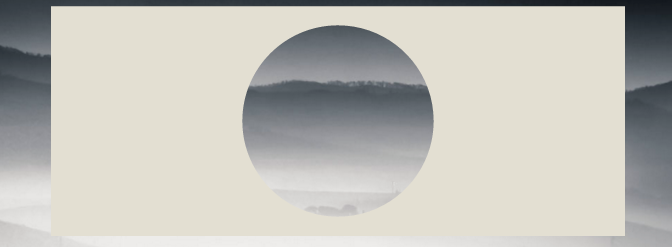
可以使用径向渐变背景和指针事件来完成(以允许鼠标通过圆形层进行交互,例如文本选择)。这是演示页面和屏幕截图:

这就是它的代码:
body {
  margin: 0;
  padding: 0;
}

.underneath {
  padding: 0;
  margin: 265px 0 0 0;
  width: 600px;
}

.overlay {
  top: 0;
  left: 0;
  position: absolute;
  width: 600px;
  height: 600px;
  background: -moz-radial-gradient(transparent 150px, rgba(0, 0, 0, 1) 150px);
  background: -webkit-radial-gradient(transparent 150px, rgba(0, 0, 0, 1) 150px);
  background: -ms-radial-gradient(transparent 150px, rgba(0, 0, 0, 1) 150px);
  background: -o-radial-gradient(transparent 150px, rgba(0, 0, 0, 1) 150px);
  pointer-events: none;
  /* send mouse events beneath this layer */
}
<body>
<p class="underneath">
Lorem ipsum dolor sit amet, consectetur adipisicing elit, sed do eiusmod tempor incididunt ut labore et dolore magna aliqua. Ut enim ad minim veniam, quis nostrud exercitation ullamco laboris nisi ut aliquip ex ea commodo consequat. Duis aute irure dolor
in reprehenderit in voluptate velit esse cillum dolore eu fugiat nulla pariatur. Excepteur sint occaecat cupidatat non proident, sunt in culpa qui officia deserunt mollit anim id est laborum.
</p>
<div class="overlay"></div>
</body>16
投票
投票
参考 web-tiki 的答案,我想补充一点,您始终可以使用
translate(-50%,-50%)borderdiv{
position:relative;
width:500px;
height:200px;
margin:0 auto;
overflow:hidden;
}
div:after{
content:'';
position:absolute;
left:50%;
top: 50%;
transform: translate(-50%,-50%);
border-radius:50%;
width:150px; height:150px;
border: 1000px solid rebeccapurple;
}
body{background: url('https://farm9.staticflickr.com/8760/17195790401_ceeeafcddb_o.jpg');background-size:cover;}<div></div>你可以通过这种技术获得真正的创意:
document.addEventListener( "DOMContentLoaded", function(){
	setInterval(function(){
		if(document.getElementById("moving").style.height === "500px"){
			document.getElementById("moving").style.height = "0px";
		} else {
			document.getElementById("moving").style.height = "500px";
		}
	}, 2000);
});
#container {
width: 500px;
margin: 0 auto;
border: 1px solid black;
overflow:hidden;
position: relative;
}
#circle{
position:relative;
height:150px;
margin:0 auto;
clear:left;
overflow:hidden;
}
#circle::before, #circle::after {
content:'';
border-radius:50%;
position: absolute;
left: 50%;
top: 50%;
transform: translate(-50%,-50%);
}
#circle::before {
height: 140px;
width: 140px;
background: rebeccapurple;
}
#circle::after{
width:150px;
height:150px;
border: 2000px solid rebeccapurple;
}
#line {
margin: 0 auto;
width: 6px;
height: 200px;
position: relative;
}
#line::before, #line::after {
content: " ";
background-color: rebeccapurple;
height: 200px;
width:2000px;
position:absolute;
}
#line::before {
right: 100%;
}
#line::after {
left: 100%;
}
#moving {
height: 0px;
width: 100%;
background: blue;
transition: 2s height;
position: absolute;
top: 0px;
z-index: -1;
}
body{
background: url('https://farm9.staticflickr.com/8760/17195790401_ceeeafcddb_o.jpg');background-size:cover;
}<div id="container">
<div id="circle"></div>
<div id="line"></div>
<div id="circle"></div>
<div id="moving"></div>
</div>6
投票
投票
关于“Pius Nyakoojo”中的“方法1”,稍加改进(见下文)就可以了。我个人认为这是最简单的解决方案:

<html>
<!-- Assuming the stuff to mask is a 100 pixel square -->
<style>
.mask {
    position: absolute;
    top: -50px;                     /* minus half the div size */
    left: -50px;                    /* minus half the div size */
    width: 100px;                   /* the div size */
    height: 100px;                  /* the div size */
    background-color: transparent;
    border-radius: 100px;           /* the div size */
    border: 50px solid white;       /* half the div size */
    pointer-events: none;           /* send mouse events beneath this layer */
}

.stuff {
    position: absolute;
    width: 100px;                   /* the div size */
    height: 100px;                  /* the div size */
    overflow: hidden;               /* hide the excess of the mask border */
    background-color: #CCC;
}
</style>
<body>
    <div class="stuff">
        <div class="mask"></div>
        blah blah blah blah blah
        blah blah blah blah blah
        blah blah blah blah blah
    </div>
</body>
</html>
6
投票
投票
我们可以使用
radial-gradientmask* {
box-sizing: border-box;
}
html,
body {
height: 100%;
}
body {
margin: 0;
background-image: url(https://picsum.photos/id/1060/720/1280);
background-size: cover;
}
.a {
/* this is flexible. you can change */
--circle-radius: 100px;
height: 100%;
width: 100%;
--mask: radial-gradient(circle farthest-side at center center, transparent var(--circle-radius), #000 calc(var(--circle-radius) + 2px) 100%) 50% 50%/100% 100% no-repeat;
-webkit-mask: var(--mask);
mask: var(--mask);
background: #000;
}<div class="a"></div>圆半径也可以是百分比值:
* {
  box-sizing: border-box;
}

html,
body {
  height: 100%;
}

body {
  margin: 0;
  padding: 30px;
  background-image: url(https://picsum.photos/id/1060/720/1280);
  background-size: cover;
}

.a {
  --circle-radius: 20%; /* changed as percent value */

  height: 100%;
  width: 100%;
  --mask: radial-gradient(circle farthest-side at center center, transparent var(--circle-radius), #000 calc(var(--circle-radius) + 2px) 100%) 50% 50%/100% 100% no-repeat;
  -webkit-mask: var(--mask);
          mask: var(--mask);
  background: rgba(0, 0, 0, .8);
}
<div class="a"></div>另一个想法:
* {
  box-sizing: border-box;
}

html,
body {
  height: 100%;
}

body {
  margin: 0;
  background-image: url(https://picsum.photos/id/1060/720/1280);
  background-size: cover;
}

.a {
  --circle-radius: 100px;
  --border-width: 30px;

  height: 100%;
  width: 100%;
  --mask: radial-gradient(circle farthest-side at center center, transparent var(--circle-radius), #000 calc(var(--circle-radius) + 2px) calc(var(--circle-radius) + 2px + var(--border-width)), transparent calc(var(--circle-radius) + 2px + var(--border-width) + 2px) 100%) 50% 50%/100% 100% no-repeat;
  -webkit-mask: var(--mask);
          mask: var(--mask);
  background: #000;
}
<div class="a"></div>反向:
* {
  box-sizing: border-box;
}

html,
body {
  height: 100%;
}

body {
  margin: 0;
  background-image: url(https://picsum.photos/id/1060/720/1280);
  background-size: cover;
}

.a {
  --circle-radius: 100px;
  --border-width: 30px;

  height: 100%;
  width: 100%;
  --mask: radial-gradient(circle farthest-side at center center, #000 var(--circle-radius), transparent calc(var(--circle-radius) + 2px) calc(var(--circle-radius) + 2px + var(--border-width)), #000 calc(var(--circle-radius) + 2px + var(--border-width) + 2px) 100%) 50% 50%/100% 100% no-repeat;
  -webkit-mask: var(--mask);
          mask: var(--mask);
  background: #000;
}
<div class="a"></div>2
投票
投票
方法 1- 首选
<div class="circle"></div>
$radius: 50px;
$thickness: 5px;

.circle {
    width: $radius;
    height: $radius;
    background-color: transparent;
    border-radius: $radius;
    border: $thickness solid gray;
}
方法2
<div class="circle"></div>
$radius: 50px;
$thickness: 5px;

.circle {
  width: $radius;
  height: $radius;
}

.circle::before, .circle::after {
  margin: -2px 0;
}
.circle::before {
    content: '';
    display: inline-block;
    width: $radius;
    height: calc(#{$radius} / 2);
    background-color: transparent;
    border-top-left-radius: calc(#{$radius} / 2);
    border-top-right-radius: calc(#{$radius} / 2);
    border: $thickness solid gray;
    border-bottom: 0;

    -webkit-box-sizing: border-box;
    -moz-box-sizing: border-box;
    box-sizing: border-box;
}

.circle::after {
  content: '';
  display: inline-block;
  width: $radius;
  height: calc(#{$radius} / 2);
  background-color: transparent;
  border-bottom-left-radius: calc(#{$radius} / 2);
  border-bottom-right-radius: calc(#{$radius} / 2);
  border: $thickness solid gray;
  border-top: 0;

  -webkit-box-sizing: border-box;
  -moz-box-sizing: border-box;
  box-sizing: border-box;
}
2
投票
投票
您可以使用 css 遮罩和额外的 svg 图像来完成此操作。
虽然浏览器支持很弱

body {
  background: url(https://data.whicdn.com/images/50959200/original.jpg);
  background-size: cover;
  background-position: center;
}

.circle {
  width: 150px;
  height: 150px;
  background: black;
  border-radius: 50%;
  -webkit-mask: url(https://svgshare.com/i/GLf.svg);
  -webkit-mask-size: 125%; /* change it */
  -webkit-mask-position: center;
  margin: 20px auto;
}
<div class="circle"></div>0
投票
投票
可以将任何空心形状插入到 HTML 页面中,无需嵌入 SVG、嵌入或以其他方式,并且无需渐变。关键是在指定剪辑路径时使用“evenodd”。
与其他解决方案一样,必须关闭指针事件才能允许单击此 div 后面的项目。
截至本文发布时,Safari、移动 Safari、Chrome 和 Android 上的 Chrome 支持此功能。
很简单吧?
.rim {
  width: 100%;
  height: 100%;
  pointer-events: none;
  position: absolute;
  background: #D0C0D0;
  clip-path: path(evenodd, "M 48 130 C 48 121.6 53.01 118 64.7 118 L 255.3 118 C 266.99 118 272 121.6 272 130 L 272 166 C 272 174.4 266.99 178 255.3 178 L 64.7 178 C 53.01 178 48 174.4 48 166 Z M 52 132.4 C 52 124.6 55.7 122 66.8 122 L 253.2 122 C 264.3 122 268 124.6 268 132.4 L 268 163.6 C 268 171.4 264.3 174 253.2 174 L 66.8 174 C 55.7 174 52 171.4 52 163.6 Z");
}
<div class="rim">
</div>最新问题
- Facebook Webhook 测试发送不起作用?
- Java 将十六进制转换为 IEEE 754 32 位值
- 为什么异步代码只能被异步代码调用?
- 释放 12 容量的 Oppo 设备中的日志消息
- 如何使用递归调用的参数包创建递归 C++ 概念
- 将多个模型的扫帚输出转换为回归表
- 如何为多文件夹文件添加gitignore
- 当我将 readonlyrootfilesystem: true 添加到 kubernetes 部署 yaml 时,无法创建 CoreCLR 错误
- 无法安装 SQL Server。退出代码(十进制):-2147467259
- 为什么要在类外部定义运算符 + 或 +=,以及如何正确执行?
- 如何让 grep 仅在整行匹配时才匹配?
- powershell 设置-adcomputer netbootguid
- 为什么无法下载最终版 - image3.png?
- 如何在不扫描数据的情况下覆盖pyspark DataFrame架构?
- 如何使用CSS阻止点击事件?
- 延迟加载名为导入抛出错误“导出错误”
- Java 谓词和函数
- 我可以使用 deref 作为方法链的一部分吗?
- 使用 Analysis for Office 功能时遇到的问题
- PHP/C/C++ - 您的初始注释块在程序中看起来如何?
© www.soinside.com 2019 - 2024. All rights reserved.