如何在盒子及其边框内制作圆角?
问题描述 投票:40回答:8
我想标题有点难以理解,所以我会解释。我想要达到这个效果:
(一个圆角及其边框,也有圆角边框)。
我通过使用background-clip属性设法做到了这一点:
(圆角为边框,但不是内框)
问题是,我怎样才能实现内盒的圆角?
谢谢!
编辑
我正在使用的HTML:
<header class="body template-bg template-border radius-all">
        <nav>
            <ul>
                <li><a href="#">Link 1</a></li>
                <li><a href="#">Link 2</a></li>
                <li><a href="#">Link 3</a></li>
                <li><a href="#">Link 4</a></li>
            </ul>
        </nav>
    </header>
而CSS:
.radius-all {
  border-radius: 10px;
  -moz-border-radius: 10px;
  -webkit-border-radius: 10px;
}

.template-bg {
  background: #FFF;
  -moz-background-clip: padding;
  -webkit-background-clip: padding;
  background-clip: padding-box;
}

.template-border {
  border: 5px solid rgba(255, 255, 255, 0.2);
}
8个回答
投票
内边界计算
首先,您需要删除-vendor-background-clip: padding-box或将它们设置为border-box默认值以实现内边界半径。
内边界半径计算为外边界半径(border-radius)和边界宽度(border-width)之差,使得
inner border radius = outer border radius - border width
每当border-width大于border-radius时,内边界半径为负,你会得到一些尴尬的倒角。目前,我不相信有调整inner-border-radius的属性,所以你需要手动计算它。
在你的情况下:
inner border radius = 6px - 5px = 1px
你的新CSS应该是:
.radius-all { border-radius: 6px; -moz-border-radius: 6px; -webkit-border-radius: 6px; }
.template-bg { background: #FFF; }
.template-border { border: 5px solid rgba(255, 255, 255, 0.2); }
只需从border-radius值(5px)中减去border-width(6px)值,即可获得所需的内边界半径:
代码对我有用
在Firefox 3.x,Google Chrome和Safari 5.0上测试过
 .radius-all { border-radius: 10px; -moz-border-radius: 10px; -webkit-border-radius: 10px; }
.template-bg { background: #FFF; }
.template-border { border: 5px solid rgba(0, 0, 0, 0.2); } /* Note that white on white does not distinguish a border */
在JavaScript中添加颜色叠加层
<script type="text/javascript">
    var bodyBgColor = document.getElementsByTagName('body')[0].style.backgroundColor;;

    // insert opacity decreasing code here for hexadecimal

    var header = document.getElementsByTagName('header')[0];
    header.style.backgroundColor = bodyBgColor;
</script>
我不完全确定如何在JavaScript中进行十六进制算术,但我相信你可以在Google中找到一个算法。
应用一般边界
您是否通过其<div>财产为您的边境使用单独的盒子background?如果是这样,您需要在边框和内框上应用border-radius及其特定于供应商的属性:
<div id="border-box" style="border-radius: 5px;">
    <div id="inner-box" style="border-radius: 5px;">
    </div>
</div>
一种更有效的方法就是让内盒管理自己的边框:
<div id="inner-box" style="border: 4px solid blue; border-radius: 5px">
    <!-- Content -->
</div>
CSS-wise,您可以声明一个.rounded-border类并将其应用于每个具有圆形边框的框:
.rounded-borders {
    border-radius: 5px;
    -moz-border-radius: 5px;
    -webkit-border-radius: 5px;
    -khtml-border-radius: 5px;
}
并将该类应用于任何具有圆形边框的框:
<div id="border-box" class="rounded-borders">
    <div id="inner-box" class="rounded-borders">
    </div>
</div>
对于单个框元素,您仍然需要声明边框大小才能显示:
<style type="text/css">
    #inner-box { border: 4px solid blue; }
</style>

<div id="inner-box" class="rounded-borders">
</div>
投票
另一个解决方案是匹配内部和外部边界与border-radius相结合是使用<spread-radius>属性的box-shadow值“伪造”边界。这会产生一个坚实的阴影,可以很容易地通过常规边框。
例如,要实现4px边框和4px白色边框半径,请尝试以下操作:
/* rounded corners */
-webkit-border-radius: 4px;
-moz-border-radius: 4px;
border-radius: 4px;

/* drop shadow */
-webkit-box-shadow: 0px 0px 0px 4px #fff;
-moz-box-shadow: 0px 0px 0px 4px #fff;
box-shadow: 0px 0px 0px 4px #fff;
如果要为整个容器添加“真实”阴影,可以简单地链接阴影语句,如下所示:
/* drop shadow */
-webkit-box-shadow: 0px 0px 0px 4px rgba(255,255,255,1.0),
        1px 1px 8px 0 rgba(0,0,0,0.4);
-moz-box-shadow: 0px 0px 0px 4px rgba(255,255,255,1.0),
        1px 1px 8px 0 rgba(0,0,0,0.4);
box-shadow: 0px 0px 0px 4px rgba(255,255,255,1.0),
        1px 1px 8px 0 rgba(0,0,0,0.4);
注意:请记住,语句的顺序是它的呈现顺序。
唯一需要注意的是,最初的“人造边框”将与你想要的任何阴影的前X个像素(其中X是边框的宽度)重叠(如果你在它上面使用RGBa不透明度,则会合并)低于100%。)
所以它不会在所有情况下都有效,但它会获得多数。当常规边界不理想时,我经常使用它。
投票
由于没有针对CSS的inner-border-radius这样的东西,浏览器将其默认为border-radius - border-width。如果您不喜欢这样,典型的解决方案是创建两个带边框的div来模仿内边界半径,但此解决方案为html带来了更多设计。如果它是在整个网站中使用的常见边界模板,那也是一种痛苦。
通过使用:after和content: ""生成内部div,我设法想出一种方法来保持它在css中。所以对于你的情况,它将是:
.template-border {
    position: relative;
    border-radius: 5px;
    background-color: #000;
    border: 10px solid #000;
    z-index: -2;
}

.template-border:after {
    content: "";
    display: block;
    position: absolute;
    width: 100%;
    height: 100%;
    border-radius: 5px;
    background-color: #FFF;
    z-index: -1;
}
投票
根据Leo Wu的想法,这是我的解决方案:
.my-div
{
  background-color: white;
  border: solid 20px black;
  border-radius: 10px;
  box-shadow: 0 0 10px black;
  height: 100px;
  left: 30px;
  position: relative;
  top: 20px;
  width: 200px;
}
.my-div:before
{
  background-color: white;
  border-radius: 5px;
  content: "";
  display: block;
  height: calc(100% + 20px);
  left: -10px;
  position: absolute;
  top: -10px;
  width: calc(100% + 20px);
  z-index: 1;
}
.some-content
{
  height: calc(100% + 20px);
  left: -10px;
  position: relative;
  top: -10px;
  width: calc(100% + 20px);
  z-index: 3;
}
.some-header
{
  background-color: green;
  border-radius: 5px 5px 0 0;
  height: 30px;
}
<html>
<body>
<div class="my-div">
<div class="some-content">
<div class="some-header">my title</div>
<div>some other content</div>
</div>
</div>
</body>
</html>投票
你需要有两个div元素,一个在另一个内部,并使用跨浏览器圆角css,如下所示:
.small-rounded {
    border: 1px solid ##000;
    -moz-border-radius-topleft: 5px; -webkit-border-top-left-radius: 5px;
    -moz-border-radius-topright: 5px; -webkit-border-top-right-radius: 5px;
    -moz-border-radius-bottomleft: 5px; -webkit-border-bottom-left-radius: 5px;
    -moz-border-radius-bottomright: 5px; -webkit-border-bottom-right-radius: 5px;
    border-radius: 5px;
}
投票
问题不在于CSS的编码,而在于圆的数学。基本上你的border-inner-radius(我知道这个属性不存在)等于border-radius - border-width。
很简单地计算出你想要的内半径,然后添加边框的宽度以达到预期的效果。
border-inner-radius border-width + = border-radius
投票
在开始查看曲线之前,需要将border-radius设置为大于border-width的值。设置边界半径+ 1px大于border-width不是一个公式。但是,肯定会是一个积极的价值。您需要在不同的浏览器中进行实验,直到您看到可能在大多数浏览器中运行良好的最小边界半径值。 (有些浏览器可能不支持此功能。)例如,在Google Chrome中,我将边框宽度设置为10px,但在开始看到内边框曲线的外观之前,必须将border-radius设置为13px,而15px工作得更好。
投票
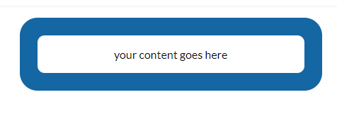
以防万一有人谷歌搜索这个答案并被送到这里,这是一个简单,容易的方法来做到这一点......
示例HTML ...
<div class="wrapper">
    <div class="content">
        your content goes here
    </div>
</div>
示例CSS ...
.wrapper {
    border-radius: 25px;
    border: solid 25px blue;
    background-color: blue;
}
.content {
    border-radius: 10px;
    background-color: white;
}
......很快。
最新问题
- 在 laravel jetstream 中按个人资料图片对成员进行分组
- JCE 无法验证提供商 BC (bcprov-jdk18on-177.jar)
- 使用 plm 包的 R 中的 HAC 标准错误?
- 复制子类的抽象函数的正确返回类型
- AttributeError:模块“cv2”没有属性“VideoCapture”
- 将单封电子邮件中的整行发送给不同的电子邮件收件人
- 如何在Workbench中运行多个查询?
- Python Dash:如何将回调期间生成的 HTML 代码添加到布局?
- OAuth (Microsoft) - 使用云服务中可信网络内创建的令牌
- R 中带百分比的 gglikert 图
- 如何在导航到第一个屏幕后从 StackNavigator 历史记录中销毁 3 个屏幕?
- 如何使用数据中没有的值作为 xticks?
- 如何将大型 .zip 文件从 Azure Blob 存储直接流式传输到浏览器?
- 如何从 contact-flow-module 向 contact Flow 传递输入参数并获取输出参数
- 如何连接表和可选择的存储过程过滤某些行?
- 如何通过 SSL 解决与 npm 服务器的通信问题?
- FluentValidation 规则链不会在第一次失败时停止
- 雪花中多列的自动增量值
- Alan AI 未安装在 React Native 中
- Swift 应用程序在运行 Firebase 2 秒后崩溃