如何在 Jetpack Compose 中添加虚线边框?
问题描述 投票:0回答:4
我可以使用
Modifier.border()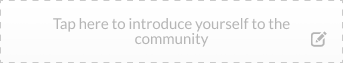
4个回答
57
投票
投票
Modifier.border()但是,您可以使用
DrawScopePath 绘制虚线 PathEffect.dashPathEffect。
类似:
val stroke = Stroke(width = 2f,
    pathEffect = PathEffect.dashPathEffect(floatArrayOf(10f, 10f), 0f)
)
drawBehindBox(
Modifier
.size(250.dp,60.dp)
.drawBehind {
drawRoundRect(color = Color.Red, style = stroke)
},
contentAlignment = Alignment.Center
) {
Text(textAlign = TextAlign.Center,text = "Tap here to introduce yourseft")
}

如果你想要圆角,只需使用
cornerRadiusdrawRoundRectdrawRoundRect(color = Color.Red,style = stroke, cornerRadius = CornerRadius(8.dp.toPx()))

如果您愿意,可以使用上面相同的代码构建您的自定义
Modifierfun Modifier.dashedBorder(strokeWidth: Dp, color: Color, cornerRadiusDp: Dp) = composed(
factory = {
val density = LocalDensity.current
val strokeWidthPx = density.run { strokeWidth.toPx() }
val cornerRadiusPx = density.run { cornerRadiusDp.toPx() }
this.then(
Modifier.drawWithCache {
onDrawBehind {
val stroke = Stroke(
width = strokeWidthPx,
pathEffect = PathEffect.dashPathEffect(floatArrayOf(10f, 10f), 0f)
)
drawRoundRect(
color = color,
style = stroke,
cornerRadius = CornerRadius(cornerRadiusPx)
)
}
}
)
}
)
然后应用它:
Box(
    Modifier
        .size(250.dp,60.dp)
        .dashedBorder(1.dp, Red, 8.dp),
    contentAlignment = Alignment.Center
) {
    Text(
        text = "Tap here to introduce yourself",
        textAlign = TextAlign.Center,
    )
}
16
投票
投票
在对正常边框修改器进行一番挖掘后,我发现它使用 Stroke 对象,该对象可以接受一个参数 PathEffect ,可以使其成为虚线,这里是接受此参数的正常边框函数的修改版本。
https://gist.github.com/DavidIbrahim/236dadbccd99c4fd328e53587df35a21
14
投票
投票
我为修改器编写了这个扩展,您可以简单地使用它或修改它。
fun Modifier.dashedBorder(width: Dp, radius: Dp, color: Color) =
    drawBehind {
        drawIntoCanvas {
            val paint = Paint()
                .apply {
                    strokeWidth = width.toPx()
                    this.color = color
                    style = PaintingStyle.Stroke
                    pathEffect = PathEffect.dashPathEffect(floatArrayOf(10f, 10f), 0f)
        }
        it.drawRoundRect(
            width.toPx(),
            width.toPx(),
            size.width - width.toPx(),
            size.height - width.toPx(),
            radius.toPx(),
            radius.toPx(),
            paint
        )
    }
}
0
投票
投票
@Composable
private fun AddNewFileButton(
    modifier: Modifier = Modifier,
    onClick: () -> Unit,
) {
    val stroke = Stroke(
        width = 4f,
        pathEffect = PathEffect.dashPathEffect(floatArrayOf(10f, 10f), 0f)
    )

    Box(
        modifier = modifier
            .drawBehind {
                drawRoundRect(
                    color = Color.Blue,
                    style = stroke,
                    cornerRadius = CornerRadius(16.dp.toPx())
                )
            }
            .clip(RoundedCornerShape(16.dp))
            .clickable { onClick() },
    ) {
        Row(
            modifier = modifier.padding(16.dp),
            horizontalArrangement = Arrangement.Center
        ) {
            Text(
                text = "Add new item"
            )
        }
    }
}

最新问题
- 使用 HtmlAgilityPack 运行 C# .NET 控制台应用程序来抓取网页并循环似乎会产生内存泄漏。问题出在哪里?
- 如何在Java中使绘制的图像透明
- 从类对象获取实体名称
- 如何在我的 CMake 项目中自动应用 include-what-you-use 的建议?
- sed 删除字符串中的值的 bash 公式
- 将图像包裹在圆柱体上
- 是否可以创建 Mac OS 特定的 CSS 来修复字体差异?
- MySQL 使用 MAX() 进行 GROUP BY 排序返回格式错误的数据
- 是否可以在 useReducer 中更新状态
- 有没有办法从本地机器访问host.docker.internal?
- Spring Batch FlatFileItemWriter - 输出定制
- 如何节省Android手机的电池寿命?
- 我正在尝试创建一个图像库作为 Umbraco 13 中的阻止列表项目
- 使用常规和“负”边界全面实现特征
- RangeQuery include_lower 和 include_upper 在 Elasticsearch Java API 客户端中替代
- 查找文件名是否包含某个(文章编号)字符串
- Selenium 上无法根据 select 的文本选项定位元素的解决方案
- psycopg2.errors.UndefinedTable:关系“mydjangoapp_mymodel”不存在
- PowerShell:使用 $_.FullName.Replace 重命名多个文件夹
- 如何使用reportlab添加指向PDF中对象的链接?
© www.soinside.com 2019 - 2024. All rights reserved.