在QToolBar后面显示QWidgets
问题描述 投票:0回答:1
我尝试使用标题栏中的透明QToolBar创建应用程序。通过使用一些Objective-C,可以对窗口本身进行一些修改。同样,setUnifiedTitleAndToolBarOnMac()看起来也和我想要的一样。现在有一个问题。我想稍后再添加QGridLayout。就像在iPadOS上的新“照片”应用程序中一样,我希望小部件位于工具栏后面。通过设置QToolBar的样式可能可以实现透明样式(但这是我可以解决的问题)。我的问题是,现在有没有办法重叠两个小部件或将小部件发送到其他任何小部件之后?我也可以使用QVBoxLayout,但是我不知道如何在其他任何小部件(或布局)后面设置一些小部件。
我试图实现的目标是:

我目前的做法是:
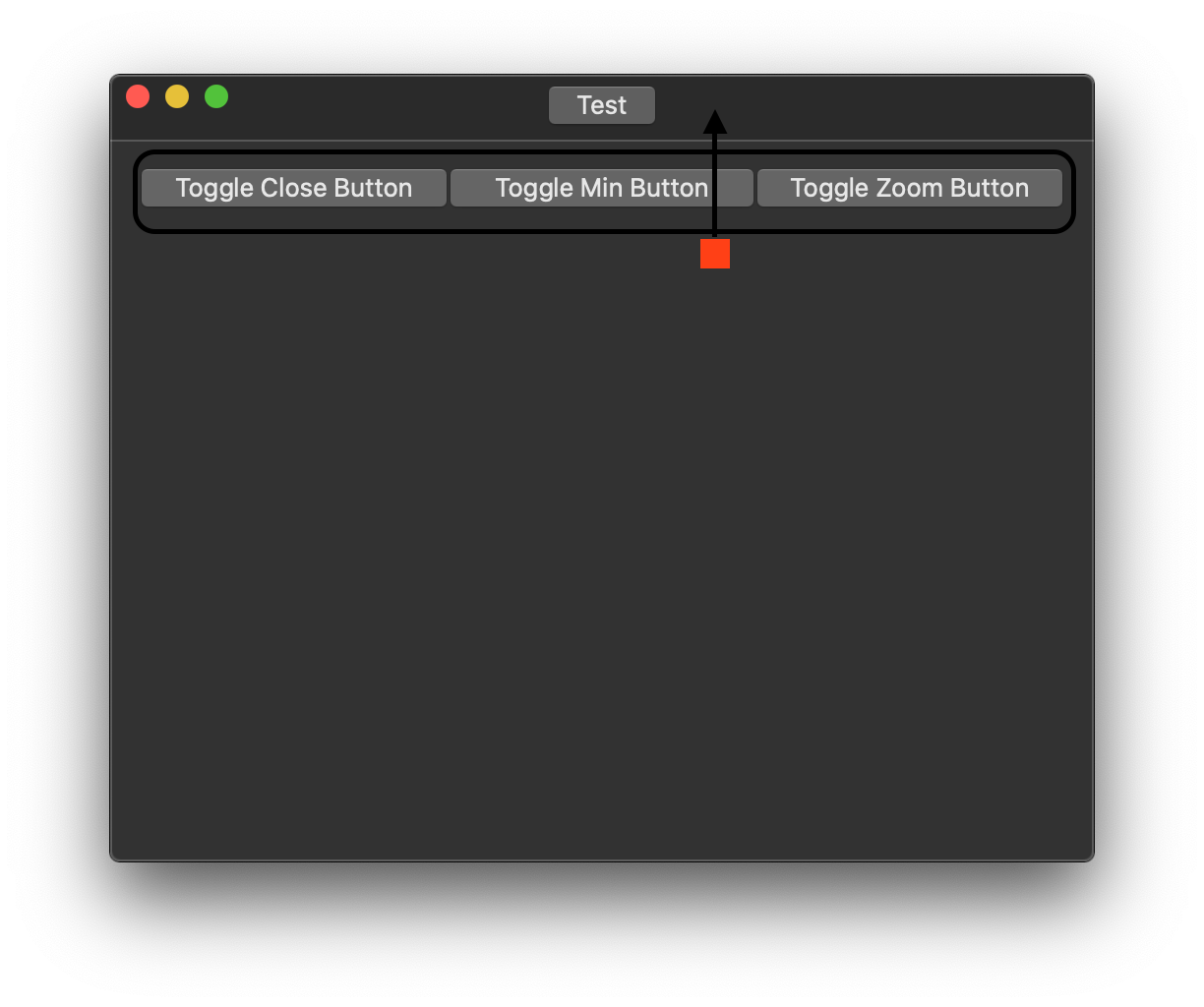
我听说过stackUnder(),但这不起作用。
希望我的问题清楚,这是我第一次在这里发帖。
谢谢!
编辑:
QToolBar *tabBar = new QToolBar(this);
tabBar->setMovable(false);
tabBar->setFloatable(false);
addToolBar(tabBar);
this->setUnifiedTitleAndToolBarOnMac(true);
QPushButton *tabBtn = new QPushButton("Test", this); // simulates our iPadOS tab control
QWidget *spaceLeft = new QWidget(this);
QWidget *spaceRight = new QWidget(this);
spaceLeft->setSizePolicy(QSizePolicy::Expanding, QSizePolicy::Preferred);
spaceRight->setSizePolicy(QSizePolicy::Expanding, QSizePolicy::Preferred);
tabBar->addWidget(spaceLeft);
tabBar->addWidget(tabBtn);
tabBar->addWidget(spaceRight);

ui->toggleMin->stackUnder(tabBar);
这三个按钮使用QtDesigner / .ui!
1个回答
投票
这里是一个管理覆盖层QWidget的通用容器QWidget的示例,在这种情况下它是工具栏样式的小部件(但实际上可以是任何东西)。对于一个简单的示例,该代码有点冗长,但是它试图涵盖一些不同的用例,以使容器更加灵活。覆盖小部件可以是QToolBar,但不一定必须是。
这里的主要技术是,覆盖小部件未放置在布局中,而是由父小部件“手动”管理其几何形状(请参见代码中的positionToolbar())。每当容器或覆盖层的大小发生变化时,都需要重新调整此几何形状。为此,最方便的“挂钩”是我们在示例中重新实现的QWidget::resizeEvent()方法。我们还监视覆盖小部件的尺寸变化,例如。添加/删除子项或修改其样式时。
一个不同的方向可能是编写一个自定义的QLayout子类,该子类实际上执行相同的操作(在QLayoutItem::setGeometry()覆盖中)。因为它可以在任何小部件中使用或用作子布局,所以它会更复杂一些,但也更加灵活。
#include <QEvent>
#include <QPointer>
#include <QToolBar>
#include <QWidget>

class ToolbarOverlayWidget : public QWidget
{
    Q_OBJECT
  public:
    ToolbarOverlayWidget(QWidget *parent = nullptr) :
      QWidget(parent)
    {
      // WA_LayoutOnEntireRect will ensure that any QLayout set on this widget will ignore
      // QWidget::contentsMargins(), which allows us to use them for toolbar margins/positioning
      // instead. This does not affect any layout()->contentsMargins() which can still be used
      // to pad anything the main layout itself contains.
      setAttribute(Qt::WA_LayoutOnEntireRect);
      // create a default toolbar
      setToolbar(new QToolBar(this));
    }

    ~ToolbarOverlayWidget() override
    {
      // don't delete the toolbar widget if we don't own it
      if (m_toolbar && !m_ownTbWidget)
        m_toolbar->setParent(nullptr);
    }

    // Returns toolbar widget instance as a QToolBar.
    // Returns nullptr if no toolbar widget is set, or widget does not inherit QToolBar.
    QToolBar *toolbar() const { return qobject_cast<QToolBar*>(m_toolbar.data()); }

    // Set a widget to be used as a toolbar. ToolbarOverlayWidget takes ownership of toolbar.
    void setToolbar(QWidget *toolbar)
    {
      // dispose of old toolbar?
      if (m_toolbar) {
        m_toolbar->removeEventFilter(this);
        m_toolbar->disconnect(this);
        if (m_ownTbWidget)
          m_toolbar->deleteLater();
        else
          m_toolbar->setParent(nullptr);
        m_toolbar.clear();
      }
      if (!toolbar)
        return;

      m_toolbar = toolbar;
      // toolbar's parent should be this widget, also keep track of if we owned it originally
      m_ownTbWidget = (m_toolbar->parent() == this);
      if (!m_ownTbWidget)
        m_toolbar->setParent(this);

      m_toolbar->setAutoFillBackground(true);  // ensure default background if otherwise unstyled
      m_toolbar->installEventFilter(this);     // see eventFilter()
      if (QToolBar *tb = qobject_cast<QToolBar*>(toolbar)) {
        // reposition toolbar if icon size or button style change
        connect(tb, &QToolBar::iconSizeChanged,        this, [this](const QSize &) {
          positionToolbar(); });
        connect(tb, &QToolBar::toolButtonStyleChanged, this, [this](Qt::ToolButtonStyle) {
          positionToolbar(); });
      }
      if (isVisible())
        positionToolbar();
    }

    QSize sizeHint() const override
    {
      if (m_toolbar.isNull())
          return QWidget::sizeHint();
      // ensure a reasonable size hint if we have a toolbar which is larger than any contents
      return QWidget::sizeHint().expandedTo(m_toolbar->sizeHint());
    }

  protected:
    void resizeEvent(QResizeEvent *e) override
    {
      QWidget::resizeEvent(e);
      // keep the toolbar properly positioned
      positionToolbar();
    }

    // filter is installed on the toolbar widget
    bool eventFilter(QObject *w, QEvent *e) override
    {
      if (!m_toolbar.isNull() && w == m_toolbar) {
        switch (e->type()) {
          // reposition the toolbar if its size hint (possibly) changed
          case QEvent::ChildAdded:
          case QEvent::ChildRemoved:
          case QEvent::StyleChange:
          case QEvent::FontChange:
            if (isVisible())
              positionToolbar();
            break;

          default:
            break;
        }
      }
      return QWidget::eventFilter(w, e);
    }

  private slots:
    // Keep the toolbar properly positioned and sized
    void positionToolbar() const
    {
      if (m_toolbar.isNull())
        return;

      const QRect rect = contentsRect();  // available geometry for toolbar
      QRect tbRect(rect.topLeft(), m_toolbar->sizeHint());  // default TB position and size
      // expand to full width?
      if (m_toolbar->sizePolicy().expandingDirections() & Qt::Horizontal)
        tbRect.setWidth(rect.width());
      // constrain width if it is too wide to fit
      else if (tbRect.width() > rect.width())
        tbRect.setWidth(rect.width());
      // otherwise center the toolbar if it is narrower than available width
      else if (tbRect.width() < rect.width())
        tbRect.moveLeft(rect.x() + (rect.width() - tbRect.width()) / 2);

      // constrain height
      if (tbRect.height() > rect.height())
        tbRect.setHeight(rect.height());

      // Set position and size of the toolbar.
      m_toolbar->setGeometry(tbRect);
      // Make sure the toolbar stacks on top
      m_toolbar->raise();
    }

  private:
    QPointer<QWidget> m_toolbar;
    bool m_ownTbWidget = true;
};
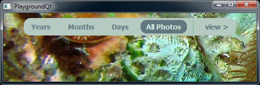
实施示例:显示了两个样式选项,均使用CSS。在第一种情况下,工具栏为最小宽度,并在可用区域中居中;在第二种方式中,工具栏的样式为全宽,具有居中按钮和部分透明的背景。第二个版本使用普通的QWidget而不是QToolBar,因为它的样式更加灵活(QToolBar有一些“怪癖”可以很好地表达出来)。
main.cpp
int main(int argc, char *argv[])
{
  QApplication a(argc, argv);

  // Use a stack widget as top-level for demo. This will have two pages.
  QStackedWidget stack;
  stack.resize(640, 480);

  // common style for tool buttons
  const QString commonCss(QStringLiteral(
    "QToolButton {"
    "  font: bold normal large sans-serif;"
    "  font-size: 14px;"
    "  color: #62777F;"
    "  background: transparent;"
    "  border-radius: 12px;"
    "  padding: 3px 6px 4px;"
    "}"
    "QToolButton:checked, QToolButton:hover {"
    "  color: #D5F2E5;"
    "  background-color: #62777F;"
    "}"
    "QToolButton:pressed { background-color: #72AF95; }"
  ));

  // creates a new ToolbarOverlayWidget holding one scalable image label
  auto imageWidget = [&stack](const QString &img) {
    ToolbarOverlayWidget *w = new ToolbarOverlayWidget(&stack);
    w->setLayout(new QVBoxLayout);
    w->layout()->setContentsMargins(0,0,0,0);
    QLabel *lbl = new QLabel(w);
    lbl->setPixmap(QPixmap(img));
    lbl->setScaledContents(true);
    lbl->setMinimumSize(160, 120);
    w->layout()->addWidget(lbl);
    return w;
  };

  // Page 1: The first stack page uses a default QToolBar, which is simpler but less flexible.
  {
    ToolbarOverlayWidget *widget = imageWidget("../../images/image1.jpg");
    // Set toolbar appearance
    widget->setContentsMargins(0, 10, 0, 0);  // 10px above toolbar, works better than CSS margin
    widget->toolbar()->setStyleSheet(commonCss + QLatin1String(
      "QToolBar {"
      "  background: #B5CAC1;"
      "  border-radius: 14px;"
      "  padding: 4px;"    // can only set one padding for all sides of a qtoolbar
      "  spacing: 12px;"   // between items
      "}"
      "QToolBar::separator { width: 1px; background-color: #72AF95; }"
    ));

    // Add items to toolbar

    QActionGroup *viewGrp = new QActionGroup(widget);
    auto addViewAction = [viewGrp, widget](const QString &ttl, bool chk = false) {
      QAction *act = widget->toolbar()->addAction(ttl);
      act->setCheckable(true);
      act->setChecked(chk);
      viewGrp->addAction(act);
      return act;
    };

    addViewAction("Years");
    addViewAction("Months");
    addViewAction("Days");
    addViewAction("All Photos", true);
    widget->toolbar()->addSeparator();
    // page stack "push" action
    QObject::connect(widget->toolbar()->addAction("view >"), &QAction::triggered, [&stack]() {
      stack.setCurrentIndex(1);
    });

    stack.addWidget(widget);
  }

  // Page 2: This page uses a plain widget for a toolbar.
  {
    ToolbarOverlayWidget *widget = imageWidget("../../images/image1.jpg");
    // Create a custom toolbar-style widget
    QWidget *toolbar = new QWidget(widget);
    toolbar->setLayout(new QHBoxLayout);
    toolbar->layout()->setContentsMargins(3, 14, 3, 28);
    toolbar->layout()->setSpacing(18);
    toolbar->setSizePolicy(QSizePolicy::Expanding, QSizePolicy::Minimum);
    toolbar->setObjectName("ToolbarWidget");
    toolbar->setStyleSheet(commonCss + QLatin1String(
      "#ToolbarWidget {"
      "  background: qlineargradient(x1:0, y1:0, x2:0, y2:1, stop: 0 black, stop: 1 transparent);"
      "}"
      "QToolButton {"
      "  color: #D5F2E5;"
      "  background-color: #62777F;"
      "}"
      "QToolButton:checked, QToolButton:hover:!pressed {"
      "  color: #62777F;"
      "  background-color: #D5F2E5;"
      "}"
    ));

    // Add items to toolbar

    auto addButton = [toolbar](const QString &ttl, QLayout *lo, bool chk = false) {
      QToolButton *tb = new QToolButton(toolbar);
      tb->setText(ttl);
      tb->setCheckable(chk);
      lo->addWidget(tb);
      return tb;
    };

    // left expander to keep buttons centered
    toolbar->layout()->addItem(new QSpacerItem(0, 0, QSizePolicy::Expanding, QSizePolicy::Ignored));
    // page stack "pop" action
    QObject::connect(addButton("< back", toolbar->layout()), &QToolButton::clicked, [&stack]() {
      stack.setCurrentIndex(0);
    });
    addButton("Adjust", toolbar->layout());
    addButton("Select", toolbar->layout(), true);
    // zoom buttons, new sub-layout w/out spacing
    QHBoxLayout *zoomBtnLayout = new QHBoxLayout;
    zoomBtnLayout->setSpacing(0);
    const QString zoomCss =
        QStringLiteral("QToolButton { border-top-%1-radius: 0; border-bottom-%1-radius: 0; }");
    addButton("-", zoomBtnLayout)->setStyleSheet(zoomCss.arg("right"));
    addButton("+", zoomBtnLayout)->setStyleSheet(zoomCss.arg("left"));
    toolbar->layout()->addItem(zoomBtnLayout);

    // right expander to keep buttons centered
    toolbar->layout()->addItem(new QSpacerItem(0, 0, QSizePolicy::Expanding, QSizePolicy::Ignored));

    // Use the custom widget as toolbar
    widget->setToolbar(toolbar);
    stack.addWidget(widget);
  }

  stack.show();
  return a.exec();
}
#include "main.moc"
最新问题
- pyplot 图中缺少时间戳
- 我的 df 在 pandas 中的对角平均计算
- “java.lang.TypeNotPresentException:类型 org.hibernate.SessionFactory 不存在”
- Node.js 中的 SerialPort 问题:“资源暂时不可用,无法锁定端口”
- 在open-api-maven-plugin中,生成客户端jar时如何标记特定参数不生成?
- 如何使用 Python 将 API 连接从 Azure 中的资源组 A 移动到资源组 B?
- For 循环超过 ubound 设置限制
- 如何使用 PDFSharp 向现有 PDF 添加文本
- 使用 onYouTubeIframeAPIReady() 加载两个 YouTube 视频
- Coccinelle 没有做任何改变
- “Streamlit 中的文本输入在按下 Enter 键后会删除输入的文本:如何修复?”
- 定期快照表设计
- Microsoft Azure 在 x 分钟后运行功能
- [PHP]倒计时特定日期的特定时间
- 如何将MSSQL中的数据导出数据库?
- 我正在实施 SecurityFilterChain 并将其设置为只有管理员才能访问。当我使用管理员登录时,不允许我访问
- 重新安装两次后,Node JS 安装配置错误。 (Windows 11)
- Mapstruct List to List:映射元素列表位置
- 添加基于日期比较的新索引列
- 嗨,我有 WordPress 革命滑块错误未捕获的类型错误:无法读取未定义的属性“is_mobile”