对齐中心CSS中的单个列表项
问题描述 投票:0回答:3
我在Reactjs中创建了一个带有四个元素的导航栏。这些项是一个简单的无序列表,其中一些css使用flexbox来对齐它们。
<ul>
    <li>One</li>
    <li>Two</li>
    <li>Three</li>
    <li>Four</li>
<ul/>
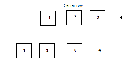
我想要实现的是:当选择列表项时,将所选列表项对齐到中心。我添加了专业图片以便澄清。稍后将对此更改进行动画处理,以实现平滑过渡,如旋转木马。
以下是<ul>标签的css。
ul {
    list-style-type: none;
    display: flex;
    flex-direction: row;
    flex-wrap: nowrap;
    justify-content: center;
}
我试过的是在align-self: center项目中使用<li>,但没有运气。
做有类似事情的人有没有经验?我对所有类型的解决方案都是开放的,即使是那些不使用flexbox的解决方案。
谢谢!
3个回答
2
投票
投票
列表元素是否已固定,您知道有多少项吗?如果是这样,您可以计算列表的中心,项目偏移量,并添加CSS变换。
例:
- 您有四个项目的列表。
- 每个项目的宽度等于100px。
- 因此列表的总宽度为400px。
- 列表的中心点距离左侧200px。
- 项目编号2的中心点距离左侧150px。因此,我们必须从左侧移动列表200px - 150px = 50px。
- 项目编号4的中心点距离左侧350px。因此,我们必须从左侧移动列表200px - 350px = -150px。
如果您的列表是动态的,无论是关于列表长度还是项目宽度,您都可以使用Element.getBoundingClientRect()查找元素的尺寸,并使用与上面相同的计算。
Codepen:https://codepen.io/anon/pen/vjJMVL
HTML:
<ul class="selected-2">
  <li>1</li>
  <li class="selected">2</li>
  <li>3</li>
  <li>4</li>
</ul>

<ul class="selected-4">
  <li>1</li>
  <li>2</li>
  <li>3</li>
  <li class="selected">4</li>
</ul>
CSS:
ul {
  display: flex;
  justify-content: center;
  list-style: none;
}

li {
  width: 80px;
  height: 80px;
  background-color: #eee;
  margin: 10px;
}

.selected {
  background-color: #ccc;
}

.selected-2 {
  transform: translateX(50px)
}

.selected-4 {
  transform: translateX(-150px)
}
1
投票
投票
计算点击的<MenuItem>中心,使用Element.getBoundingClientRect()得到它的left和width,然后传递给父母(<Menu>)。在父母使用<ul>s参考获得它的left和宽度与Element.getBoundingClientRect()。计算moveTo状态,并相应地更新<ul>s样式transform: translateX():
const { Component } = React;
const items = ['One', 'Two', 'Three', 'Four'];

class MenuItem extends Component {
  clickHandler = (e) => {
    const { left, width } = e.target.getBoundingClientRect();
    const itemCenter = left + width / 2;
    this.props.updateCenter(itemCenter);
  }

  render() {
    const { children } = this.props;

    return (
      <li onClick={this.clickHandler}>{children}</li>
    );
  }
}

class Menu extends Component {
  state = {
    moveTo: 0
  };

  updateCenter = (itemCenter) => {
    const { left, width } = this.ul.getBoundingClientRect();

    //this.ul.style.transform = `translateX(${center}px)`;

    this.setState(() => ({
      moveTo: left + width / 2 - itemCenter
    }));
  };

  render() {
    const { items } = this.props;
    const { moveTo } = this.state;

    return (
      <nav>
        <ul ref={(ul) => this.ul = ul} style={{
          transform: `translateX(${moveTo}px)`
        }}>
        {
          items.map((text) => (
            <MenuItem key={text}
              updateCenter={this.updateCenter}>
              {text}
            </MenuItem>
          ))
        }
        </ul>
      </nav>
    );
  }
}

ReactDOM.render(
  <Menu items={items} />,
  demo
);
/** demo only - display the center **/
body::before {
position: absolute;
left: 50%;
height: 100vh;
border-right: 1px solid black;
content: '';
}
nav {
overflow: hidden;
}
ul {
list-style-type: none;
display: flex;
flex-direction: row;
flex-wrap: nowrap;
justify-content: center;
transition: transform 0.5s cubic-bezier(0.175, 0.885, 0.32, 1.275);
}
li {
padding: 1em;
border: 1px solid black;
cursor: pointer;
}
ul li:not(:last-child) {
margin: 0 1em 0 0;
}<script crossorigin src="https://unpkg.com/react@16/umd/react.development.js"></script>
<script crossorigin src="https://unpkg.com/react-dom@16/umd/react-dom.development.js"></script>
<div id="demo"></div>0
投票
投票
因为我没有完全得到你想要的东西,这是我能想到的最好的,将绝对定位应用于所选择的一个并使其与z-index重叠
document.querySelectorAll('li').forEach(function(li){
	li.addEventListener('click',function(e){
		document.querySelectorAll('li').forEach(function(obj){
			obj.classList.remove('selected');
		});
		e.target.classList.add("selected");
	});
});
ul {
list-style-type: none;
display: flex;
flex-direction: row;
flex-wrap: nowrap;
justify-content: center;
}
li{
border:1px solid;
padding:10px;
cursor:pointer;
position:relative;
transition:all ease 1s;
margin:0 20px;
}
.selected{
transform:scale(2.1);
background:white;
box-shadow:0px 0px 55px black;
position:absolute;
z-index:5;
}<ul>
<li>One</li>
<li>Two</li>
<li>Three</li>
<li>Four</li>
</ul>最新问题
- 为什么我的 R 图没有显示完整的 y 轴?
- Azurite 模拟器和 Blob 存储的性能似乎随着时间的推移而下降的原因是什么?
- 为什么这个js代码函数要这样写?
- Xcode 找不到任何与 [bundle ID] 匹配的 iOS App Store 配置文件
- Flutter GetX 封装同页过渡问题
- 当 VPN 开启时,Liquibase 读取超时从本地主机更新到 Docker 容器中的数据库
- 使用 SAP CDS 视图根据 FlightDate 查找最繁忙的 CarrierId
- 如何使一组元素表现得像字符串?
- 如何构建带有命名空间的cmake库?
- Spring Security架构中SecurityContext的用途是什么?
- 如何根据模块参数计算生成循环控制值?
- 如何在 while read 循环中交互使用 rm?
- 我们如何使用“yield return”从 MediatR 请求处理程序返回 IAsyncEnumerable?
- 如何让海龟通过点击和拖动进行绘制?
- foreach 循环中的打字稿字符串索引
- javascript中字符串的includes函数会受到标点符号的影响吗?
- 日期标准在 Spring boot 标准生成器中不起作用
- 与集群节点中的 AG Listener IP 连接速度非常慢
- 无法使用路由器重定向到不同页面以在单击按钮时做出反应
- 一系列图像按钮未及时加载,如果快速单击会导致问题 Asp.Net/VB.Net
© www.soinside.com 2019 - 2024. All rights reserved.