无法为OutlineButton设置填充颜色
问题描述 投票:0回答:2
OutlineButton的documentation表示color属性填充按钮颜色,默认情况下是透明的。具体来说,Flutter文档说明了颜色属性:“颜色→颜色按钮的填充颜色,由其材料显示,而处于默认(未按下,已启用)状态。”
但是设置color属性没有任何效果:
OutlineButton(
        color: Colors.orange,
        textColor: BmsColors.primaryForegroundColor,
        borderSide: BorderSide(color: BmsColors.primaryForegroundColor, width: 2.0),
        shape: new RoundedRectangleBorder(
          borderRadius:
              new BorderRadius.circular(8.0),
        ),
        child: Text(
          this.text,
          style: TextStyle(fontFamily: 'Lalezar', fontWeight: FontWeight.w400),
        ),
        onPressed: () {},
      );
2个回答
3
投票
投票
如果你查看OutlineButton的源代码,有一种获取fillColor的方法
      Color _getFillColor() {
        if (widget.highlightElevation == null || widget.highlightElevation == 0.0)
          return Colors.transparent;
        final Color color = widget.color ?? Theme.of(context).canvasColor;
        final Tween<Color> colorTween = ColorTween(
          begin: color.withAlpha(0x00),
          end: color.withAlpha(0xFF),
        );
        return colorTween.evaluate(_fillAnimation);
      }
但是这种方法有一个if条件,只有当color与highlightElevation不同时它才使用0,并且它还使用colorTween的color.withAlpha(0x00)动画到color.withAlpha(0xFF)。
因此,当您按下它时,它会从透明变为您的颜色。
如果你愿意,你可以创建自己的OutlineButton小部件,这是我做的一个样本:
    class MyCustomOutlineButton extends StatelessWidget {
      final String text;
      final VoidCallback onPressed;
      final Color color;

      const MyCustomOutlineButton({Key key, this.text, this.onPressed, this.color})
          : super(key: key);

      @override
      Widget build(BuildContext context) {
        return Container(
          decoration: BoxDecoration(
            border: Border.all(color: Colors.yellow, width: 2.0),
            color: color,
            borderRadius: BorderRadius.circular(8.0),
          ),
          margin: EdgeInsets.all(2.0),
          child: RawMaterialButton(
            fillColor: color,
            elevation: 0,
            shape: RoundedRectangleBorder(
              borderRadius: BorderRadius.circular(8.0),
            ),
            child: Padding(
              padding: const EdgeInsets.symmetric(horizontal: 14.0),
              child: Text(
                text,
                style: TextStyle(
                    fontFamily: 'Lalezar',
                    fontWeight: FontWeight.w400,
                    color: Colors.yellow),
              ),
            ),
            onPressed: onPressed,
          ),
        );
      }
    }
用法
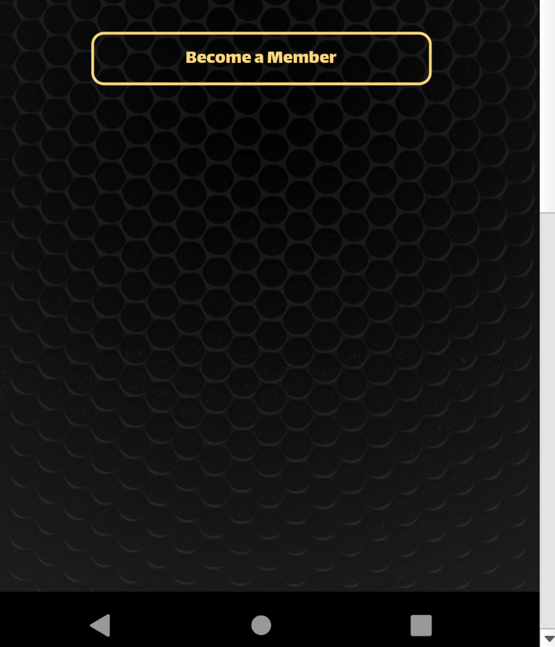
  MyCustomOutlineButton(
            text: "Become a Member",
            color: Colors.orange,
            onPressed: () {
              print("here");
            },
          ),
1
投票
投票
根据需要,您可以使用简单的RaisedButton和RoundedRectangleBorder。见例如:
Container(
            color: Colors.pink,
            child: RaisedButton(
              color: Colors.black,
              child: Text('Become a member', style: TextStyle(color: Colors.yellow)),
              onPressed: () {
                print('Hello');
              },
              shape: RoundedRectangleBorder(
                  borderRadius: BorderRadius.circular(10.0),
                  side: BorderSide(color: Colors.yellow, width: 5.0)),
            ),
          )
可以使用BorderSide指定边框颜色,填充的颜色只是RaisedButton的常规颜色属性。 希望这有帮助。
最新问题
- 为什么我需要在node.js中编写“function(value) {return my_function(value);}”作为回调?
- 如何手动将浮点数的fprintf十六进制表示转换为十进制
- Next.js 中的 Stripe Payment:Webhook 问题 - 401(未经授权)
- pandas:具有多级列的数据框将日期索引向上移动以使其变平
- 如何在所有序列化为 JSON 以及模型绑定时全局强制执行小写蛇形大小写
- 如何修复此警告 Array.prototype.map() 需要来自箭头函数 array-callback-return 的返回值?
- 异步上传 Azure blob 时出现 MD5 错误
- Tomcat webapp 类加载器不支持运行时编译
- 如何在单个查询中获取反向连接的实体?
- 找不到参数的 exec() 方法。 Android 构建错误
- 在用户单击预期按钮之前出现反应对话框模式
- openai.AzureOpenAI 和 langchain_openai.AzureOpenAI 之间的区别
- 使用 PHP API 进行 Facebook 转化跟踪 (fbq)
- R 代码 - 绘制调查响应图
- 网站可以发出请求,但我收到 CORS 错误,这怎么可能?
- GitHub Actions CI - Gem/Rails Engine - Ruby v3.3.1/Bundler 错误
- 使用 serde-xml-rs 反序列化以获得具有任意属性的奇怪标签
- Git:在 Windows 上重命名目录(仅限大小写)
- 在 Android studio 中重命名文件后,它将从 git 中删除(并丢失历史记录)
- 无法在android模拟器上运行flutter
© www.soinside.com 2019 - 2024. All rights reserved.