3 状态 CSS 切换开关
问题描述 投票:0回答:11
我一直在寻找三态切换开关,但运气不佳。
基本上我需要一个具有以下状态的开关: |开 |不适用 |关闭 |
滑块默认从中间开始,一旦用户向左或向右滑动,就无法返回到 N/A(未接听)状态。
有人知道如何处理这个问题吗?
11个回答
投票
尝试这样的事情:
.switch-toggle {
  width: 10em;
}

.switch-toggle label:not(.disabled) {
  cursor: pointer;
}
<link href="https://cdn.jsdelivr.net/css-toggle-switch/latest/toggle-switch.css" rel="stylesheet" />
<div class="switch-toggle switch-3 switch-candy">
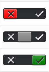
<input id="on" name="state-d" type="radio" checked="" />
<label for="on" onclick="">ON</label>
<input id="na" name="state-d" type="radio" disabled checked="checked" />
<label for="na" class="disabled" onclick=""> </label>
<input id="off" name="state-d" type="radio" />
<label for="off" onclick="">OFF</label>
<a></a>
</div>这将以
N/Achecked="checked"disabledJSFiddle 演示(简化版)
投票
.switch-toggle {
   float: left;
   background: #242729;
}
.switch-toggle input {
  position: absolute;
  opacity: 0;
}
.switch-toggle input + label {
  padding: 7px;
  float:left;
  color: #fff;
  cursor: pointer;
}
.switch-toggle input:checked + label {
  background: green;
}
<div class="switch-toggle switch-3 switch-candy">
<input id="on" name="state-d" type="radio" checked="" />
<label for="on" onclick="">ON</label>
<input id="na" name="state-d" type="radio" checked="checked" />
<label for="na" class="disabled" onclick="">N/A</label>
<input id="off" name="state-d" type="radio" />
<label for="off" onclick="">OFF</label>
</div>投票
如果您想要使用颜色进行“否”/“未设置”/“是”切换,请像这样:
然后使用上面 DarkAjax 的答案,但添加以下 CSS:
.switch-toggle  input:checked.toggle-no ~ a {
    background-color:  red;
 }

 .switch-toggle  input:checked.toggle-yes ~ a {
    background-color:  green;
 }

 .switch-toggle  input:checked.toggle-unset ~ a {
    background-color:  grey;
 }
并将相应的类(class="toggle-no" 等)添加到相应的单选按钮输入中。如果您愿意,您还可以添加图标等。
希望这对某人有帮助!
投票
作为 jQuery 插件
function filterme(value) {
  value = parseInt(value, 10); // Convert to an integer
  if (value === 1) {
    $('#RangeFilter').removeClass('rangeAll', 'rangePassive').addClass('rangeActive');
    $('span').text('Active');
  } else if (value === 2) {
    $('#RangeFilter').removeClass('rangeActive', 'rangePassive').addClass('rangeAll');
    $('span').text('All');
  } else if (value === 3) {
    $('#RangeFilter').removeClass('rangeAll', 'rangeActive').addClass('rangePassive');
    $('span').text('Passive');
  }
}
<script src="https://ajax.googleapis.com/ajax/libs/jquery/2.1.1/jquery.min.js"></script>
<p class="range-field" style=" width:60px">
<input type="range" id="RangeFilter" name="points" onchange="filterme(this.value);" min="1" class="rangeAll" max="3" value="2">
</p>
<span>All</span>
(function($) {
  $.fn.removeClasses = function(classes) {
    return this.removeClass(classes.join(' '));
  };
  $.fn.switchify = function(config) {
    config = config || {};
    var prefix   =           config.prefix   || 'range-';
    var onCls    = prefix + (config.onCls    || 'on'   );
    var offCls   = prefix + (config.offCls   || 'off'  );
    var unsetCls = prefix + (config.unsetCls || 'unset');
    var $self = this;
    return this.on('change', function(e) {
      var value = parseInt(this.value, 10);
      switch (value) {
        case 1  :  return $self.removeClasses([unsetCls, offCls]).addClass(onCls);
        case 2  :  return $self.removeClasses([onCls, offCls]).addClass(unsetCls);
        case 3  :  return $self.removeClasses([onCls, unsetCls]).addClass(offCls);
        default :  return $self;
      }
    });
  };
})(jQuery);

$('#range-filter').switchify({
   onCls    : 'active',
   offCls   : 'passive',
   unsetCls : 'all'
}).on('change', function(e) {
  var $self = $(this);
  if      ($self.hasClass('range-active'))  $('span').text('Active');
  else if ($self.hasClass('range-passive')) $('span').text('Passive');
  else if ($self.hasClass('range-all'))     $('span').text('All');
  else                                      $('span').text('Error!');
});
.range-field { width: 60px; }<script src="https://ajax.googleapis.com/ajax/libs/jquery/2.1.1/jquery.min.js"></script>
<p class="range-field">
<input type="range" id="range-filter" name="points" min="1" class="rangeAll" max="3" value="2">
</p>
<span>All</span>投票
除了 gat 的回复之外,还可以通过 Bootstrap 将其建模为分组单选按钮:
<div class="btn-group" data-toggle="buttons">
    <label class="btn btn-primary">
        <input type="radio" name="options" id="On" />ON</label>
    <label class="btn btn-primary">
        <input type="radio" name="options" id="NA" />N/A</label>
    <label class="btn btn-primary">
        <input type="radio" name="options" id="Off" />OFF</label>
</div>
JSFiddle:http://jsfiddle.net/p7DGe/1/
投票
$(document).ready(function(){
  $("#toggle-button1").addClass("active");
  $(".tri-state-toggle-button").click(function(){
    $(".tri-state-toggle-button").removeClass("active");
    var id = $(this).attr('id');
    $("#" + id).addClass("active");
  });
});
body {
margin-left: 100px;
margin-top: 100px;
}
.tri-state-toggle {
background: rgba(0,0,0,0.8);
box-shadow: inset 0 2px 8px 0 rgba(165,170,174,0.25);
border-radius: 24px;
display: inline-block;
overflow: hidden;
display: inline-flex;
flex-direction: row;
transition: all 500ms ease;
}
.tri-state-toggle-button {
border-radius: 22px;
height: 44px;
display: flex;
align-items: center;
justify-content: center;
width: 64px;
background-color: transparent;
border: 0px solid transparent;
margin: 2px;
color: white;
cursor: pointer;
/* -webkit-transition: all 0.5s ease-in-out;
-moz-transition: all 0.5s ease-in-out;
-ms-transition: all 0.5s ease-in-out;
-o-transition: all 0.5s ease-in-out; */
transition: all 0.5s ease;
}
.tri-state-toggle-button.active {
background-image: linear-gradient(
90deg,
rgba(229, 3, 87, 1) 0%,
rgba(229, 3, 56, 1) 35%,
rgba(219, 101, 17, 1) 100%
);
border: 0px solid rgba(207,207,207,0.6);
box-shadow: 0 8px 16px 0 rgba(0,0,0,0.1);
color: white;
font-weight: 500;
transition: all .5s ease-in;
}
.tri-state-toggle-button:focus {
outline: none;
}<script src="https://cdnjs.cloudflare.com/ajax/libs/jquery/3.3.1/jquery.min.js"></script>
<h3>Select any one option:</h3>
<div class="tri-state-toggle">
<button class="tri-state-toggle-button" id="toggle-button1">
Song
</button>
<button class="tri-state-toggle-button" id="toggle-button2">
Video
</button>
<button class="tri-state-toggle-button" id="toggle-button3">
Party
</button>
</div>投票
我创建了一个 JSFiddle,它演示了功能齐全的三态开关。请注意,JSfiddle 中的 javascript 窗口无法正常工作,因此脚本会加载到 html 窗口中。
function togglebutton(range) {
  var val = range.value;
  if (val == 1) {
    //change color of slider background
    range.className = "rangeFalse";

    //alter text
    $('.toggle-false-msg').attr('id', 'textActive');
    $('.toggle-neutral-msg').attr('id', '');
    $('.toggle-true-msg').attr('id', '');
  } else if (val == 2) {
    //change color of slider background
    range.className = "rangeNeutral";

    //alter text
    $('.toggle-false-msg').attr('id', '');
    $('.toggle-neutral-msg').attr('id', 'textActive');
    $('.toggle-true-msg').attr('id', '');

  } else if (val == 3) {
    //change color of slider background
    range.className = "rangeTrue";

    //alter text
    $('.toggle-false-msg').attr('id', '');
    $('.toggle-neutral-msg').attr('id', '');
    $('.toggle-true-msg').attr('id', 'textActive');
  }
}
.test_div {
height: 50px;
width: 50px;
background: #204d75 !important;
top: 100px;
position: relative;
display: block;
}
.toggle-container {
position: relative;
width: 8em;
margin: 1em;
padding: 0.25em;
border: thin solid lightgrey;
text-align: center;
}
.range-field {
display: inline-block;
width: 100px;
margin: 0px;
border-radius: 2px;
}
input[type=range] {
-webkit-appearance: none;
margin: 0;
width: 100%;
padding: 0px;
outline: none;
border: none;
}
.toggle-false-msg {
display: none;
opacity: .2;
transition: .5s opacity;
display: inline-block;
position: relative;
top: -8px;
}
.toggle-true-msg {
display: none;
opacity: .2;
transition: .5s opacity;
display: inline-block;
position: relative;
top: -8px;
}
.toggle-neutral-msg {
display: none;
opacity: .2;
transition: .5s opacity;
display: none;
position: relative;
top: -8px;
}
#rangeActive {
background-color: blue;
}
#textActive {
opacity: 1;
color: black;
}
input[type=range]:focus {
outline: none;
}
input[type=range]::-webkit-slider-runnable-track {
width: 100%;
height: 30px;
cursor: pointer;
animate: 0.2s;
box-shadow: 0px 0px 0px #000000;
background: #3071A9;
border-radius: 0px;
border: 0px solid #000000;
}
input[type=range]::-webkit-slider-thumb {
box-shadow: 0px 0px 0px #000000;
border: 0px solid #000000;
height: 30px;
width: 19px;
border-radius: 0px;
background: #FFFFFF;
cursor: pointer;
-webkit-appearance: none;
margin-top: 0px;
}
input[type=range]:focus::-webkit-slider-runnable-track {
background: #3071A9;
}
input[type=range]::-moz-range-track {
width: 100%;
height: 30px;
cursor: pointer;
animate: 0.2s;
box-shadow: 0px 0px 0px #000000;
background: #3071A9;
border-radius: 0px;
border: 0px solid #000000;
}
input[type=range]::-moz-range-thumb {
box-shadow: 0px 0px 0px #000000;
border: 0px solid #000000;
height: 30px;
width: 19px;
border-radius: 0px;
background: #FFFFFF;
cursor: pointer;
}
input[type=range]::-ms-track {
width: 100%;
height: 30px;
cursor: pointer;
animate: 0.2s;
background: transparent;
border-color: transparent;
color: transparent;
}
input[type=range]::-ms-fill-lower {
background: #3071A9;
border: 0px solid #000000;
border-radius: 0px;
box-shadow: 0px 0px 0px #000000;
}
input[type=range]::-ms-fill-upper {
background: #3071A9;
border: 0px solid #000000;
border-radius: 0px;
box-shadow: 0px 0px 0px #000000;
}
input[type=range]::-ms-thumb {
box-shadow: 0px 0px 0px #000000;
border: 0px solid #000000;
height: 30px;
width: 19px;
border-radius: 0px;
background: #FFFFFF;
cursor: pointer;
}
input[type=range]:focus::-ms-fill-lower {
background: #3071A9;
}
input[type=range]:focus::-ms-fill-upper {
background: #3071A9;
}
.rangeFalse::-webkit-slider-runnable-track {
background: #5d0a0a !important;
}
.rangeFalse::-webkit-slider-thumb {
background: white !important;
}
.rangeNeutral::-webkit-slider-runnable-track {
background: #204d75 !important;
}
.rangeNeutral::-webkit-slider-thumb {
background: white !important;
}
.rangeTrue::-webkit-slider-runnable-track {
background: #0e4e1f !important;
}
.rangeTrue::-webkit-slider-thumb {
background: white !important;
}<script src="https://ajax.googleapis.com/ajax/libs/jquery/2.1.1/jquery.min.js"></script>
<div class="toggle-container">
<div class="toggle-false-msg">Off</div>
<div class="range-field" style=" width:60px">
<input type="range" name="points" min="1" class="" max="3" value="2"
onchange="togglebutton(this);">
</div>
<div class="toggle-neutral-msg">Neutral</div>
<div class="toggle-true-msg">On</div>
</div>此开关不使用单选按钮,而是利用一个范围并将值传递到 JavaScript 中来确定开关的操作。设计这个的最大障碍是改变范围的伪元素(特别是其轨道的背景颜色)。这可以通过使用伪元素设置不同的类并使用 java 轮换类来实现。
有关修改伪元素的信息可以在下面的链接中找到。我使用了文章中描述的方法1。
资源
投票
我修改了一些@mustafa bagwala的答案,所以这里是具有三个状态按钮的相同示例,可以在两个之间设置,但可以在三种和不同颜色之间设置。
输出可以是这样的:
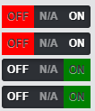
以下是 CSS 代码和 HTML 代码:
.switch-toggle input {
    opacity: 0;
    height: 25px;
    position: absolute;
    border-radius: 15px;
}

.switch-toggle input + label {
    float: left;
    color: #fff;
    height: 25px;
    font-size: 12px;
    cursor: pointer;
}

.switch-toggle input[value="na"] + label {
    pointer-events: none;
    opacity: 0.5;
}

.switch-toggle input[value="na"]:checked + label {
    background: grey;
}

.switch-toggle input[value="on"]:checked + label {
    background: green;
}

.switch-toggle input[value="off"]:checked + label {
    background: red
}
<link href="https://cdn.jsdelivr.net/css-toggle-switch/latest/toggle-switch.css" rel="stylesheet" />
<div class="switch-toggle switch-3 switch-candy">
<input id="on" name="state-d" type="radio" value="on" />
<label for="on">ON</label>
<input id="na" name="state-d" type="radio" value="na" checked="checked" />
<label for="na">N/A</label>
<input id="off" name="state-d" type="radio" value="off" />
<label for="off">OFF</label>
<a></a>
</div>投票
这是一个 3 路 React 开关,具有前进、后退、解锁轨道和键盘控制,您可以在 CodePen here 上看到它的运行情况。它从左侧位置开始,称为选项 1,但您可以修改它以从您想要的任何位置开始。
/*React Component*/
class ThreeWayToggleSwitchComponent extends React.Component {
  constructor(props) {
    super(props);

    this.threeWayToggleSwitchComponentDivRef = React.createRef();
    this.option1Ref = React.createRef();
    this.option3Ref = React.createRef();
    this.slidingButtonDivRef = React.createRef();

    this.state = {
      selectedOption: "Option 1"
    };

    this.handleOptionChange = this.handleOptionChange.bind(this);
    this.keyboardPress = this.keyboardPress.bind(this);
  }

  handleOptionChange(event) {
    if (event.target.value === "Option 1") {
      if (this.state.selectedOption === "Option 2") {
        this.setState({
          selectedOption: event.target.value
        });

        this.slidingButtonDivRef.current.style.transform = "translate(0px)";
        this.slidingButtonDivRef.current.style.background = "green";
      }
      else if (this.state.selectedOption === "Option 3") {
        this.setState({
          selectedOption: "Option 2"
        });

        this.slidingButtonDivRef.current.style.transform = "translate(40px)";
        this.slidingButtonDivRef.current.style.background = "yellow";
      }
    }
    else if (event.target.value === "Option 2") {
      this.setState({
        selectedOption: "Option 2"
      });

      this.slidingButtonDivRef.current.style.transform = "translate(40px)";
      this.slidingButtonDivRef.current.style.background = "yellow";
    }
    else if (event.target.value === "Option 3") {
      if (this.state.selectedOption === "Option 1") {
        this.setState({
          selectedOption: "Option 2"
        });

        this.slidingButtonDivRef.current.style.transform = "translate(40px)";
        this.slidingButtonDivRef.current.style.background = "yellow";
      }
      else if (this.state.selectedOption === "Option 2") {
        this.setState({
          selectedOption: "Option 3"
        });

        this.slidingButtonDivRef.current.style.transform = "translate(80px)";
        this.slidingButtonDivRef.current.style.background = "red";
      }
    }
  }

  keyboardPress(event) {
    if (event.keyCode === 37) {
      this.option1Ref.current.click();
    }
    else if (event.keyCode === 39) {
      this.option3Ref.current.click();
    }
  }

  componentDidMount() {
    this.threeWayToggleSwitchComponentDivRef.current.focus();
  }

  render() {
    return(
      <div ref={this.threeWayToggleSwitchComponentDivRef} id="three-way-toggle-switch-component-div" tabIndex="0" onKeyDown={this.keyboardPress}>
        <div id="radio-buttons-and-sliding-button-container-div">
          <div id="radio-buttons-div">
            <label id="option-1-label" className="single-option-label" for="option-1">Label 1
              <input type="radio" ref={this.option1Ref} id="option-1" className="radio-input-class" name="radio-input" value="Option 1" checked={this.state.selectedOption === "Option 1"} onChange={this.handleOptionChange}/>
            </label>

            <label id="option-2-label" className="single-option-label" for="option-2">Label 2
              <input type="radio" id="option-2" className="radio-input-class" name="radio-input" value="Option 2" checked={this.state.selectedOption === "Option 2"} onChange={this.handleOptionChange}/>
            </label>

            <label id="option-3-label" className="single-option-label" for="option-3">Label 3
              <input type="radio" ref={this.option3Ref} id="option-3" className="radio-input-class" name="radio-input" value="Option 3" checked={this.state.selectedOption === "Option 3"} onChange={this.handleOptionChange}/>
            </label>
          </div>

          <div ref={this.slidingButtonDivRef} id="sliding-button-div">
          </div>
        <div>

        <div id="selected-option">Option Selected: {this.state.selectedOption}
        </div>

        <div id="keyboard-message">
          You can control the sliding button via the left arrow key or the right arrow key on your keyboard.
        </div>
      </div>
    );
  }
};

ReactDOM.render(<ThreeWayToggleSwitchComponent/>, document.getElementById("react-component-div"));

/*CSS Styling*/
#three-way-toggle-switch-component-div:focus {
  outline: none;
}

#radio-buttons-and-sliding-button-container-div {
  position: relative;
  display: inline-block;
  height: 30px;
  width: 120px;
  border: 2px solid black;
  border-radius: 5px;
}

#sliding-button-div {
  position: absolute;
  display: inline-block;
  top: 0;
  height: 30px;
  width: 40px;
  background: green;
  transition: 0.8s;
  border-radius: 3px;
}

#radio-buttons-div {
  display: flex;
  justify-content: space-between;
}

.single-option-label {
  width: 100%;
  color: transparent;
}

.radio-input-class {
  display: none;
}
投票
您始终可以使用同心三元运算符。 这是要点..
className = {title === '一' ?类.一:(标题==='二:类.二:类.三)
等等..n 个班级。
投票
使用 Bootstrap 5 和 JQuery :
$(document).on('click', '.switch-3', function(event) {


   /* get switch slider */
    let slider = $(this).find('.switch-3-slider');
    /* get switch height */
    let height = $(this).height();
    /* get coord of click */
    let clickPos = event.pageY - $(this).offset().top;
    /* get 1/3 of switch height */
    let heightThird1 = height / 3;
    let heightThird2 = heightThird1 + height / 3;
    if (clickPos > heightThird2) {
        $(this).removeClass('switch-state-top');
        $(this).removeClass('switch-state-center');
        $(this).addClass('switch-state-bottom');
        $(this).find('.switch-3-label').eq(2).find('.switch-3-radio').prop('checked', true);
    } else if (clickPos > heightThird1 && clickPos <= heightThird2) {
        $(this).removeClass('switch-state-top');
        $(this).removeClass('switch-state-bottom');
        $(this).addClass('switch-state-center');
        $(this).find('.switch-3-label').eq(1).find('.switch-3-radio').prop('checked', true);
    } else {
        $(this).removeClass('switch-state-bottom');
        $(this).removeClass('switch-state-center');
        $(this).addClass('switch-state-top');
        $(this).find('.switch-3-label').eq(0).find('.switch-3-radio').prop('checked', true);
    }

});
.switch-3 {
width: 3rem;
height: 7.5rem;
overflow: hidden;
}
.switch-3 .switch-3-slider {
width: 3rem;
height: 7.5rem;
left: 0;
right: 0;
transition: ease .4s all;
}
.switch-3 .switch-3-cover {
width: 3rem;
height: 2.5rem;
}
.switch-3 .switch-3-key {
width: 3rem;
height: 2.5rem;
background-color: rgba(0, 0, 0, .25);
}
.switch-3-label {
flex: 0 1 2.5rem;
}
.switch-3.switch-state-top .switch-3-slider {
bottom: 5rem;
}
.switch-3.switch-state-center .switch-3-slider {
bottom: 2.5rem;
}
.switch-3.switch-state-bottom .switch-3-slider {
bottom: 0rem;
}<script src="https://cdn.jsdelivr.net/npm/[email protected]/dist/js/bootstrap.bundle.min.js"></script>
<link href="https://cdn.jsdelivr.net/npm/[email protected]/dist/css/bootstrap.min.css" rel="stylesheet"/>
<script src="https://cdnjs.cloudflare.com/ajax/libs/jquery/3.3.1/jquery.min.js"></script>
<div class="position-relative d-inline-block switch-3 switch-state-bottom" role="button">
<div class="h-100 w-100 d-flex flex-column flex-nowrap text-light bg-primary">
<label class="d-flex justify-content-center align-items-center switch-3-label">
<small>ON</small>
<input class="switch-3-radio" type="radio" value="on" />
</label>
<label class="d-flex justify-content-center align-items-center switch-3-label">
<small>N/A</small>
<input class="switch-3-radio" type="radio" value="na" />
</label>
<label class="d-flex justify-content-center align-items-center switch-3-label">
<small>OFF</small>
<input class="switch-3-radio" type="radio" value="off" checked />
</label>
</div>
<div class="position-absolute d-block switch-3-slider">
<span class="d-block bg-primary switch-3-cover"></span>
<span class="d-block bg-primary switch-3-cover"></span>
<span class="d-block switch-3-key"></span>
<span class="d-block bg-primary switch-3-cover"></span>
<span class="d-block bg-primary switch-3-cover"></span>
</div>
</div>最新问题
- 应用程序集成的 SQL Server 权限
- 具有外部数据连接的另存为模板
- 如何在GCC中的配置/变量下命名环境变量?
- Autofac:如何防止处置通过ServiceCollection注册的服务?
- lm-evaluation-harness with LoRa 微调模型 Hugging Face
- 如何获得物理屏幕分辨率?
- 使用 Go 模板获取 docker 镜像路径的最后一个元素
- 如何在ForEach控制器中使用数组数据?获取一个线程组中的数据列表并在另一个线程的 forEach 控制器中使用该变量
- Flutter 网页问题
- Graph / DAG:并行执行工作流程优化
- 如何获取 Instagram 故事精选高清封面照片
- 有很多列的数据库
- npx create-react-app 不适用于节点 v20.9.0
- 如何强制我的 JAR 在 JDK 8 上执行?
- 高图表散点未对齐
- 缓存 firebase 函数输出以减少数据库调用
- 首次打开时 GUI 崩溃。不过下次打开就正常了
- 在 typescript Angular 4 中将传单地图导出为 JPG
- 找不到凭据<mainstorage path>,因为它不存在或您没有权限。由于绑定错误,无法使用视图/函数
- “Visual Studio 版本选择器”到底是如何选择 Visual Studio 版本的?