由于其中有图像,列不会随着 Flexbox 中的窗口大小进行调整
问题描述 投票:0回答:2
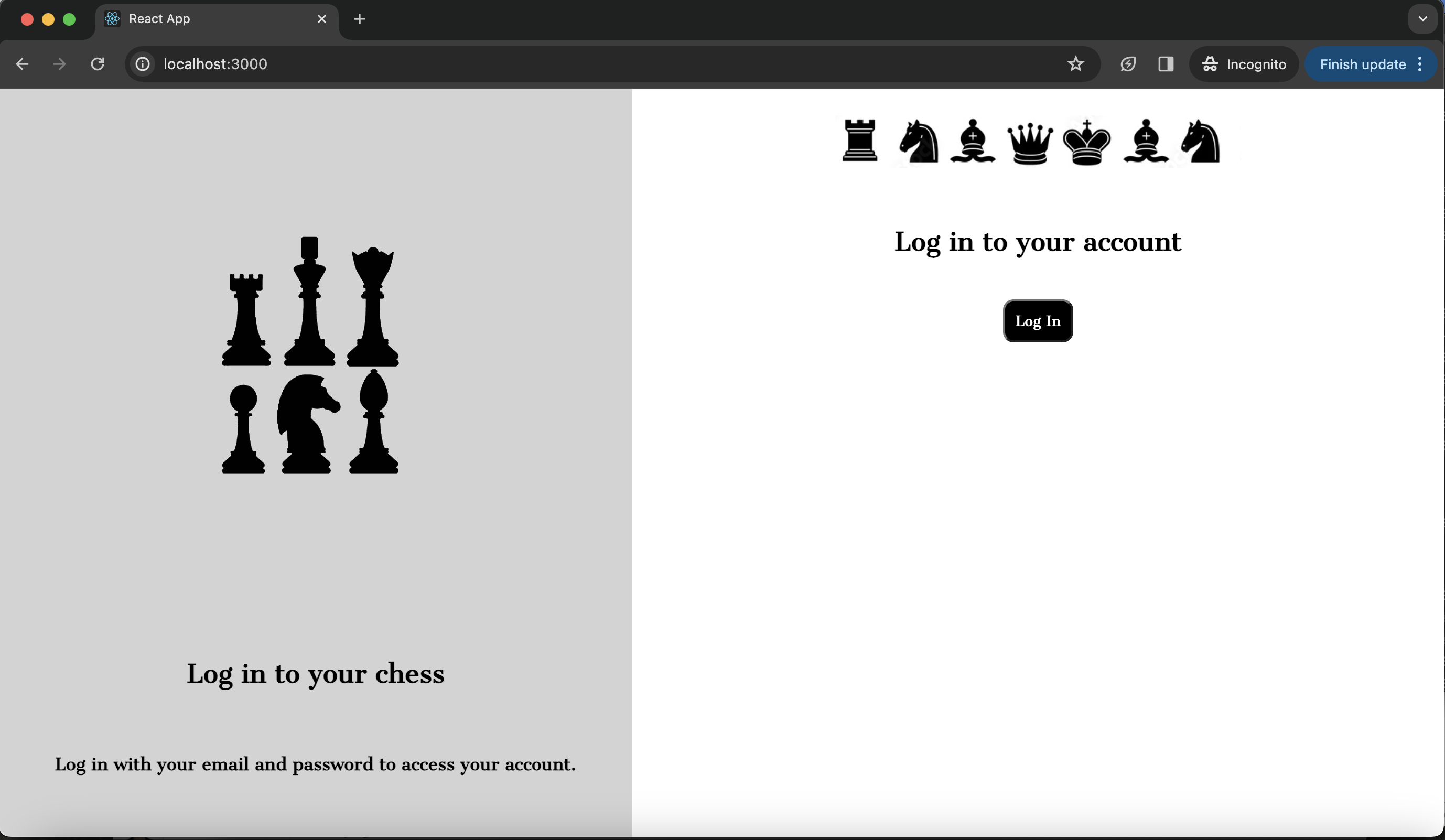
我正在尝试构建一个分为两列的登陆页面(当前未完成)。每列包含图像和文本。当窗口为全尺寸时,它显示得非常好,但小于该尺寸时,页面将停止显示为两列。我希望页面显示为两列,无论窗口大小如何,并且图像随窗口缩小和增长,以便它们保持比例。我尝试过使用 max-height 和 max-width 但都没有帮助解决这个问题。但是,当我删除图像或尝试使用完美的方形图像时,不会发生此问题,并且列会随着窗口大小的调整而正确调整自身大小。请参阅下面的屏幕截图和代码。
.center-img-half {
  display: flex;
  align-items: center;
  justify-content: center;
  scale: 50%;
}

.center-div {
  display: flex;
  align-items: center;
  justify-content: center;
  padding: 10px;
  text-align: center;
}

.black-white-button {
  background-color: black;
  color: white;
  border-radius: 10px;
  font-family: 'Cantata One', serif;
  padding: 10px;
}

.wrapper {
  background-color: white;
}

.login-column1 {
  background-color: lightgray;
  display: flex;
  flex-direction: column;
  flex-basis: 100%;
  flex: 1;
  height: 100vh;
}

.login-column2 {
  background-color: white;
  display: flex;
  flex-direction: column;
  flex-basis: 100%;
  flex: 1;
  height: 100vh;
}

.row {
  display: flex;
  flex-direction: row;
  flex-wrap: wrap;
  width: 100%;
}
<div class="wrapper">
<div class="row">
<div class="login-column1">
<div class="center-img-half">
<img src="https://via.placeholder.com/300x300" />
</div>
<div class="center-div">
<h2>Log in to your chess </h2>
</div>
<div class="center-div">
<h4>Log in with your email and password to access your account.</h4>
</div>
</div>
<div class="login-column2">
<div class="center-img-half">
<img src="https://via.placeholder.com/600x200" alt="Chess Pal Logo" />
</div>
<div class="center-div">
<h2> Log in to your account </h2>
</div>
<div class="center-div">
<Button class="black-white-button">Log In</Button>
</div>
</div>
</div>
</div>2个回答
0
投票
投票
对列使用动态宽度
为了始终保持两列显示,可以将两者的宽度设置为 0,该属性与 flex-grow: 1 一起使用(在使用 flex: 1 时已应用)将确保屏幕将被分为两部分具有相同宽度值的列!所以,基本上:
  width: 0;
  flex-grow: 1; (or flex: 1)
对于图像,您可以将它们放入 div 容器中,并根据百分比值设置宽度,这样它将保持比例。
0
投票
投票
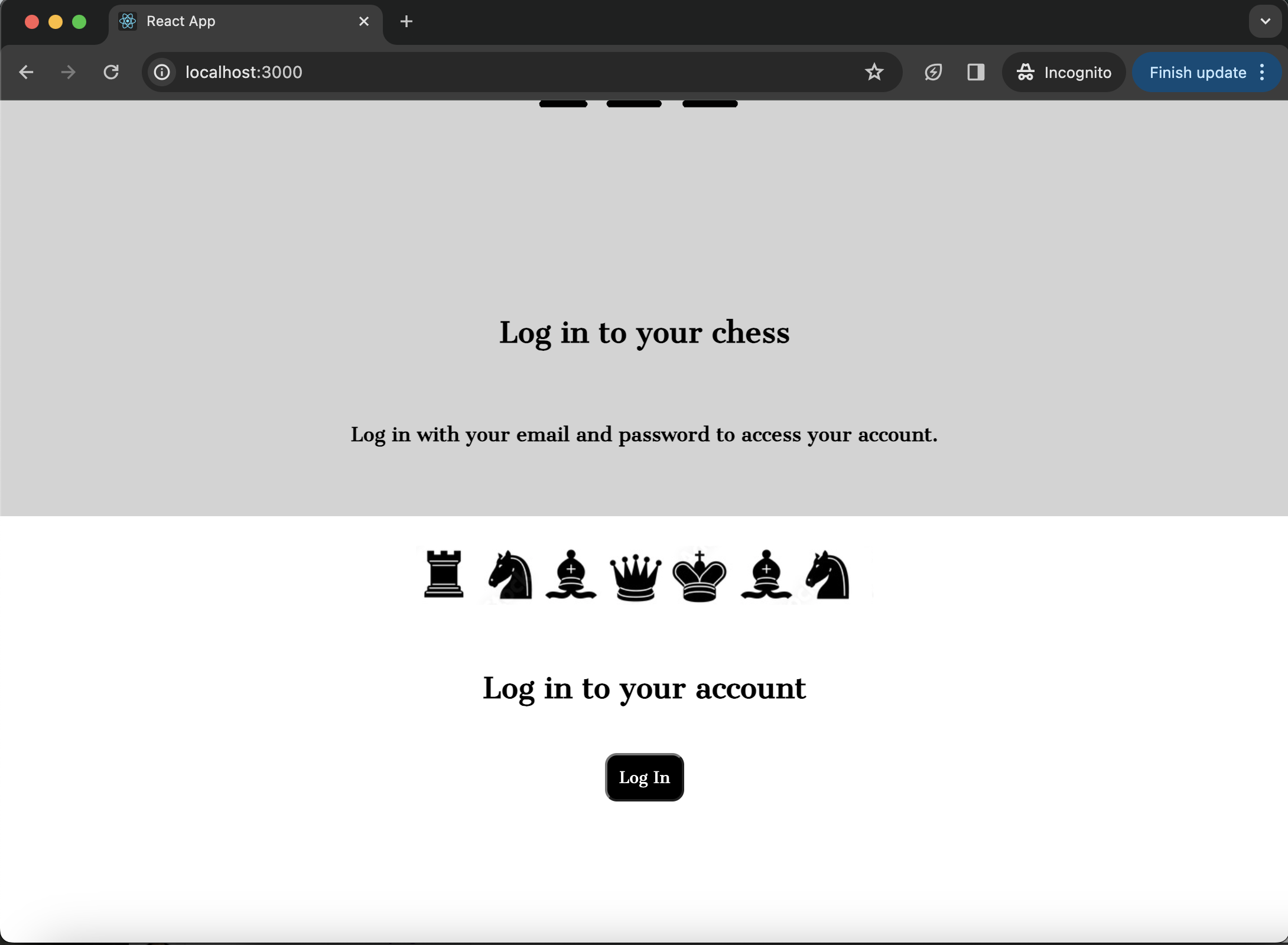
这是想要的结果吗?
.center-img-half {
    display: flex;
    align-items: center;
    justify-content: center;
    scale: 50%;
  }

  .center-div {
    display: flex;
    align-items: center;
    justify-content: center;
    padding: 10px;
    text-align: center;
  }

  .black-white-button {
    background-color: black;
    color: white;
    border-radius: 10px;
    font-family: 'Cantata One', serif;
    padding: 10px;
  }

  .wrapper {
    background-color: white;
    height: 100%;
  }

  .login-column1,
  .login-column2 {
    display: flex;
    flex-direction: column;
    flex: 1 0 0;
    min-width: 0;
  }

  .login-column1 {
    background-color: lightgray;
  }

  .login-column2 {
    background-color: white;
  }

  .row {
    display: flex;
    height: 100%;
    justify-content: space-between;
  }
<div class="wrapper">
<div class="row">
<div class="login-column1">
<div class="center-img-half">
<img src="https://via.placeholder.com/300x300" />
</div>
<div class="center-div">
<h2>Log in to your chess </h2>
</div>
<div class="center-div">
<h4>Log in with your email and password to access your account.</h4>
</div>
</div>
<div class="login-column2">
<div class="center-img-half">
<img src="https://via.placeholder.com/600x200" alt="Chess Pal Logo" />
</div>
<div class="center-div">
<h2> Log in to your account </h2>
</div>
<div class="center-div">
<Button class="black-white-button">Log In</Button>
</div>
</div>
</div>
</div>重点关注以下选择器:
  .login-column1,
  .login-column2 {
    display: flex;
    flex-direction: column;
    flex: 1 0 0;
    min-width: 0;
  }

  .row {
    display: flex;
    height: 100%;
    justify-content: space-between;
  }
最新问题
- 扑流中的汽车推荐
- OAuth 2.1 是否需要将每个前端路径配置为有效的redirect_uri?
- 如何使用 Quarkus 拦截日志消息以进行测试
- 带订单的响应式网格 MUI
- 使用 Dplyr 和 Flextable 进行行求和
- 如何获取 LocalePath() 并返回 Nuxt3 服务器中语言环境的路径
- 当我托管我的 React 应用程序时,它只显示自述文件
- 如何在大型数据库上优化 whereHas 的性能?
- 如何在 Visual Studio 上启用 __int128?
- 查询执行时间太晚,无法获取数据
- SheetJS 导出的 Excel 文件显示不正确的日期和字符串值被简化为科学记数法
- 如何仅对模板中的一个变量禁用 USE_THOUSAND_SEPARATOR?
- DocuSaurus - 自动 JavaScript 文档
- 更新 TextEditingController 文本时应用程序关闭
- 使用 npm run build 时 Sentry CLI 插件命令失败
- C# - Moq - 异步事件处理程序模拟隐藏异常
- 如何计算 1x1、1x2、2x1 瓷砖的可能组合有多少种可以填充 2 x N 地板?
- Mac 版 android studio 中的光标是矩形区域
- GKE Autopilot 将计算类别更改为“通用”
- 从 Azure VMSS 执行 Docker Run 命令时出错
© www.soinside.com 2019 - 2024. All rights reserved.