页面对齐和div元素对齐
问题描述 投票:0回答:1
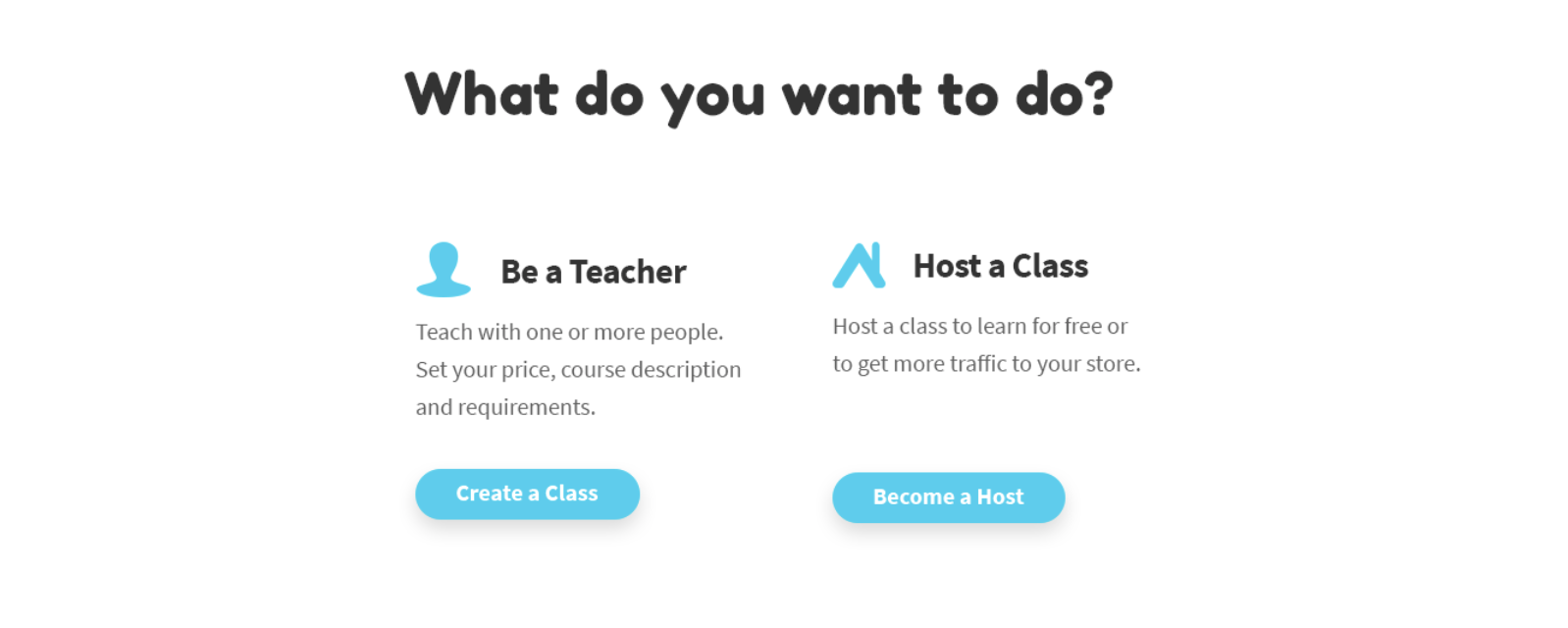
所以我试图建立一个这样的页面:
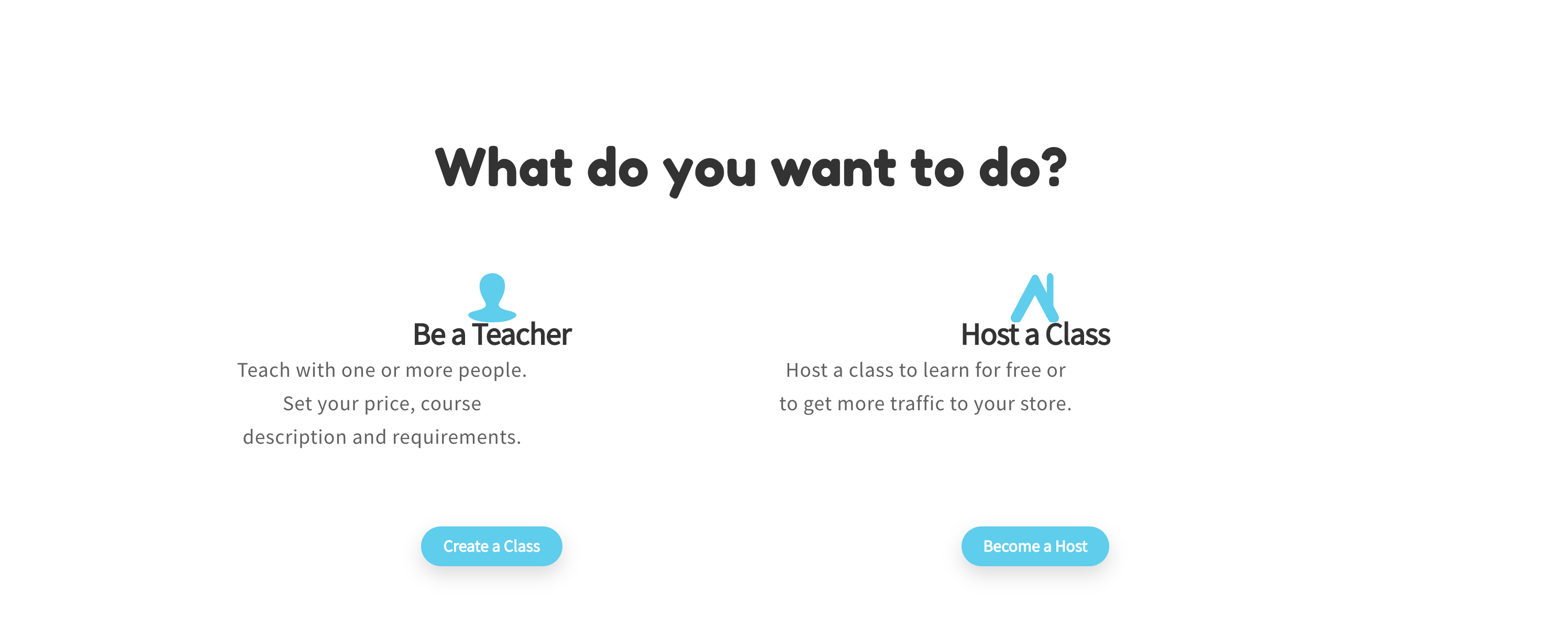
但是看起来像这样:
我尝试使用多个div,并且也将Row和Col结合起来使用,但似乎一团糟。某些更改也没有任何效果。
代码:
import React from 'react';
import TextContents from '../assets/translations/TextContents';
import BlueButton from '../components/materialdesign/BlueButton';
import TeachIcon from '../assets/images/teach-class-icon.svg';
import HostIcon from '../assets/images/host-a-class-icon.svg';

import './CreateClassAndHost.css';
import { Row, Col, Container } from 'react-bootstrap';

class CreateClassAndHost extends React.Component {

    render() {

        const CreateAClass =
            <Col className="create-tile">
                <div className="create-style-title">
                    <img
                        src= { TeachIcon }
                        className= "create-icon"
                        alt="TeachIcon"
                    />
                    <h2>{TextContents.BeATeacher}</h2>
                </div>
                <p>{TextContents.BeATeacherDesc}</p>
                <div className="create-button">
                <BlueButton textSize="13" link_href="/createaclass" text={TextContents.BeATeacherBtn} />
                </div>
            </Col>;

        const CreateAHost =
            <Col className="create-tile">
                <div className="create-style-title">
                    <img
                        src= { HostIcon }
                        className= "create-icon"
                        alt="HostIcon"
                    />
                    <h2>{TextContents.HostAClass}</h2>
                </div>
                <p>{TextContents.HostAClassDesc}</p>
                <div className="create-button">
                <BlueButton textSize="13" link_href="/createahost" text={TextContents.HostAClassBtn} />
                </div>
            </Col>;
        return (
            <Container bsPrefix="create-container">
                <h1>{TextContents.CreateClassOrHostTitle}</h1>
                <Row classname="create-section">
                    {CreateAClass}
                    {CreateAHost}
                </Row>
            </Container>

        );
    }

}

export default CreateClassAndHost;
Css代码:
.create-container {
    margin-top: 8%;
    margin-left: auto;
    margin-right: auto;
    width: 60%;
}

.create-container h1 {
    text-align: center;
    height: 51px;
    margin: auto;
    font-family: Fredoka One;
    font-size: 50px;
    color: #333333;
    width:100%;
}

.create-section {
    width:100%;
}

.create-icon {
    width:47px;
    height:47px ;
}

.create-style-title {

}

.create-tile {
    display: inline-block;
    left: 12px;
    top: 80px;
    text-align: center;
    width: 200px;
    height: 250px;
    background-color: #ffffff;
}


.create-tile h2 {
    font-family: Source Sans Pro;
    font-weight: bold;
    font-size: 30px;
    line-height: 0.7;
    color: #333333;
    letter-spacing: -0.6px;

}

.create-tile p {
    font-family: Source Sans Pro;
    font-size: 20px;
    line-height: 1.6;
    color: #616161;
    width: 280px;
    height: 85px;
}

.create-button {
    position: relative;
    left: 0px;
    top: 50px;
}
任何想法如何使其看起来像上面提供的页面?
而且任何人都可以提供有关如何正确构建布局的良好资源。我也想在一些资源上看一下自己,轻松地显示如何对齐,..建立...
谢谢
1个回答
0
投票
投票
首先,我将简化结构。然后,我将使用:before选择器插入图标,并将父元素的text-align属性值设置为center,为子元素设置fixed width。
#parent {
  text-align: center;
}

.card {
  width: 200px;
  display: inline-block;
  margin: 25px;
}

a {
  display: inline-block;
  height: 36px;
  line-height: 36px;
  font-size: 17px;
  background: blue;
  margin-top: 25px;
  color: white;
  padding: 0 20px;
  border-radius: 36px;
  box-sizing: border-box;
}

h2 {
  position: relative; /* To help control overlap */
}

h2:before {
  content: "accessible_forward"; /* You can also use images as the content */
  font-family: Material Icons;
  position: relative;
  flort: left;
  margin-right: 10px;
}

.card:nth-of-type(2) h2:before {
  content: "anchor";
}
<link rel="stylesheet" href="https://fonts.googleapis.com/icon?family=Material+Icons">
<div id="parent">
<div class="card">
<h2>Titlt1</h2>
<p>
"Lorem ipsum dolor sit amet, consectetur adipiscing elit, sed do eiusmod tempor incididunt ut labore et dolore magna aliqua. Ut enim ad minim veniam, quis nostrud exercitation ullamco laboris nisi ut aliquip
</p>
<a hred="#">Click me</a>
</div>
<div class="card">
<h2>Titlt2</h2>
<p>
"Lorem ipsum dolor sit amet, consectetur adipiscing elit, sed do eiusmod tempor incididunt ut labore et dolore magna aliqua. Ut enim ad minim veniam, quis nostrud exercitation ullamco laboris nisi ut aliquip
</p>
<a hred="#">Click me</a>
</div>
</div>最新问题
- Angular 17 功能解析器无法将服务注入 Jest 测试用例
- 顺风柱系统
- routerLink 不可点击 - Angular
- 属性错误:模块“gspread.auth”没有属性“console_flow”
- Swift #Predicate 宏条件
- Pandas 数据框:合成数据生成
- 如何清理/清除BackgroundService(Microsoft.Hosting.Extensions.BackgroundService)中的AsyncLocal<T>对象?
- 在Python中,如何迭代集合列表脚本的输出
- TensorFlow Keras编译成功;仍然模型摘要未定义
- 正则表达式通配符与多个匹配对象匹配
- 如何在Python中制作符号表
- 如何在可接受的时间内计算出这么大的斯特林数?
- Azure 订阅的剩余费用
- 每次尝试从不同服务器访问我的存储库时是否都必须创建新的 ssh 密钥对?
- Python Tkinter; .place() 不起作用,但 .grid() 和 .pack() 起作用
- Java Path2D.Double 在 JPanel 上画有“尾巴”
- 子目录上的 Apache2 基本身份验证不提示身份验证
- 为什么在 Jupyter Notebook 中导入 pandas、numpy 和 seaborn 时出现 NameError: name "type_check" is not Defined?
- 如何在自动热键中暂停循环
- 从 URL 读取远程 txt 文件并将其按原样存储到 const char* [] 数组的 C++ 代码
© www.soinside.com 2019 - 2024. All rights reserved.