如何以圆角矩形的形式对指示器进行动画处理?
问题描述 投票:0回答:1
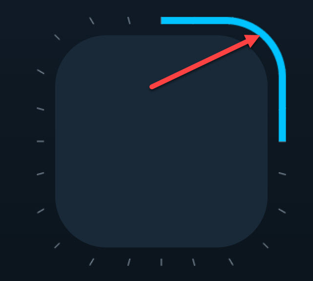
如何使用 html-js-css 为其制作动画?指标必须顺时针顺利填充。
我必须马上说CSS中的clip-path属性在iPhone上不起作用。
我没有任何想法。
1个回答
0
投票
投票
这可以通过将要旋转的时钟指针放在 div 中,然后绕其中心旋转该 div 来实现。
您可以使用 CSS 动画 平滑地旋转手包装 div。请参阅下面的示例。
function toggleDebug () {
  console.log('toggle debug')
  document.querySelector('.clockface').classList.toggle('debug');
}
.clockface {
border: 2px solid #000;
border-radius: 50px;
height: 100px;
position: relative;
width: 100px;
}
.hand-wrapper {
left: 0;
height: 100%;
position: absolute;
top: 0;
width: 100%;
}
.hand {
background-color: red;
height: 4px;
left: 50%;
position: absolute;
top: 50%;
transform: translateY(-50%);
width: 50px;
}
.rotate-forever {
animation: rotate 4s linear infinite;
}
@keyframes rotate {
from { transform: rotate(0deg) }
to { transform: rotate(360deg) }
}
.debug .hand-wrapper {
border: 2px solid red;
}<div class="clockface">
<div class="hand-wrapper rotate-forever">
<div class="hand"></div>
</div>
</div>
<div><button onclick="toggleDebug()">Debug</button></div>最新问题
- 在 uint256 中进行依赖于参数的查找后,未找到或不可见成员“长度”
- Accelerate 的 SparseMultiple 因 EXC_BAD_ACCESS 随机崩溃
- 如何在 Django 中将客户上传的文件附加到电子邮件?
- 引导左右列
- 如何将元素放置在网格中[关闭]
- 在 Unity 上启用旧版 uGUI
- 如何使用 Json.NET 读取带注释的 JSON 内容?
- Redis RDB 内部错误;哈希列表包完整性检查失败
- 更改作为参数传递的闭包签名的替代方案
- Nginx UDP 代理
- 如何防止 Firebase 身份验证在首次登录时隐式创建新用户?
- jenkins 管道失败 - 错误:无法运行 ssh-add ;说加载密钥时出错 - 格式无效
- 我尝试使用(pip install pickle5)安装Python的pickle包,但安装包失败
- 在交互式报告中搜索其他页面上的 sql 中出现的值
- 将 cookie 加载到 Python 请求会话时出错
- 光线投射精灵在屏幕周围传送
- webRequest API:如何获取新请求的requestId?
- 使用 Flexbox 和 object-fit 时出现 Box-shadow 问题
- 点云位于哪个参考系?
- Spark DataFrame 中的领域特定语言 API 是什么? [重复]
© www.soinside.com 2019 - 2024. All rights reserved.