如何使用“flex-flow:列换行”?
问题描述 投票:0回答:5
精简版
使用
flex-flow: column wrapdisplay: inline-flexinline-block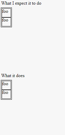
(function() {
  var ascending = true;
  setInterval(function() {
    var parent = document.getElementById('flex');
    if (ascending) {
      var child = document.createElement('p');
      child.innerHTML = "foo";
      parent.appendChild(child);
    } else {
      parent.removeChild(parent.children[0]);
    }
    if (parent.children.length <= 1) ascending = true;
    if (parent.children.length >= 40) ascending = false;
  }, 20);
})();
(function() {
  var ascending = true;
  setInterval(function() {
    var parent = document.getElementById('failex');
    if (ascending) {
      var child = document.createElement('p');
      child.innerHTML = "foo";
      parent.appendChild(child);
    } else {
      parent.removeChild(parent.children[0]);
    }
    if (parent.children.length <= 1) ascending = true;
    if (parent.children.length >= 40) ascending = false;
  }, 20);
})();
#flexdesc {position: absolute; top: 25px;}
#flex {
top: 50px;
position: absolute;
display: inline-flex;
flex-flow: row wrap;
outline: 1px solid black;
padding: 3px;
max-height: 100%;
max-width: 180px;
align-content: flex-start;
transform: matrix(0, 1, 1, 0, 0, 0);
transform-origin: top left;
}
#flex > p {
margin: 0;
outline: 1px solid black;
height: 30px;
width: 30px;
align-self: flex-start;
transform: matrix(0, 1, 1, 0, 0, 0);
}
#failexdesc {position: absolute; top: 275px;}
#failex {
top: 300px;
position: absolute;
display: flex;
flex-flow: column wrap;
outline: 1px solid black;
padding: 3px;
max-height: 200px;
align-content: flex-start;
transform-origin: top left;
}
#failex > p {
margin: 0;
outline: 1px solid black;
height: 30px;
width: 30px;
align-self: flex-start;
}<!DOCTYPE html>
<html>
<head>
<meta charset=utf-8 />
<title>JS Bin</title>
</head>
<body>
<div id="flexdesc">What I expect it to do</div>
<div id="flex">
<p>foo</p>
<!-- add extra "<p>foo</p>" here. -->
</div>
<div id="failexdesc">What it does</div>
<div id="failex">
<p>foo</p>
</div>
</body>
</html>注意每个弹性容器的大小如何变化(或不变化!)
我想要这种行为,因为我想将这些元素并排放置以形成水平滚动的网站。
为什么不收缩?怎么让它收缩?
原始问题
flex-flow: row wrapflex-flow: column wrapdisplay: flexmax-widthdisplay: flexalign-contentstretchflex-start...但是容器还是太宽了。它仍然是一个块,并填充其父块的宽度。
我需要弹性盒收缩以适应其列。为什么?我正在尝试在水平滚动网站中使用 Flexbox。当然,我可以让孩子们溢出,但溢出往往会……破坏东西。 所以我想我需要
flex-flow: column wrapdisplay: inline-flex...然后这个发生了。在 Chrome 中,父级宽度等于子级宽度之和,但除此之外,换行是正常的。在 Firefox 中,父级是全宽的,并且只是变高以容纳元素(我不认为 Firefox 支持换行)。在 IE11 中,宽度是正确的,但子级只是向下溢出(甚至超出了正文)。
我很困惑。
我在这里做错了什么?我知道 Flexbox 是一个较新的功能,但我不知道这有多少是我的错与浏览器的错。
顺便说一下,我正在 Chrome 中测试这个。仅限 chrome 的解决方案对我来说很好。 (但是优雅的包罗万象的解决方案总是好的!)
这里是我链接到的演示代码,以防 jsbin 宕机:
var ascending = true;
   setInterval(function() {
     var parent = document.getElementById('flex');
     if (ascending) {
       var child = document.createElement('p');
       child.innerHTML = "f";
       parent.appendChild(child);
     } else {
       parent.removeChild(parent.children[0]);
     }
     if (parent.children.length <= 1) ascending = true;
     if (parent.children.length >= 30) ascending = false;
   }, 200);
#flex {
display: inline-flex;
flex-flow: column wrap;
outline: 1px solid black;
padding: 3px;
max-height: 100%;
align-content: flex-start;
}
p {
margin: 0;
outline: 1px solid black;
width: 10px;
}
body {
height: 150px;
width: 300px;
outline: 1px dashed black
}<!DOCTYPE html>
<html>
<head>
<meta charset=utf-8 />
<title>JS Bin</title>
</head>
<body>
<div id="flex">
<p>f</p>
<!-- add extra "<p>foo</p>" here. -->
</div>
</body>
</html>5个回答
投票
这确实是一个错误。这里是跟踪器的链接:
https://bugs.chromium.org/p/chromium/issues/detail?id=247963 https://bugs.chromium.org/p/chromium/issues/detail?id=507397
正如OP所希望的:
我需要弹性盒收缩以适应其列。为什么?我正在尝试在水平滚动网站中使用 Flexbox。当然,我可以让孩子们溢出,但溢出往往会……破坏东西。所以我想我需要 flex-flow: 带有 display: inline-flex 的列换行。我希望有一个“从上到下,从左到右”的效果,其中父级没有空白空间。
我们可以简单地用
flex-flow: column wrap;align-content: flex-start;http://output.jsbin.com/qixuxiduxe/1
#flex {
  display: flex;
  flex-flow: column wrap;
  max-height: 100%;
  width: 150px;
  overflow: auto;
  align-content: flex-start;
}

p {
  margin: 0;
  align-self: flex-start
}

body {
  height: 150px;
}
更新了小提琴:http://jsbin.com/qixuxiduxe/1/edit?html,css,js,console
投票
如果您不知道每件物品的高度或您将拥有多少物品,更灵活的解决方案是:
.parent {
  column-count: 4
}
.child {
  display: inline-block;
  width: 100%;
}
https://developer.mozilla.org/en-US/docs/Web/CSS/column-count
如果
margin-top.child:first-child投票
我也遇到过类似的问题,我有一个
div {
    display:flex;
    flex-direction:column;
    flex-wrap:wrap;
}
但是子项目没有包装,它只是一列。 解决方案是赋予 div
max-height投票
可能有点晚了,但我认为 Firefox 并不完全支持“column-wrap”。正如你所说,你在 Chrome 中需要这个,在这种情况下你可以看到 Chris Coyier 做了什么:添加 webkit 前缀 --> http://css-tricks.com/snippets/css/a-guide-to-弹性盒/
希望还不算晚:/
投票
<div  style="height: 250px; width: 100%; outline: 1px dashed black; position: relative; ">
  <div id="flex" style="display: flex; flex-wrap: wrap; flex-direction: column; justify-content: flex-start; position: absolute; left: 0; bottom: 0; max-height: 100%; overflow: auto; align-content: flex-end; background: red;">
    <p style="margin: 0; outline: 1px solid black; width: 52px; height: 52px;">START</p>
    <p style="margin: 0; outline: 1px solid black; width: 52px; height: 52px;">1</p>
    <p style="margin: 0; outline: 1px solid black; width: 52px; height: 52px;">2</p>
    <p style="margin: 0; outline: 1px solid black; width: 52px; height: 52px;">3</p>
    <p style="margin: 0; outline: 1px solid black; width: 52px; height: 52px;">4</p>
    <p style="margin: 0; outline: 1px solid black; width: 52px; height: 52px;">5</p>
    <p style="margin: 0; outline: 1px solid black; width: 52px; height: 52px;">6</p>
    <p style="margin: 0; outline: 1px solid black; width: 52px; height: 52px;">7</p>
    <p style="margin: 0; outline: 1px solid black; width: 52px; height: 52px;">8</p>
    <p style="margin: 0; outline: 1px solid black; width: 52px; height: 52px;">9</p>
    <p style="margin: 0; outline: 1px solid black; width: 52px; height: 52px;">10</p>

        <p style="margin: 0; outline: 1px solid black; width: 52px; height: 52px;">END</p>
  </div>
最新问题
- 如何在orange3中导入compute_CD
- 将数据传递到 Android Compose 中之前的可组合项
- 使用 G:桌面版 Google Drive 进行 Node JS 项目(npm 安装错误)
- GKE Autopilot Guardian 与图表中的 CPU 资源请求不兼容
- Android Studio 模拟器未启动:找不到 GLES 2.x 配置
- 如何在没有任何插件的情况下在非 GUI 模式下在一个实例上运行多个 .jmx 录制的脚本?
- 如何翻译带有变量的文本
- 从具有类类型的函数返回数组如何知道调用哪个构造函数 C++
- 父级溢出隐藏不隐藏位置固定子级
- CreateProcess() 编译错误:“返回语句没有值,函数返回‘int’”
- 如何使用 SPEL 表达式修剪从 application.yaml 加载的列表中的每个元素
- 如何使用fl_chart的BarChartRodData
- 来自云配置的 JsonTemplateLayout eventTemplateUri
- 具有不同计数的案例列表
- SwiftUI .animation(:value:) 不起作用
- “未连接 ST-LINK!” Nucleo-F413ZH 的问题
- pandas qcut 没有将相同数量的观察结果放入每个 bin 中
- npm install mathjs 抛出错误消息
- R:如何将关键字集与预定义类别相匹配?
- 将字符串上传到 Azure Blob