分页符上的 CSS 边距
问题描述 投票:0回答:2
我正在开发一个小型个人网站,该网站也需要可打印。该网站本身的结构很简单:
body <div class="section">)。在打印过程中,除非有必要,否则我宁愿不要分解这些部分(因此,.sectionpage-break-inside: avoid;这部分工作正常,但是在分页之后,我仍然希望下一个元素与其默认边距正确对齐到页面顶部。但这并没有发生。每当我准备打印时,被推到下一页的
.section我准备了一个小例子:
body {
  background: none repeat scroll 0 0 #eee;
  margin: 0;
  color: #4a4a4a;
  display: block;
}

.container {
  margin: 16px auto;
  padding: 2.5% 0;
  max-width: 200mm;
  line-height: 1.1;
  border-radius: 16px;
  background-color: #fff;
  color: #fff;
}

.container>.section {
  padding: 3%;
  margin: 5% 2.5%;
  min-height: 500px;
  border-radius: 16px;
  box-shadow: 0px 4px 8px 0px #AA888888;
}

.container>.section:first-of-type {
  margin-top: 0%;
}

.container>.section:last-of-type {
  margin-bottom: 0%;
}

.section-red {
  background-color: #f44336;
  background-repeat: repeat;
}

.section-green {
  background-color: #8bc34a;
  background-repeat: repeat;
}

.section-blue {
  background-color: #03a9f4;
  background-repeat: repeat;
}

.section-yellow {
  background-color: #c0ca33;
  background-repeat: repeat;
}

.section-orange {
  background-color: #ffb300;
  background-repeat: repeat;
}

.section-pink {
  background-color: #e91e63;
  background-repeat: repeat;
}

.section-purple {
  background-color: #9c27b0;
  background-repeat: repeat;
}

.font-size-large {
  font-size: 14px !important;
}

.font-size-xlarge {
  font-size: 18px !important;
}

@media print {

    body {
        width: 210mm;
    }

    .container {
        max-width: 90%;
        min-width: 0;
        margin: 5mm auto 200mm;
    }

    .container > .section {
        page-break-inside: avoid;
        margin-top: 8px;
    }

    .container > .section > section {
        page-break-inside: avoid;
    }
}
<html>
<head>
</head>
<body>
<div class="container font-size-large">
<div class="section section-red">
</div>
<div class="section section-blue">
</div>
<div class="section section-green">
</div>
<div class="section section-purple">
</div>
<div class="section section-orange">
</div>
</div>
</body>
</html>不过,您可能需要将其复制到本地 HTML 和 CSS 文件才能正确打印。
编辑:
问题的快速视觉示例。
常规页面,无间断(预期布局):
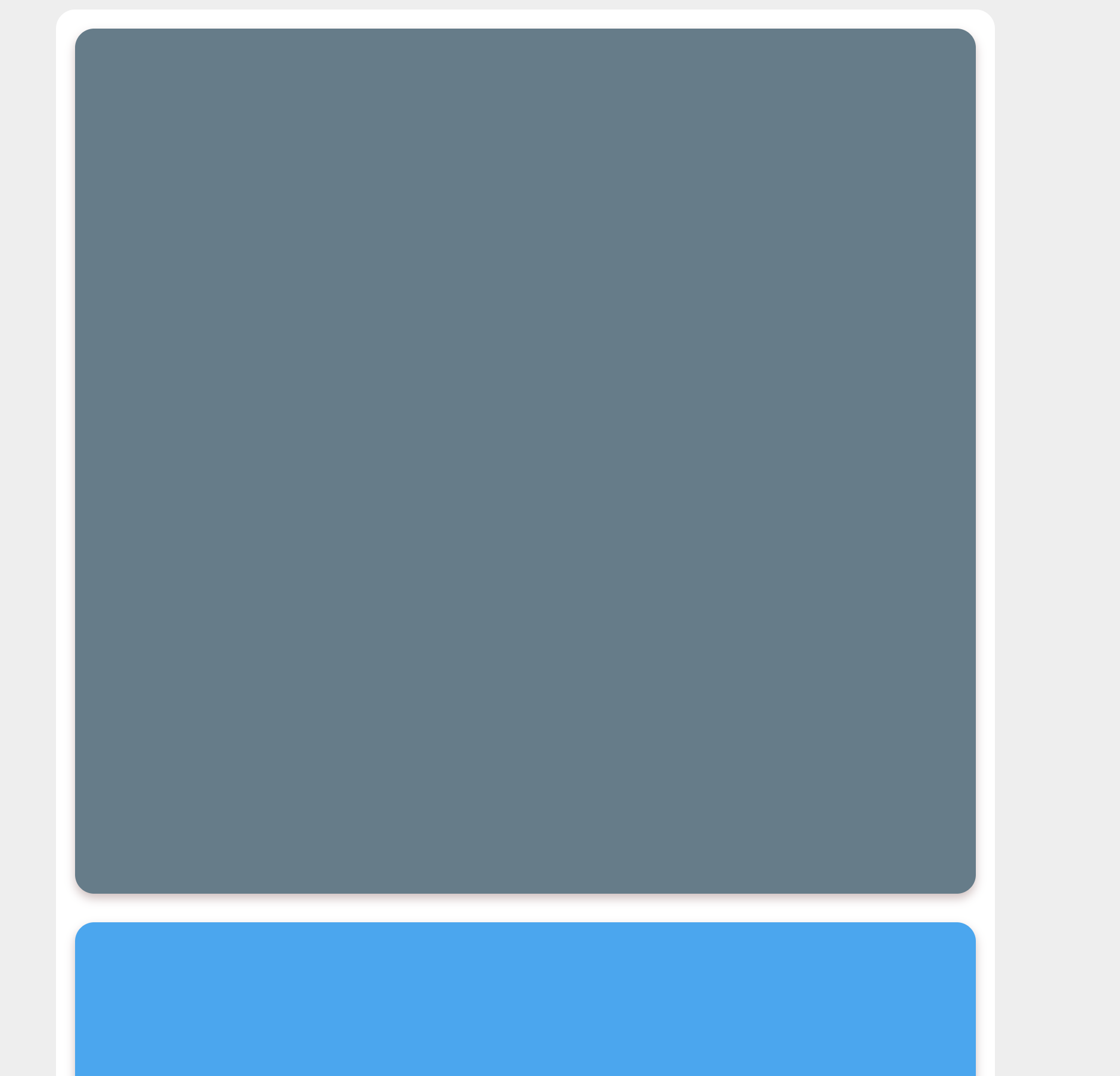
打印期间布局损坏:

2个回答
0
投票
投票
我从相关上下文中找到了一个解决方案here,它也适用于这种情况。 box-decoration-break:克隆用于在发生行、列或分页时“复制”CSS 属性。后者就是这里的情况,scence margin 和/或 padding 是复制的属性之一。 (除了 iexplore 之外,它得到了广泛的支持。)
我所要做的就是将该属性添加到我的 print-css 中,以便在每个页面上都有一个固定的标题和主元素(这将是您的 .container)的重复填充:
@media print {

    header {
        display: flex;
        flex-flow: wrap;
        position: fixed;
        top: 0;
        left: 0;
        right: 0;
    }

    main{
        padding: 4cm 2cm 2cm 2cm;
        box-decoration-break: clone;
    }
...
}
...
0
投票
投票
我相信我已经找到了一种可靠的方法来使用无头镀铬基于
<div>问题是,当您向 div 添加边距并将其
breaks
我想要的是wrapped-div上方的空间,正如你所描述的。好吧,解决方法是将容器包装在另一个 div 中,然后向该元素添加一些填充,最终会得到这样的结果:

顺风时,这就像
<div class="pt-4 first:pt-0">非常整洁!
最新问题
- 如何在 azure 中设置 Web 应用程序的连接字符串?
- 如何使用 Konva React (konva-react) 从舞台捕获流?
- 收到无效的标头行:“HTTP Strict-Transport-Security:default-src 'self';”在 C# 控制台应用程序中
- 如何在 Django 中使用相关模型和计数构建单个查询
- 基本 Spring Boot 本机应用程序使用 Maven 构建,但不使用 gradle
- 有没有办法通过命令行(用于 Github Actions)在 Windows 上安装 Apple Bonjour SDK?
- 如何在测试执行期间模拟实例化类的类函数
- 这个行动真的能避免SOH问题吗?
- 使用PowerShell删除文件扩展名
- Azure CLI 与 Python SDK
- Microsoft Visual Studio Community 安装问题
- NextJS Typescript - 对象可能未定义 - nextjs 构建失败
- 如果给定值则查找数组索引
- TWebRequest 支持 HTML 锚点吗?
- 相对跳跃与绝对跳跃的表现
- 如何阻止 Livewire 重新渲染元素
- Spring Retry 访问实现类名
- latex2sympy 和 sympy.symbols() 之间的交互
- 从 Redshift 中的超类型获取值
- URI 中没有重定向参数,即使有一个 - Facebook
© www.soinside.com 2019 - 2024. All rights reserved.