如何向 DataGrid 行 MUI 添加额外组件
问题描述 投票:0回答:2
我正在尝试向 MUI DataGrid 中的行添加额外的组件。
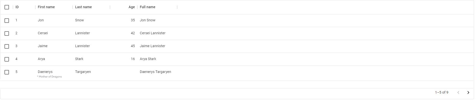
例如,在下面的DataGrid中,我想在一行的主要内容下方添加一些文本。 (注意行 ID 5 的名字列的值)
是否有可用的 API 允许进行此类修改而无需修改核心组件?如果没有,我如何创建一个允许这种行为的自定义组件?
2个回答
2
投票
投票
您可以在字段中使用
renderCellconst columns = [
{ field: "id", headerName: "ID", width: 90 },
{
field: "firstName",
headerName: "First name",
width: 150,
editable: true,
renderCell: (params) => {
return (
<Stack>
<span>{params.value}</span>
<span>Your extra text</span>
</Stack>
);
}
},
...
]
这是基于您的代码的工作codesandbox
0
投票
投票
renderCell如果您的问题更笼统且需要更多自定义:
如何在 DataGrid MUI 中将每一行自定义为 React 组件?
简而言之
使用
<DataGrid slots={{ row: ProjectInfoRcompDto }}其中
ProjectInfoRcompDto- 采用
props类型的GridRowProps - 其中
使您可以访问 每一行(即:props.row
中arr_ProjectInfo
的每一行)<DataGrid rows={arr_ProjectInfo} - 需要返回每行的渲染结果组件。
-
- (注:
的默认值为row
——即:GridRow
)slots={{ row: GridRow }}
代码前
class ProjectInfo {
  public readonly name: string;
  public readonly arr_urlStr: string[] = [];
  public readonly arr_imgInfo: ImgInfo[] = [];
  public readonly arr_pathStr_vid: string[] = [];
  public readonly flexGrow = 1;
  public readonly seqAddedDate;
  public readonly lvOfComplexity;

...

const arr_ProjectInfo_ori: readonly ProjectInfo[] = [

...


function App() {
  const [arr_ProjectInfo, set_arr_ProjectInfo] = React.useState(arr_ProjectInfo_ori.slice());

  return (
    <ThemeProvider theme={muitheme_DataGrid}>
      <Box>Full Stack Developer / Data Analyst</Box>

      <DataGrid
        rows={arr_ProjectInfo}
        columns={columns}
        getRowId={(row) => row.name}
        // columns={columns.map((column) => ({
        //   ...column,
        //   // renderCell: (params) => <ProjectInfoRcomp projectInfo={params} />,
        //   renderCell: (params) => <div>8888888{params.value}</div>,
        // }))}
        // slots={{ row: GridRow }}
        slots={{ row: ProjectInfoRcompDto }}

        sx={{
          margin: 2,
          height: '100%',
        }}
      />
    </ThemeProvider>
  );
}

// no_knowlres // check the jsdoc found default GridRow -> GridRowProps
const ProjectInfoRcompDto: React.FC<GridRowProps> = (props) => {
  // console.log(props);
  // console.log(props.row);
  if (!(props.row instanceof ProjectInfo)) {
    console.log('not_sure_Api');
    // throw new TypeError('not_sure_Api');
    return <div>not_sure_Api</div>;
  }
  return <ProjectInfoRcomp projectInfo={props.row} />;
};
最新问题
- AWS 代码提交 - 对 PR 事件采取行动
- 如何等待并使用来自 XMLHttpRequest 的数据?
- 如何显示 Azure ACA 环境中所有 ACA 的状态
- 启动应用程序时从 json 加载值
- 如何实现 Django 命名空间
- 如何使用Rex查找<=AAA in Python?
- 使用 httpClient PostAsync 调用 api - 400 错误请求
- 如何将 xhttp 下载的数据获取到 Javascript 中的字符串变量并在我的应用程序中使用它
- 使用空手道记录请求/响应
- 响应式 H-Full 按尺寸 Prime Flex
- 如何在 C++ 中重载枚举的 ++ 运算符
- 创建 numpy 数组的缩减长度重采样
- JavaScript 扩展
- 为什么包含波斯语/阿拉伯语和英语字符的字符串在浏览器视图中会混乱?
- 错误:以数组和函数指针作为参数的函数的“未定义引用”
- Excel:Worksheet.Calculate 导致 udf 无限运行
- 使实时访客计数器发生变化而无需刷新
- TYPO3 通过
- 滚动回到可滚动div的顶部
- 如何仅将第一个字母转换为大写?
© www.soinside.com 2019 - 2024. All rights reserved.