Jetpack Compose 如何去除 EditText/TextField 下划线并保留光标?
问题描述 投票:0回答:3
嗨,我需要删除文本字段中的下划线,因为当文本字段是圆形时,它看起来很难看。我已将 activeColor 设置为透明,但光标不会显示(因为它是透明的)。如何删除下划线/activeColor并保留光标?
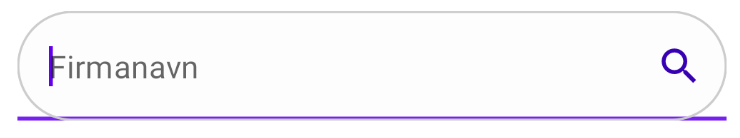
这是我的圆形文本字段代码:
@Composable
fun SearchBar(value: String) {
// we are creating a variable for
// getting a value of our text field.
val inputvalue = remember { mutableStateOf(TextFieldValue()) }
TextField(
// below line is used to get
// value of text field,
value = inputvalue.value,
// below line is used to get value in text field
// on value change in text field.
onValueChange = { inputvalue.value = it },
// below line is used to add placeholder
// for our text field.
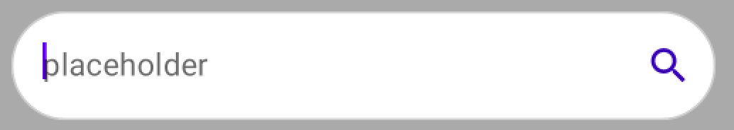
placeholder = { Text(text = "Firmanavn") },
// modifier is use to add padding
// to our text field, and a circular border
modifier = Modifier.padding(all = 16.dp).fillMaxWidth().border(1.dp, Color.LightGray, CircleShape),
shape = CircleShape,
// keyboard options is used to modify
// the keyboard for text field.
keyboardOptions = KeyboardOptions(
// below line is use for capitalization
// inside our text field.
capitalization = KeyboardCapitalization.None,
// below line is to enable auto
// correct in our keyboard.
autoCorrect = true,
// below line is used to specify our
// type of keyboard such as text, number, phone.
keyboardType = KeyboardType.Text,
),
// below line is use to specify
// styling for our text field value.
textStyle = TextStyle(color = Color.Black,
// below line is used to add font
// size for our text field
fontSize = TextUnit.Companion.Sp(value = 15),
// below line is use to change font family.
fontFamily = FontFamily.SansSerif),
// below line is use to give
// max lines for our text field.
maxLines = 1,
// active color is use to change
// color when text field is focused.
activeColor = Color.Gray,
// single line boolean is use to avoid
// textfield entering in multiple lines.
singleLine = true,
// inactive color is use to change
// color when text field is not focused.
inactiveColor = Color.Transparent,
backgroundColor = colorResource(id = R.color.white_light),
// trailing icons is use to add
// icon to the end of tet field.
trailingIcon = {
Icon(Icons.Filled.Search, tint = colorResource(id = R.color.purple_700))
},
)
3个回答
132
投票
投票
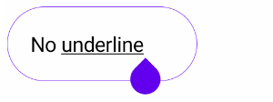
您可以定义这些属性来应用透明颜色:
focusedIndicatorColorunfocusedIndicatorColordisabledIndicatorColor
类似:
   TextField(
       //..
       colors = TextFieldDefaults.textFieldColors(
            textColor = Color.Gray,
            disabledTextColor = Color.Transparent,
            backgroundColor = Color.White,
            focusedIndicatorColor = Color.Transparent,
            unfocusedIndicatorColor = Color.Transparent,
            disabledIndicatorColor = Color.Transparent
        )
    )
从 1.2.0 开始,您还可以将新的
OutlinedTextFieldDecorationBoxBasicTextField val interactionSource = remember { MutableInteractionSource() }
val enabled = true
val singleLine = true
val colors = TextFieldDefaults.outlinedTextFieldColors()
BasicTextField(
value = value,
onValueChange = onValueChange,
modifier = modifier,
// internal implementation of the BasicTextField will dispatch focus events
interactionSource = interactionSource,
enabled = enabled,
singleLine = singleLine
) {
TextFieldDefaults.OutlinedTextFieldDecorationBox(
value = value,
visualTransformation = VisualTransformation.None,
innerTextField = it,
// same interaction source as the one passed to BasicTextField to read focus state
// for text field styling
interactionSource = interactionSource,
enabled = enabled,
singleLine = singleLine,
// update border thickness and shape
border = {
TextFieldDefaults.BorderBox(
enabled = enabled,
isError = false,
colors = colors,
interactionSource = interactionSource,
shape = CircleShape,
unfocusedBorderThickness = 1.dp,
focusedBorderThickness = 1.dp
)
}
)
}
您还可以使用
TextFieldDecorationBoxindicatorLinefocusedIndicatorLineThicknessunfocusedIndicatorLineThickness val colors = TextFieldDefaults.textFieldColors(
backgroundColor = White,
focusedIndicatorColor = Gray)
BasicTextField(
modifier = Modifier
.border(1.dp, Color.LightGray, CircleShape)
.indicatorLine(
enabled = enabled,
isError = false,
colors = colors,
interactionSource = interactionSource,
focusedIndicatorLineThickness = 0.dp,
unfocusedIndicatorLineThickness = 0.dp
)
.background(colors.backgroundColor(enabled).value, CircleShape),
) {
TextFieldDecorationBox(
//...
colors = colors
)
}
3
投票
投票
如果您不需要 TextField 参数/功能(例如折叠标签、占位符等),您可以使用一层 Text / BasicTextField 来创建 SearchField (这是根据 issue FilledTextField: can't remove Bottom Indicator 的建议解决方法):
@Composable
fun Search(
        hint: String,
        endIcon: ImageVector? = Icons.Default.Cancel,
        onValueChanged: (String) -> Unit,
) {
    var textValue by remember { mutableStateOf(TextFieldValue()) }

    Surface(
        shape = RoundedCornerShape(50),
        color = searchFieldColor
    ) {
        Box(
            modifier = Modifier
                .preferredHeight(40.dp)
                .padding(start = 16.dp, end = 12.dp),
            contentAlignment = Alignment.CenterStart
        )
        {
            if (textValue.text.isEmpty()) {
                Text(
                    text = "Search...",
                    style = MaterialTheme.typography.body1.copy(color = MaterialTheme.colors.onSurface.copy(ContentAlpha.medium)),
                    )
            }

            Row(
                verticalAlignment = Alignment.CenterVertically
            ) {
                BasicTextField(
                    modifier = Modifier.weight(1f),
                    value = textValue,
                    onValueChange = { textValue = it; onValueChanged(textValue.text) },
                    singleLine = true,
                    cursorColor = YourColor,
                )
                endIcon?.let {
                    AnimatedVisibility(
                        visible = textValue.text.isNotEmpty(),
                        enter = fadeIn(),
                        exit = fadeOut()
                    ) {
                        Image(
                            modifier = Modifier
                                .preferredSize(24.dp)
                                .clickable(
                                    onClick = { textValue = TextFieldValue() },
                                    indication = null
                                ),
                            imageVector = endIcon,
                            colorFilter = iconColor
                        )
                    }
                }
            }
        }
    }
}
0
投票
投票
我认为最好的解决方案是使用 OutlinedTextField 组件,并尝试使其与您的设计相同,而不是使用已弃用的 TextFieldDefaults.textFieldColors。
OutlinedTextField(
    value = searchText,
    onValueChange = { searchText = it },
    label = { Text("Search") },
    modifier = Modifier
        .fillMaxWidth()
        .padding(8.dp),
    keyboardOptions = KeyboardOptions.Default.copy(imeAction = ImeAction.Search),
    keyboardActions = KeyboardActions(onSearch = { onSearch(searchText) }),
    shape = MaterialTheme.shapes.large,
    leadingIcon = {
        Icon(
            imageVector = Icons.Filled.Search,
            contentDescription = "Search Icon"
        )
    },
)
最新问题
- 使用 Siri 让用户在多个操作之间进行选择的 CarPlay 模板?
- 需要帮助使用 lex 和 yacc 生成三个地址代码
- Jmeter Groovy 脚本读取和利用标头值
- 如何在 Hetzner Cloud Console 中选择文本?
- SQL 查询不适用于相应的输出
- 释放 IIS 保存的文件
- 如何直接从应用程序打开苹果地图?
- 通过VBA放置工程图后,有没有办法更改Solidworks属性
- [已解决]使用 STDIN 和 STDOUT 创建一个子进程,以 UTF-16 进行管道传输
- 尝试在 Ubuntu 16.04 上安装 OCFS2:找不到 o2cb 命令
- 使用k3s访问本地docker镜像
- 直接应用于音频文件时滤波器系数不起作用?
- 从 NodeJS 向 Elastic 搜索请求
- 无法解析类型“http://schemas.syncfusion.com/maui:core:SfChip”
- 是否可以使用 Slack API 进行不需要的输入?
- 必须调用字体加载器并将其分配给 Nextjs13 上模块范围内的 const
- Google Cloud Functions v2 - onValueUpdated 和 onValueWritten 永远不会触发(错误)
- 常量数据 = Object.fromEntries(formData);
- Jest 在将 Svelte v3 升级到 v4 期间遇到意外令牌
- 使用 STDIN 和 STDOUT 创建一个位于 UTF-16 管道中的子进程
© www.soinside.com 2019 - 2024. All rights reserved.