为 ion-toast 组件和阴影部分的按钮应用不同的样式
问题描述 投票:0回答:2
我正在使用 Ionic 创建一个应用程序,并且正在使用带有两个按钮的 toast 组件。 我必须为每个按钮创建不同的样式。
我的代码是这样的:
import { Component } from '@angular/core';
import { ToastController } from '@ionic/angular';

@Component({
  selector: 'toast-example',
  templateUrl: 'toast-example.html',
  styleUrls: ['./toast-example.css'],
})
export class ToastExample {

  constructor(public toastController: ToastController) {}

  async presentToast() {
    const toast = await this.toastController.create({
      message: 'Your settings have been saved.',
      duration: 2000
    });
    toast.present();
  }

  async presentToastWithOptions() {
    const toast = await this.toastController.create({
      header: 'Toast header',
      message: 'Click to Close',
      position: 'top',
      buttons: [
        {
          side: 'start',
          icon: 'star',
          text: 'Favorite',
          handler: () => {
            console.log('Favorite clicked');
          }
        }, {
          text: 'Done',
          role: 'cancel',
          handler: () => {
            console.log('Cancel clicked');
          }
        }
      ]
    });
    await toast.present();

    const { role } = await toast.onDidDismiss();
    console.log('onDidDismiss resolved with role', role);
  }

}
我想这样做:
ion-toast::part(button):first-of-type {
  --button-color: green !important;
}
ion-toast::part(button):nth-of-type(2) {
  --button-color: red !important;
}
但它不起作用:(
在这种情况下,有没有办法将样式应用于每个按钮?
提前致谢。
2个回答
1
投票
投票
不可能通过 css 对两个按钮使用不同的样式,但是你可以使用一点 JavaScript 来实现这一点。
将自定义类放入 toast 中
cssClass: 'toast-custom-class'
使用 cssClss
first-buttonsecond-button然后像吐司一样
await toast.present().then(() => {
  const toasts = document.getElementsByClassName('toast-custom-class');
  const shadow = toasts[0].shadowRoot;
  const childNodes = Array.from(shadow.childNodes);
  childNodes.forEach((childNode: any) => {
     const firstButton = childNode.getElementsByClassName('first-button');
     firstButton[0].setAttribute( 'style', 'color: red !important' );
     const secondButton = childNode.getElementsByClassName('second-button');
     secondButton[0].setAttribute( 'style', 'color: green !important' );
  });
});
0
投票
投票
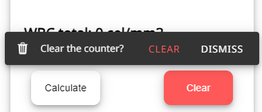
您可以更改颜色或样式,将
role:"string"::part(button "string")例如:
ion-toast.eraseToast::part(button) {
  font-family: var(--customFont);
  color: #ff5858;
}

ion-toast.eraseToast::part(button cancel) {
  color: rgb(255, 255, 255);
}
<IonToast trigger='erasebutton'icon={trash} cssClass={"eraseToast"} message={"Clear the counter?"}
buttons={[ {text:"Clear" ,role:"clear",handler()
{erase()} },
{text: "Dismiss",role:"cancel", handler() { eraseButtonItem?.classList.remove("selected") },} ]}>
</IonToast>结果:
最新问题
- Microsoft WebView2 启动时崩溃
- 将类和程序集名称存储在数据库中有多糟糕?
- 调用新展示位置时,填充重要吗?
- 如何在Python中的多类分类问题上获取每个类的SHAP值
- Lua中pairs()和ipairs()有什么区别?
- 如何使 python tkinter 应用程序在 Android 上运行
- “__cplusplus”宏扩展为什么?
- 使用 std::unique_ptr 实现持续遵守
- AttributeError:模块“click.utils”没有属性“_expand_args”
- 如何在 GNU GCC 上启用 c++23?
- React.js 中使用 useParams 的未定义参数
- 列表中其值总和最多为 K 的元素的最大数量,复杂度为 O(log n)
- JS:如何删除动画而不只是停止它们?
- 两个独立的 Java 桌面应用程序之间的通信
- Java 8 JavaFX - 如何设置单个选项卡标题文本的颜色
- python函数根据主数据帧设置值
- 验证贝宝账户
- 运行分布式 API 测试的工具
- IFogSim:GUI 和代码之间的链接
- Pytest Monkeypatch 用于测试的多进程函数
© www.soinside.com 2019 - 2024. All rights reserved.