滑块相对于滑块拇指的显示值
问题描述 投票:0回答:7
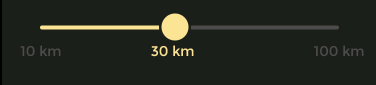
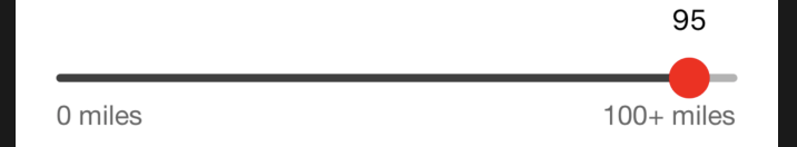
我想相对于滑块拇指移动标签,就像这样:
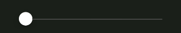
现在我的滑块是这样的:
我想显示相对于滑块拇指 30 公里的标签,这样当滑块移动时,标签应该相应移动。
我正在使用 Native React Slider 组件。
这是我的代码:
<Slider
     style={styles.slider}
     thumbTintColor='rgb(252, 228, 149)'
     step={1}
     maximumValue={5}
     thumbTintColor='rgb(252, 228, 149)'
     maximumTrackTintColor='#494A48'
     minimumTrackTintColor='rgb(252, 228, 149)' />
7个回答
17
投票
投票
您可以将文本左侧调整为滑块的值。
const left = this.state.value * (screenWidth-60)/100 - 15;

<Text style={ { width: 50, textAlign: 'center', left: left } }>
  {Math.floor( this.state.value )}
</Text>

<Slider maximumValue={100}
        value={this.state.value}
        onValueChange={value => this.setState({ value })} />
6
投票
投票
问题的解决方案:
    constructor(props){
        super(props)
        this.state = {
            distance: 30,
            minDistance: 10,
            maxDistance: 100
        }
    }


    render() {
        return (
            <View style={styles.container}>
                <Slider
                    style={{ width: 300}}
                    step={1}
                    minimumValue={this.state.minDistance}
                    maximumValue={this.state.maxDistance}
                    value={this.state.distance}
                    onValueChange={val => this.setState({ distance: val })}
                    thumbTintColor='rgb(252, 228, 149)'
                    maximumTrackTintColor='#d3d3d3'
                    minimumTrackTintColor='rgb(252, 228, 149)'
                />
                <View style={styles.textCon}>
                    <Text style={styles.colorGrey}>{this.state.minDistance} km</Text>
                    <Text style={styles.colorYellow}>
                        {this.state.distance + 'km'}
                    </Text>
                    <Text style={styles.colorGrey}>{this.state.maxDistance} km</Text>
                </View>
            </View>
        );
    }
}
风格:
const styles = StyleSheet.create({
    container: {
        flex: 1,
        justifyContent: 'center',
        alignItems: 'center',
        backgroundColor: '#000',
    },
    textCon: {
        width: 320,
        flexDirection: 'row',
        justifyContent: 'space-between'
    },
    colorGrey: {
        color: '#d3d3d3'
    },
    colorYellow: {
        color: 'rgb(252, 228, 149)'
    }
});
输出:

3
投票
投票
内置
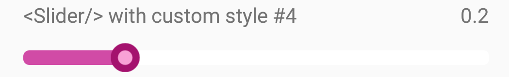
<Slider />这应该有效,react-native-slider,它是官方
<Slider />您需要的与它的演示风格#4非常相似。
对于您的 Slider Label 值,您可以修改其函数 _renderThumbImage() 来替换默认的
<Image />0
投票
投票
测量滑块View的大小和位置
<Slider
    maximumValue={10}
    onLayout={(event)=>{this.slider_bound(event)}}/>


//majore size of Slider.
slider_bound=(event)=>{
var {x, y, width, height} = event.nativeEvent.layout;
this.state.slider_Width=width;
this.state.slider_Height=height;
this.state.slider_x = x;
this.state.slider_y = y;
this.state.slider_x_step_size = width/10; //Devide the width by slider maximum value

this.setState({triger:''});
console.log(TAG+"Slider Dimen:"+width,height+'pos:',x,y);

}
2.现在在滑块的“onValueChange”回调中。
   //compute position to show slider value txt
   this.state.value_x = (value * this.state.slider_x_step_size) + this.state.slider_x;
   this.state.value_y = this.state.slider_Height + this.state.slider_y;
在计算位置上显示滑块值 txt。
<Text style={{position:'absolute',top:this.state.value_y,left:this.state.value_x,color:colors.blackc}}>{this.state.data.slider_value}</Text>
.............. 这样就可以完成工作,但您可能需要稍微调整一下。
0
投票
投票
我认为react-native-multi-slider会解决你的问题。您可以通过将自定义设计的组件发送到可用的
customMarkerMultislideronValuesChange这个链接也可能对您有帮助。
0
投票
投票
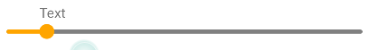
import {Slider} from 'react-native-elements';
<Slider
      thumbStyle={{height: 15, width: 15, backgroundColor: 'orange'}}
      maximumTrackTintColor="grey"
      minimumTrackTintColor="orange"
      thumbProps={{
        children: (
          <View
            style={{
              color: 'green',
              marginTop: -22,
              width: 100,
            }}>
            <Text>Text</Text>
          </View>
        ),
      }}
    />


0
投票
投票
以 ahsan 准则为基础, 我添加了动画值,并将该值包装在 Animated.View 因此它可以正确地制作动画
import React, { useState } from 'react';
import { Text, View, StyleSheet, Slider,Animated } from 'react-native';

const SliderComponent = () => {
  const minDistance = 10;
  const maxDistance = 100;

  const tooltipPosition = new Animated.Value(0);

  const updateTooltipPosition = (value) => {
    setDistance(value);
    tooltipPosition.setValue(value);
  };
  const [distance, setDistance] = useState(30);

  return (
    <View style={styles.container}>
      <Slider
        style={{ width: 300 }}
        step={1}
        minimumValue={minDistance}
        maximumValue={maxDistance}
        value={distance}
        onValueChange={(val) => updateTooltipPosition(val)}
        thumbTintColor='rgb(252, 228, 149)'
        maximumTrackTintColor='#d3d3d3'
        minimumTrackTintColor='rgb(252, 228, 149)'
      />
      <View style={styles.textCon}>
        <Text style={styles.colorGrey}>{minDistance} km</Text>
        <Animated.View
        style={[
          styles.bubble,
          { left: `${(distance / 100) * 90}%`, transform: [{ translateY: -10 }] },
        ]}
      >
        <Text style={[styles.colorYellow]}>{distance} km</Text>
      </Animated.View>
        <Text style={styles.colorGrey}>{maxDistance} km</Text>
      </View>
    </View>
  );
};

const styles = StyleSheet.create({
  container: {
    flex: 1,
    justifyContent: 'center',
    alignItems: 'center',
    backgroundColor: '#000',
  },
  textCon: {
    width: 320,
    flexDirection: 'row',
    justifyContent: 'space-between',
  },
  colorGrey: {
    color: '#d3d3d3',
  },
  colorYellow: {
    color: 'rgb(252, 228, 149)',
  },
  bubble: {
    position: 'absolute',
    alignItems: 'center',
    justifyContent: 'center',
  },
  bubbleText: {
    color: '#000000',
    fontWeight: 'bold',
    fontSize: 16,
    backgroundColor: '#FFFFFF',
    borderRadius: 5,
    paddingVertical: 5,
    paddingHorizontal: 10,
  },
});

export default SliderComponent;
最新问题
- Selenium运行报错,浏览器匹配chromedriver版本,配置了系统变量,但还是报错
- docker-compose 与 golang、nginx 和 postgres 找不到 ./main
- Python Flet 错误:接受 0 个位置参数,但给出了 1 个
- 在 JSON 中编码嵌套的 python 对象
- 尝试使用 VLLM 和 Vertex AI 部署 Llama3 70b 时出现 Ray 错误
- JwtAuthFilter 适用于所有请求,甚至适用于允许的端点
- 如何使用selenium接受来自站点的cookie
- 将参数传递给 Blazor 中的匿名 javascript 函数
- 不使用 strlen 时会出现 strlen 分段错误吗?
- Junit 和 Mockito 如何使用模拟参数实例化模拟类
- 如何对前端性能进行基准测试以加载巨大的数组?
- React Native:Fata 错误 - AmplifyRTNCore/AmplifyRTNCore.modulemap 未找到
- Linux下检索SD卡序列号和制造商
- 我想在打字稿中获取 svelte on:input 事件的事件类型,但我找不到它
- 如何删除电报机器人中的主键盘标记
- 如何制作跳过某些行(重复行)的 VSTACK 函数
- 如何将自定义脚本添加到运行 javascript 文件的 package.json 文件中?
- 如何从package.json运行启动脚本?
- django中的Authenticate方法返回None
- Gnuplot 中是否可以具有与分辨率无关的元素大小?
© www.soinside.com 2019 - 2024. All rights reserved.