如何在 React Native 中添加浮动工具提示?
问题描述 投票:0回答:9
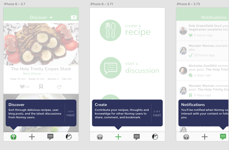
我正在开发一个应用程序,它会在用户进入应用程序主页之前(在初始注册之后)进行一次简短的浏览。我想做的是用以下设计覆盖应用程序页面(通过标签栏看到):
然而,React Native Overlay 有留下很多错误的历史——它也从来没有对我个人有用。 React Native ToolTip 模块不再受支持,也无法正常工作。有没有人完成过这个?如果是这样,如何?谢谢你的建议!
9个回答
投票
与其使用现有的 npm 模块,我的建议是为此编写你自己的东西。
我认为来自 react-native 的模态框会帮助你实现这一点,你可以轻松地放置不同的模态框,这些模态框会有你的功能介绍文本/图像,你可以很容易地继续切换这些文本/图像的可见性。
假设您首先覆盖一个 Modal,它在初始状态下具有“菜单”功能的描述符文本,然后当用户在后台单击并打开下一个项目可见时,您可以将其可见性设置为 false,依此类推,在您想要的最后一个项目上要显示,您可以将 Modal 本身的可见性设置为 false,然后继续主应用程序流程。
这听起来有说服力吗?
投票
您是否尝试过创建自己的
tabBarComponent您可以复制内置的 tabComponent 并将您的 ToolTip 组件添加到渲染
投票
工具提示功能可以使用这个库来实现:rn-tooltip
投票
在这种情况下,我更喜欢创建自己的组件作为答案之一,但您可以使用此组件:react-native-popable
我在一些应用程序中使用它,它运行得非常好。
投票
投票
投票
你可能对使用单个组件的框架不感兴趣,但就流行和良好支持的库而言,React Native Paper 有一个工具提示组件,是一个健壮和广泛使用的库。
投票
已更新
抱歉忘了更新我的答案,请让我更简要地解释一下我是如何结束的
所以我处理这个使用,创建自己的组件,样式位置
absoluteuseRefy// Tooltip.js
const styles = StyleSheet.create({
toolTip: (x, y) => ({
position: 'absolute',
left: x,
top: y
}),
});
const Tooltip = ({pos}) => {
return (
<View style={styles.toolTip(pos.x, pos.y)} >
<Text>Hi There!</Text>
</View>
)
}
// App.js
import {useRef} from 'react';
const bottomNavRef = useRef();
const [tooltip, setTooltip] = useState({visible: false, pos: {x: 0, y: 0}})
const showTooltip = () => {
const x = bottomNavRef.current.clientX
const y = bottomNavRef.current.clientY
setTooltip({ visible: true, pos: {x, y} })
}
...
return (
<View>
<Tooltip visible={tooltip.visible} />
<BottomNav ref={bottomNavRef}>
...
</BottomNav>
</View>
)
我知道它没有经过测试,但我发誓这就是您创建自己的工具提示的全部想法
投票
也许您可以创建自定义工具提示组件。这是一个非常基本的示例,说明如何使用一些 CSS 技巧和 zIndex 属性使其出现在其他组件的前面:https://codepen.io/vtisnado/pen/WEoGey
class SampleApp extends React.Component {
  render() {
    return (
      /******************* RENDER VISUAL COMPONENTS *******************/
      <View style={styles.container}>
        <View style={styles.mainView}>
          {/* Start: Tooltip */}
          <View style={styles.talkBubble}>
            <View style={styles.talkBubbleSquare}>
              <Text style={styles.talkBubbleMessage}>Put whatever you want here. This is just a test message :)</Text>
            </View>
            <View style={styles.talkBubbleTriangle} />
          </View>
          {/* End: Tooltip */}
          <View style={styles.anotherView} /> {/* The view with app content behind the tooltip */}
        </View>
      </View>
      /******************* /RENDER VISUAL COMPONENTS *******************/
    );
  }
}

/******************* CSS STYLES *******************/
const styles = StyleSheet.create({
  container: {
    flex: 1,
    justifyContent: 'center',
    alignItems: 'center',
    backgroundColor: '#F5FCFF'
  },
  mainView: {
    flex: 1,
    flexDirection: 'row',
  },
  talkBubble: {
    backgroundColor: 'transparent',
    position: 'absolute',
    zIndex: 2, // <- zIndex here
    flex: 1,
    left: 20,
    //left: (Dimensions.get('window').width / 2) - 300, // Uncomment this line when test in device.
    bottom: 60,
  },
  talkBubbleSquare: {
    width: 300,
    height: 120,
    backgroundColor: '#2C325D',
    borderRadius: 10
  },
  talkBubbleTriangle: {
    position: 'absolute',
    bottom: -20,
    left: 130,
    width: 0,
    height: 0,
    borderLeftWidth: 20,
    borderRightWidth: 20,
    borderTopWidth: 20,
    borderLeftColor: 'transparent',
    borderRightColor: 'transparent',
    borderTopColor: '#2C325D',
  },
  talkBubbleMessage: {
    color: '#FFFFFF',
    marginTop: 40,
    marginLeft: 20,
    marginRight: 20,
  },
  anotherView: {
    backgroundColor: '#CCCCCC',
    width: 340,
    height: 300,
    position: 'absolute',
    zIndex: 1, // <- zIndex here
  },
});
/******************* /CSS STYLES *******************/
更新:我删除了 Codepen iframe 小部件,因为它可能会让一些用户感到困惑,请按照上面的链接查看示例。
最新问题
- 使用 Wireshark 捕获网络路由器流量
- 为什么 `dataclasses.asdict(obj)` 比 `obj.__dict__()` 慢 10 倍
- 出现错误:在为 webdriverio 进行 npm 安装后,yards 支持最低 Node.js 版本 12
- gghighlight 不能与 ggplot 分面一起使用
- nextjs 应用程序中动态页面道具的类型是什么
- 使用带有索引匹配的数组公式
- constexpr bool 是原子约束吗?
- Graphviz如何缩小下标和脚本之间的间距?
- 导入 org.powermock.api.mockito.PowerMockito 未找到?
- Cloud firestore 无法与我的 Android studio 连接
- 为shutil.copy文件创建目标路径
- *快速*从 rastio rasterize() ndarray 中提取像素值行
- 如何让子进程使用另一个终端输入输出?
- 在静态函数中使用配置属性
- 如何在不同工作表的循环中引用活动单元格?
- 逻辑应用中的 CosmosDB 查询:跨分区查询时响应为空
- Perl:在这种情况下我可以跳过中间哈希变量吗?
- 当我在服务之间进行休息调用时,出现异常,提示无法调用“java.util.List.stream()”,因为返回值为 null
- 为什么哈希值被打印两次
- 如果重复字符重复少于一定次数,则删除它们 - Julia