如何在 TimePicker 组件中设置高度、宽度和边框半径 - MUI React
问题描述 投票:0回答:1
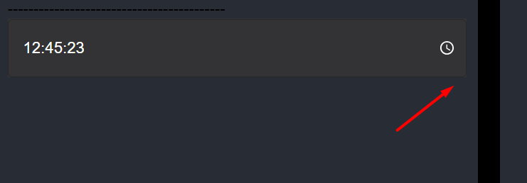
我试图更改 TimePicker 中输入的一些属性,例如高度、宽度和边框半径,但没有成功。有谁知道如何使用 sx 或 slotProps 更改它?这是我当前的代码。
<TimePicker
          ampm={false}
          views={['hours', 'minutes', 'seconds']}
          sx={{
            backgroundColor: "#333335",
            font: "white",
            color: "#FFFF",
            textDecoration: "bold",
            input: {
              color: "#FFFF",
              fontSize: "1.4rem",
            },
              "& .MuiTimePicker-root": {
              backgroundColor: "#222223",
            },
            "& .MuiTimePicker-input": {
              color: "#FFFF",
              fontSize: "1.2rem",
            },
          }}
          slotProps={{
            popper: {
              sx: {
                "& .MuiList-root": {
                  backgroundColor: "#333335",
                },
                "& .MuiMenuItem-root": {
                  "&.Mui-selected": {
                    backgroundColor: "#04395E",
                    color: "white"
                  },
                  color: "white"
                },
                "& .MuiDialogActions-root": {
                  backgroundColor: "#333335",
                },
                "& .MuiSvgIcon-root": {
                  "&.MuiSvgIcon-fontSizeMedium": {
                    backgroundColor: "#04395E",
                    color: "white"
                  },
                  color: "white"
                },
              },
            },
          }}
          value={selectedTime}
          onChange={(newTime: any) => setSelectedTime(newTime)}
          timeSteps={{hours: 1, minutes: 1, seconds: 1}}
/>
1个回答
0
投票
投票
您需要在
textfieldslotPropsimport OutlinedInputClasses from '@mui/material/OutlinedInput/outlinedInputClasses'
<TimePicker
label="Basic time picker"
slotProps={{
textField: {
sx: {
borderRadius: 6,
fieldset: { borderRadius: 6 },
/* Use FilledInputClasses if your TextField variant changed to "filled" otherwise use below */
[`.${OutlinedInputClasses.root}`]: {
height: 80,
width: 300,
},
/* If you change the default height, you need to adjust the Input Label position as well */
'& .MuiInputLabel-root': { lineHeight: 3 },
},
},
}}
/>
⭐ 注意:确保
borderRadiusfieldset: {borderRadius: _}希望有帮助。
最新问题
- 在C#中动态添加和加载资源中的图像
- 使用 Turbo Native Android 播放背景音频
- Python:使用 Selenium/BS4 抓取使用脚本填充的画布
- 为什么不同版本的intern方法有变化?
- 无法使用凭据从 Spring Boot 应用程序连接到 Neo4J 数据库
- Google 是否可以看到通过 Google 跟踪代码管理器发送的数据?
- Powershell - XML 根据子节点值重命名节点名称
- 优化 SQL 查询流程
- 如何在 JavaFX 中使用不确定的 ProgressIndicator 来制作可暂停任务?
- 如何根据时间和优先级生成队列? [已关闭]
- 无法设置材质-ui 日期选择器确定/取消按钮的样式
- 将 $_SESSION 设置为 1 个月后 PHP 过期
- 如何在 React 中显示 Bootswatch 模式?
- System.Text.Json 现在是否始终需要无参数构造函数?
- 从 Xcode 构建游戏时出错; ExternalBuildToolExecution & 内部不一致错误
- 如何在 ASP.NET Core Web API、Entity Framework Core 和 PostgreSQL 中创建具有唯一编号的序列号服务?
- 组件未在react-native中渲染
- 如何将串口暴露给docker主机?
- 使用另一个按钮禁用/启用按钮
- 使用视图更新表并获取“在关系“员工”的规则中检测到无限递归
© www.soinside.com 2019 - 2024. All rights reserved.