水平滚动容器中的中央响应元素
问题描述 投票:0回答:2
我创建了一个容器(红色边框,其线表示中心),如果有溢出,该容器将水平滚动。
此容器的第一个子项(紫色块)始终是一个按钮。
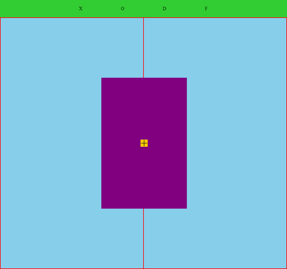
当您单击此按钮时,它将向容器中添加其他子项。
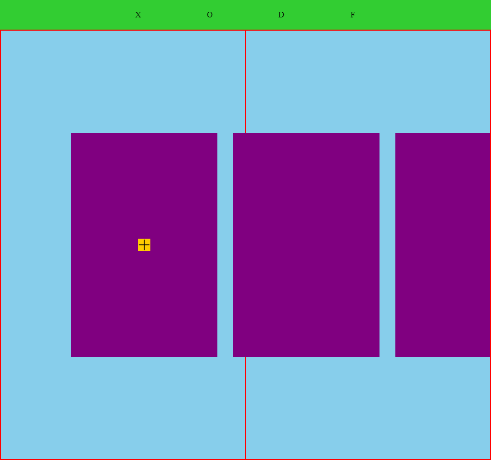
[我想做的是找出一种使用纯CSS的方法,以便在加载应用程序时第一个孩子始终居中,并且如果有多个孩子,那么容器中的最后一个孩子元素也可以滚动到容器的正中央。
我很难弄清楚这一点,因为除了对子元素做出响应min-width(即100px)之外,我还应用了width(即25vw)。
[我最初计划实现此目标的方法是将padding-left应用于父容器,然后将::after伪元素应用于:not(.first-child).children:last-child,但是后来我意识到,如果我想要此方法是不够的,完全响应。但是,我知道我可以手动计算将在哪个宽度触发min-width,然后使用@media查询,但我希望有更好的方法。
#container {
  width: 100%;
  height: 100%;
  padding-left: ; /* Half the window width minus half the width of the child. */
  overflow-x: scroll;
  display: flex;
  align-items: center;
  background: skyblue;
  box-sizing: border-box;
  border: solid red 2px;
}

#container::-webkit-scrollbar {
  display: none;
}

.children {
  width: 25vw;
  min-width: 100px;
  height: 50%;
  min-height: 200px;
  position: relative;
  margin-right: 5%;
  display: flex;
  justify-content: center;
  align-items: center;
  background: purple;
}

:not(.first-child).children:last-child::after {
  content: '';
  width: ; /* Half the window width minus half the width of the child. */
  height: 100%;
  position: relative; /* relative or absolute      */
  left: ;             /* and offset appropriately. */
  transform: ;        /*                           */
}
有人对此有任何想法吗?
2个回答
2
投票
投票
您可以将margin-left应用于第一个孩子,并且可以使用媒体查询来处理最小宽度。当屏幕小于400px时,25vw将小于100px,并且您更改值以考虑100px。
#container {
  position: fixed;
  top:0;
  left:0;
  width: 100%;
  height: 100%;
  overflow-x: scroll;
  display: flex;
  align-items: center;
  background:
    linear-gradient(red,red) center/1px 100% no-repeat,
    skyblue;
  box-sizing: border-box;
  border: solid red 2px;
}

#container::-webkit-scrollbar {
  display: none;
}

.children {
  width: 25vw;
  min-width: 100px;
  height: 40%;
  min-height: 100px;
  position: relative;
  margin-right: 5px;
  display: flex;
  justify-content: center;
  align-items: center;
  background: purple;
  flex-shrink:0; /* don't forget this to avoid the shrink */
}

.children:first-child {
  margin-left: calc(50% - 12.5vw);
}

@media (max-width:400px) {
  .children:first-child {
    width: 25vw;
    min-width: 100px;
    margin-left: calc(50% - 50px);
  }
}
<div id="container">
<div class="children"></div>
<div class="children"></div>
<div class="children"></div>
<div class="children"></div>
</div>没有媒体查询,您可以考虑将具有max-width约束的伪元素:
#container {
  position: fixed;
  top:0;
  left:0;
  width: 100%;
  height: 100%;
  overflow-x: scroll;
  display: flex;
  align-items: center;
  background:
    linear-gradient(red,red) center/1px 100% no-repeat,
    skyblue;
  box-sizing: border-box;
  border: solid red 2px;
}

#container::-webkit-scrollbar {
  display: none;
}

.children {
  width: 25vw;
  min-width: 100px;
  height: 40%;
  min-height: 100px;
  position: relative;
  margin-right: 5px;
  display: flex;
  justify-content: center;
  align-items: center;
  background: purple;
  flex-shrink:0;
}

#container:before {
  content:"";
  width: calc(50% - 12.5vw);
  max-width:calc(50% - 50px);
  flex-shrink:0;
}
<div id="container">
<div class="children"></div>
<div class="children"></div>
<div class="children"></div>
<div class="children"></div>
</div>0
投票
投票
即使我将calc用作孩子的vh,我仍然可以使用width创建严格响应的解决方案。 CSS是一个救星。
#container {
--offset: calc(50vw - ((100vh / 100) * 20);
  padding-left: var(--offset);
  background: skyblue;
}

.children {
  min-width: 40vh; /* vh is used for width to account for the height of window. */
  min-height: 60vh;
  position: relative;
  background: purple;
}

:not(.first-child).children:last-child::after {
  content: '';
  width: var(--offset);
  height: 1px;
  position: absolute;
  left: 100%;
}
最新问题
- 分配标签:所有值均为 false
- constexpr 数据成员和单一定义规则
- 为什么 JavaScript 双边字符串文字插值不是二次的?
- 如何将二维 numpy 数组变成三维数组?
- 如何在C中识别字符串中的减法?
- 在Konsole中执行命令时显示时间
- 如何卸载ag-grid-community
- 在 Android SQLite 上执行“PRAGMAcompile_options”没有输出任何内容
- 外部数据量大的情况下如何快速使用Google的Gemini?
- 如何将搜索栏灰色区域的背景颜色更改为白色?
- 如何使用 Selenium 打印 Python 中 Web 表格列中的所有文本?
- 我可以使用 .NET core 中的 httpclient 发送 GraphQL 查询吗?
- 高效的 for/each 循环来匹配短语?
- 使用 ngrok 而不是 localhost 时,Axios 响应返回 HTML 代码块(反应)
- 使用 almalinux 8 plesk 部署 django 应用程序
- HTML linting 错误(',' 预期的 javascript),但遵循建议会破坏代码
- 错误“NameError:名称“a”未定义”
- nextjs 应用程序顶层的更改仅影响索引页面
- 使用spark.conf.set()函数更新Spark属性真的安全吗?
- 从一列而不是另一列中选择所有值的有效方法
© www.soinside.com 2019 - 2024. All rights reserved.