div内的边界框/框
问题描述 投票:1回答:1
我正在开发一个人脸识别webapp,但我遇到了一些问题,试图“修复”图像上的边界框使其响应。如果屏幕的大小是(正确的)结果:
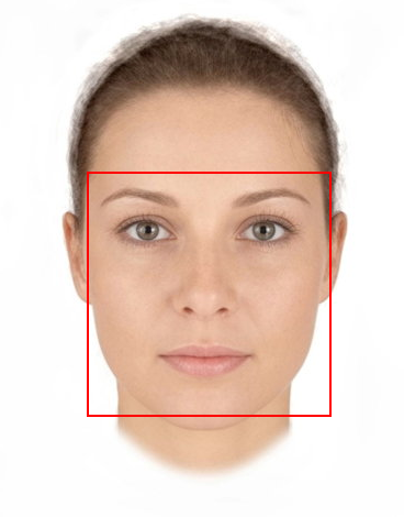
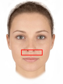
但是一旦我尝试调整窗口浏览器的大小,使其变小,盒子就会失去它的位置:
.image-container {
  position: relative;
  display: inline-block;
  img {
    display: block;
    max-width: 100%;
    height: auto;
    margin-left: auto;
    margin-right: auto;
  }
}

.box {
  display: flex;
  flex-wrap: wrap;
  justify-content: center;
  position: absolute;
  border: 2px solid red;
}
      <div>
        {this.setRecognitionType()}
        <div className={styles["image-container"]}>
          {this.state.box ? (
            <div
              className={styles.box}
              style={{
                top: this.state.box.top,
                right: this.state.box.right,
                bottom: this.state.box.bottom,
                left: this.state.box.left
              }}
            />
          ) : null}
          <img id="image" src={this.props.imageUrl} alt="" />
        </div>
      </div>
在这种情况下EDIT Box属性:
top: 192px;

right: 85px;

bottom: 118px;

left: 92px;
编辑:解决方案如前所述,唯一的方法似乎是使用百分比而不是px。
我整理的方式:
left: (coords.left / imageWidth) * 100,
top: (coords.top / imageHeight) * 100,
right: ((width - coords.right) / imageWidth) * 100,
bottom: ((height - coords.bottom) / imageHeight) * 100
“imageHeight”和“imageWidth”是原始图片的大小,coords是以像素为单位的坐标。
1个回答
1
投票
投票
由于您使用静态单位定位框,因此您的代码无法产生所需的效果。随着图片变小,盒子总是从顶部192px,从右边85px等。尝试使用百分比单位而不是相似(显然使用数字直到看起来正确):
top: 30%;
right: 5%;
left: 5%;
bottom: 15%;
最新问题
- 求两个向量之间每对的距离
- 调用非对象上的成员函数
- 如何将 pygbif 中的 X 和 Y 坐标转换为 Cartopy 的经纬度
- 如何在 Visual Studio Code 中将鼠标悬停在状态栏项目上时创建自定义对话框
- 使用LangChain分割HTML文件并保存块
- 下载带有代理设置的Python包
- 如何不执行从float到torch.float64的舍入
- 如果构造该类型的对象,为什么有两个默认构造函数只会出错?
- Jupyter Notebook 将多个绘图保存为一个 PDF
- 如何将外部 JS 脚本添加到 Blazor 页面
- 即使互联网关闭,应用程序也应该导航到主页
- 有没有办法改变Chip的点击颜色
- 在 Supabase 中创建触发器函数以更新另一个表中的字段时遇到问题
- Azure BlobClient VS CloudBlobClient
- 使用 itemize 时出现“出了点问题,可能缺少 \item”错误
- 如何在 Windows 中安装 Linaro 工具链?
- 使用 Grok 解析日志
- 使用InterceptorBinding时拦截器没有输出
- 如何在 Playwright 中指示哪个项目启动设置(项目)过程
- C++ 从 VT_DISPATCH 类型的 SafeArray 获取 IDispatch 指针
© www.soinside.com 2019 - 2024. All rights reserved.