使用默认大小调整窗口大小来调整 div 大小
问题描述 投票:0回答:2
我见过类似的主题,其答案以 % 或 vh 为单位,但有点不同。 我使用此 CSS 默认情况下有一组尺寸为 900x600 的不同绘图:
.chartbox {
    display: flex;
    flex-wrap: wrap;
    background-color: DodgerBlue;
    justify-content: space-around;
}
.chart {
    background-color: #f1f1f1;
    width: 900px;
    height: 600px;
    margin: 10px;
    position: center;
}
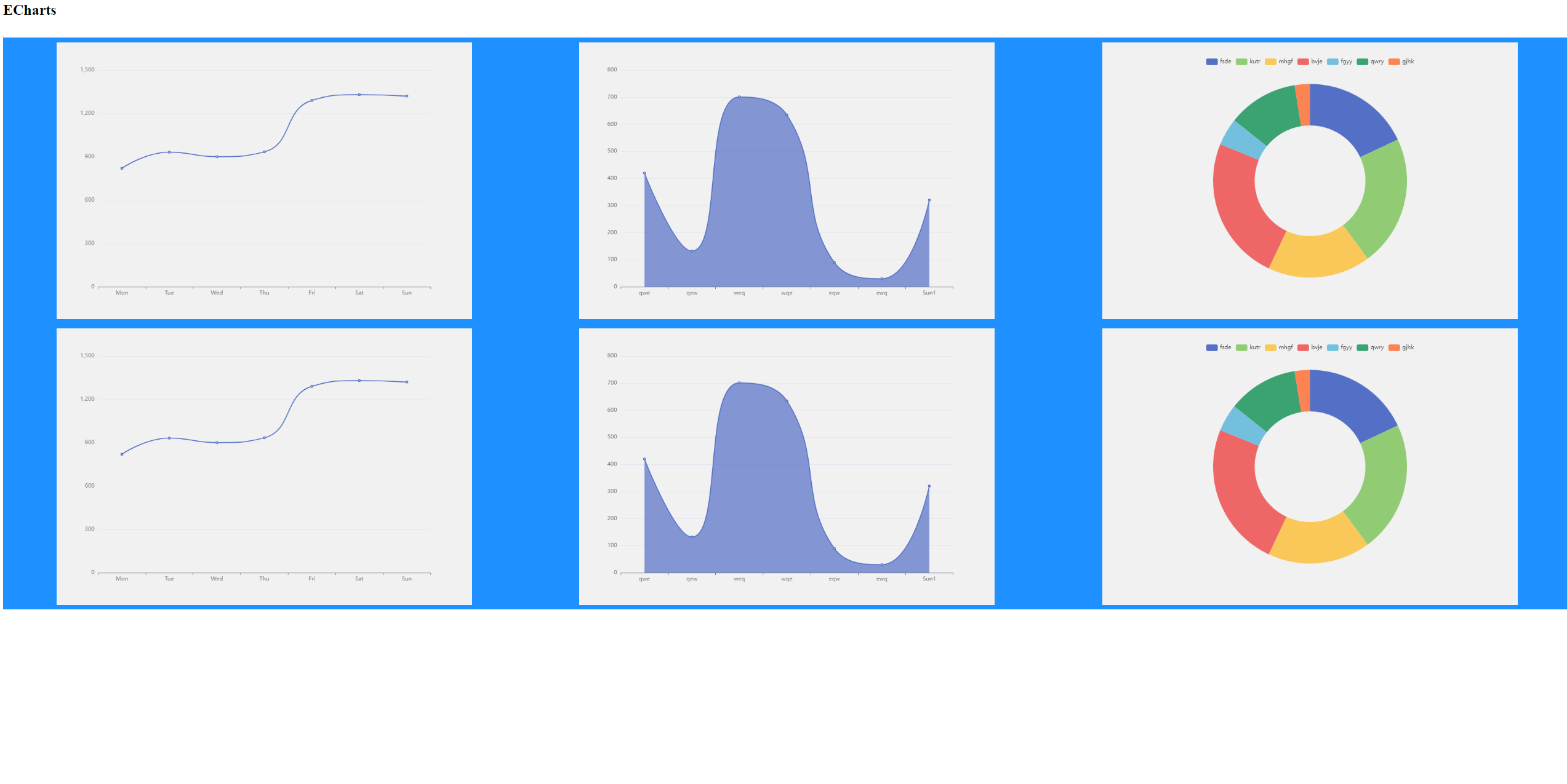
我希望它们在窗口大小调整时自动调整大小(或者屏幕很小) 我使用 ECharts 中的图表,带有 js 代码,例如:
var myChart = echarts.init(document.getElementById('main'));

var option = {
    xAxis: {
        type: 'category',
        data: ['Mon', 'Tue', 'Wed', 'Thu', 'Fri', 'Sat', 'Sun']
    },
    yAxis: {
        type: 'value'
    },
    series: [
    {
      data: [820, 932, 901, 934, 1290, 1330, 1320],
      type: 'line',
      smooth: true
    }
    ]
};

myChart.setOption(option)
我的 HTML:
<DOCTYPE html>
<html>
    <head>
        <meta charset = "utf-8" />
        <h1>ECharts</h1>
        <link rel="stylesheet" type="text/css" href="mycss.css">
        <!-- Include The ECharts file you just downloaded -->
        <script src = "echarts.js"></script>
    </head>
    <body>
        <br>
        <!-- Prepare a DOM with a defined width and height for ECharts -->
        <div class="chartbox">
            <div class="chart" id= "main"></div>
            <div class="chart" id= "main1"></div>
            <div class="chart" id= "main2"></div>
            <div class="chart" id= "main3"></div>
            <div class="chart" id= "main4"></div>
            <div class="chart" id= "main5"></div>

        </div>

        <script src = "myjs.js"></script>
        <script src = "myjs1.js"></script>
        <script src = "myjs2.js"></script>
        <script src = "myjs3.js"></script>
        <script src = "myjs4.js"></script>
        <script src = "myjs5.js"></script>
    </body>
</html>
我尝试使用 % 和 vh 来表示 .chart 的高度和宽度,但它们与默认大小冲突。 我尝试使用不带宽度和高度的 max-width 和 max-height ,但图表没有出现(mb 它是 ECharts 功能)。 我期望以下内容:
- 如果 3 个 900x600 的图表适合屏幕,则放置它们
- 否则,如果 3 个 600x400 的图表适合屏幕,则放置它们
- 否则,如果 2 个 900x600 的图表适合屏幕,则放置它们
- 否则,如果 2 个 600x400 的图表可以适合屏幕,则放置它们
- 否则如果 1 个 900x600 的图表可以适合屏幕,则将其放置
- 否则,如果 1 个图表 600x400 可以适合屏幕,则将其放置
- 否则尽可能调整大小
2个回答
0
投票
投票
我认为这个片段与你的问题类似。
它利用弹性布局和夹具尺寸计算来实现您想要的。
请注意,这些值不是您指定的值(我的屏幕对于 3*900px 来说太小了:D)
.container {
  display: flex;
  background: lightgrey;
  padding: 2rem;
  justify-content: center;
}
.chart-container {
  display: flex;
  gap: 16px;
  flex-wrap: wrap;
  justify-content: center;
  width: clamp(200px, 100%, 1000px);
}
.chart {
  display: block;
  width: clamp(200px, 33%, 300px);
  aspect-ratio: 3/2;
  flex-grow: 1;
}
.red {
  background: red;
}
.green {
  background: green;
}
.blue {
  background: blue;
}
.yellow {
  background: yellow;
}
.orange {
  background: orange;
}
.purple {
  background: purple;
}
<div class='container'>
<div class='chart-container'>
<div class='chart red'></div>
<div class='chart green'></div>
<div class='chart blue'></div>
<div class='chart yellow'></div>
<div class='chart orange'></div>
<div class='chart purple'></div>
</div>
</div>0
投票
投票
也许有一种更优雅的方法,但我发现可以通过媒体查询来完成
您可以决定图之间的最小间隙,将其添加到它们的整体宽度,并将该值设置为查询的
max-width示例:
如果 3 个 900x600 的图表适合屏幕,则放置它们
我们需要有 3 个宽度为 900 的图表,因此它们的总宽度为 900px * 3 = 2700px。
最小间隙应该类似于 10px (它可以是你想要的任何值)。您想要 3 个项目,因此它们之间有 2 个间隙。并且您有
justify-content: space-around;我们为您的线条提供了完整的最小宽度:2700px + 30px = 2730px
@media (max-width: 2730px){
 .chart {
  width: 600px;
  height: 400px;
 }
}
您需要为所有案例创建此类查询。
每个查询都将处理克服最小可能宽度并且我们需要显示较小图表的情况
最新问题
- 当我尝试将函数从页面发送到组件时,Next js 给我一个错误
- 如何在`rust_socketio`(异步版本)中使用共享外部变量?
- 如何在作用域枚举上重载 |= 运算符?
- 有人可以帮忙找到最好的 JavaScript 课程吗?
- AWS 代码提交 - 对 PR 事件采取行动
- 如何等待并使用来自 XMLHttpRequest 的数据?
- 如何显示 Azure ACA 环境中所有 ACA 的状态
- 启动应用程序时从 json 加载值
- 如何实现 Django 命名空间
- 如何使用Rex查找<=AAA in Python?
- 使用 httpClient PostAsync 调用 api - 400 错误请求
- 如何将 xhttp 下载的数据获取到 Javascript 中的字符串变量并在我的应用程序中使用它
- 使用空手道记录请求/响应
- 响应式 H-Full 按尺寸 Prime Flex
- 如何在 C++ 中重载枚举的 ++ 运算符
- 创建 numpy 数组的缩减长度重采样
- JavaScript 扩展
- 为什么包含波斯语/阿拉伯语和英语字符的字符串在浏览器视图中会混乱?
- 错误:以数组和函数指针作为参数的函数的“未定义引用”
- Excel:Worksheet.Calculate 导致 udf 无限运行
© www.soinside.com 2019 - 2024. All rights reserved.