如何从 jetpack compose 更改 OutlinedTextField 的轮廓颜色?
问题描述 投票:0回答:7
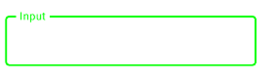
这是 OutlinedTextField 代码在 jetpack-compose 中的样子:
OutlinedTextField(
    value = "",
    onValueChange = {},
    label = {Text("Input")}
)
此 TextField 轮廓的默认颜色是紫色。我想明显地改变轮廓颜色和标签。
7个回答
76
投票
投票
OutlinedTextFieldTextFieldDefaults.outlinedTextFieldColors、
focusedBorderColor、unfocusedBorderColordisabledBorderColor 中定义。
与 M2:
focusedBorderColor: Color = MaterialTheme.colors.primary.copy(alpha = ContentAlpha.high),
unfocusedBorderColor: Color = MaterialTheme.colors.onSurface.copy(alpha = ContentAlpha.disabled),
您可以更改主题中的
colors.primarycolors.onSurface与 M3:
    focusedBorderColor: Color = OutlinedTextFieldTokens.FocusOutlineColor.toColor(),
    unfocusedBorderColor: Color = OutlinedTextFieldTokens.OutlineColor.toColor(),
在这种情况下,您可以更改主题中的
primaryoutline否则你可以使用以下方法覆盖它们:
    OutlinedTextField(
        value = "",
        onValueChange = {},
        label = {Text("Input")},
        colors = TextFieldDefaults.outlinedTextFieldColors(
            focusedBorderColor = Green,
            unfocusedBorderColor = Yellow)
    )
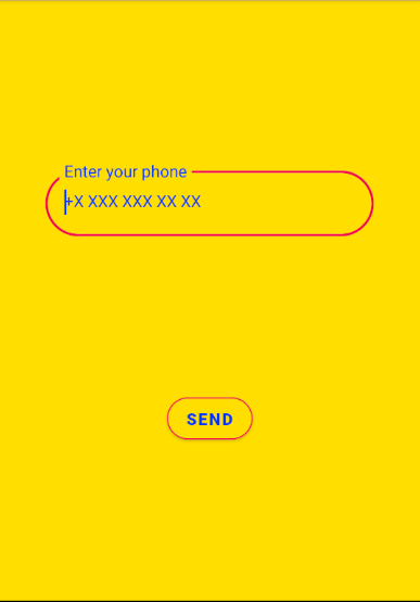
11
投票
投票
@Preview
@Composable
fun TelephoneEditText() {
    val textValue = remember {
        mutableStateOf("")
    }

    OutlinedTextField(
        label = {
            Text(
                text = stringResource(
                    id = R.string.phoneNumber
                ),
                style = TextStyle(
                    color = MaterialTheme.colors.primaryVariant,
                )
            )
        },
        placeholder = {
            Text(
                text = stringResource(id = R.string.phone_placeholder),
                style = TextStyle(
                    color = MaterialTheme.colors.primaryVariant,
                    textAlign = TextAlign.Center
                )
            )
        },
        colors = TextFieldDefaults.outlinedTextFieldColors(
            focusedBorderColor = MaterialTheme.colors.secondary,
            unfocusedBorderColor = MaterialTheme.colors.secondary,
            focusedLabelColor = MaterialTheme.colors.secondary,
            cursorColor = MaterialTheme.colors.primaryVariant
        ),
        keyboardOptions = KeyboardOptions.Default.copy(keyboardType = KeyboardType.Number),
        value = textValue.value,
        onValueChange = { textValue.value = it },
    )
    WhatsAppButton(textValue)
}
颜色.kt
val Yellow500 = Color(0XFFFFDE03)
val Blue700 = Color(0xFF0036FF)
val Pink500 = Color(0xFFf50057)
val Pink700 = Color(0xFFff5983)

val LightColors = lightColors(
    primary = Yellow500,
    primaryVariant = Blue700,
    secondary = Pink500,
    secondaryVariant = Pink700
)

val DarkColors = darkColors(
    primary = Yellow500,
    primaryVariant = Blue700,
    secondary = Pink700
)
2
投票
投票
对于 1.0.0 beta-1
OutlinedTextField(
    value = "",
    onValueChange = {},
    label = {Text("Input")},
    color = TextFieldDefaults.outlinedTextFieldColors(
            focusedBorderColor: Color = MaterialTheme.colors.primary.copy(alpha =
              ContentAlpha.high),
            unfocusedBorderColor: Color = MaterialTheme.colors.onSurface.copy(alpha =
              ContentAlpha.disabled),
            disabledBorderColor: Color = unfocusedBorderColor.copy(alpha =
              ContentAlpha.disabled),
            errorBorderColor: Color = MaterialTheme.colors.error,
    )
)
使用上述参数根据情况设置边框颜色。
2
投票
投票
使用撰写 androidx.compose:compose-bom:2023.04.01 现在你需要使用颜色。 对于背景,使用容器颜色,对于边框,使用指示符颜色
  OutlinedTextField(
            searchValue.value,
            {
                searchValue.value = it
            },
            placeholder = { Text(text = stringResource(id = R.string.hint_search_food)) },
            keyboardOptions = KeyboardOptions(
                keyboardType = KeyboardType.Text, imeAction = ImeAction.Search
            ),
            modifier = Modifier.fillMaxWidth(),
            shape = RoundedCornerShape(24.dp),
            colors = TextFieldDefaults.colors(
                unfocusedContainerColor = fieldBackGroundColor,
                focusedContainerColor = fieldBackGroundColor,
                focusedIndicatorColor = fieldBackGroundColor,
                unfocusedIndicatorColor = fieldBackGroundColor
            ),
            leadingIcon = {
                Icon(Icons.Outlined.Search, "Search")
            },
        )
1
投票
投票
我相信这是 M3 的解决方案:
colors = TextFieldDefaults.textFieldColors(
                backgroundColor = Color.Transparent,
                cursorColor = androidx.compose.material3.MaterialTheme.colorScheme.onPrimaryContainer.copy(alpha = ContentAlpha.medium),
                focusedIndicatorColor = androidx.compose.material3.MaterialTheme.colorScheme.onPrimaryContainer.copy(alpha = ContentAlpha.medium),
                focusedLabelColor = androidx.compose.material3.MaterialTheme.colorScheme.onPrimaryContainer.copy(alpha = ContentAlpha.medium)
            )
1
投票
投票
您可以使用此属性来更改边框颜色
OutlinedTextFieldDefaults.colors(
                    focusedBorderColor = // someColor,
                    unfocusedBorderColor = //someColor,
                )
例如,
OutlinedTextField(
                value = status,
                onValueChange = { status = it },
                shape = RoundedCornerShape(8.dp),
                colors = OutlinedTextFieldDefaults.colors(
                    focusedBorderColor = Grey80,
                    unfocusedBorderColor = Grey80,
                )

            )
您有很多选择可供尝试。
0
投票
投票
在 Compose 1.4.0 和 Material 3 中,您可以使用以下内容:
    OutlinedTextField(
        value = "Hello",
        onValueChange = {},
        colors = TextFieldDefaults.outlinedTextFieldColors(
            containerColor =,
            focusedBorderColor =,
            unfocusedBorderColor =
        ),
    )
最新问题
- 为什么窄化在 React 组件函数中不能正常工作?
- 如何将 HTML5 和 Bootstrap 4.6 模板转换为 React?
- IntelliJ 中不兼容的 Android Gradle 插件版本
- 以非 root 用户身份构建 Docker 镜像
- 即使我获得令牌,Azure 应用程序也会未经授权
- 使用PDFBox将PDF转换为JPG/PNG但缺少内容
- 获取“ValidationError:VectorstoreIndexCreator 嵌入出现 1 个验证错误”
- 应用程序图标替换为树莓派任务栏上的标准图标
- 在spring中一起使用@ConfigurationProperties和@Value时出现问题
- 运行 php artisan 服务器,它给我 phpinfo()
- 1 / 0.2 应该是5,那为什么结果是4呢? [重复]
- 为什么循环不运行一次
- 当音乐改变时AudioContext暂停
- 如何在 Google Cloud 构建步骤中包含 sonarqube 扫描步骤
- Django 声称首次迁移时迁移历史不一致
- 是否可以根据另一个属性的值更改 Django 管理面板中 Binaryfield 模型属性的显示?
- 如何使用在一个kivy文件中创建的元素在另一个kivy文件中创建另一个元素?
- 如何获取UserControl所属的Window?
- 解决依赖于模板 YAML Azure Pipelines
- Python 多处理 - 共享大型数据集
© www.soinside.com 2019 - 2024. All rights reserved.